
It’s important to have a good mobile layout because 80% of customers and vendors usually access the web from mobile. The most preferable way of creating a nice-looking CS-Cart mobile site both for the customer area and admin panel is through responsive themes. Google likes responsive designs as it leverages experience over a number of screens without using a lot of resources. Starting your business online, we highly recommend using a responsive CS-Cart template from the very beginning. The Simtech Development Marketplace has a great choice of fully responsive CS-Cart themes to fit any eCommerce area. But you can do more with responsiveness. In this post, we examine some examples of how a responsive theme can be customized.
Responsive Theme definition
A Responsive Theme means that it smoothly adjusts the online store layout based on the screen size and resolution. Responsive themes provide better usability and readability on small screens such as smartphones or tablets. It also prevents you from creating a device-specific mobile version. Sometimes, it is a more preferable option for startup stores that don’t have enough budget for a mobile app.
Responsive means a robust and flexible theme: it renders sharp across devices and fit a wide range of products and industry types.
A responsive theme by its definition should come with a number of mobile-friendly features than can be further enhanced like for example, mobile-friendly checkouts or customized blocks for a better user journey on a tablet device. To check if your online store is already mobile-friendly, use Google’s mobile-friendly tool.
Does CS-Cart have a responsive theme out of the box?
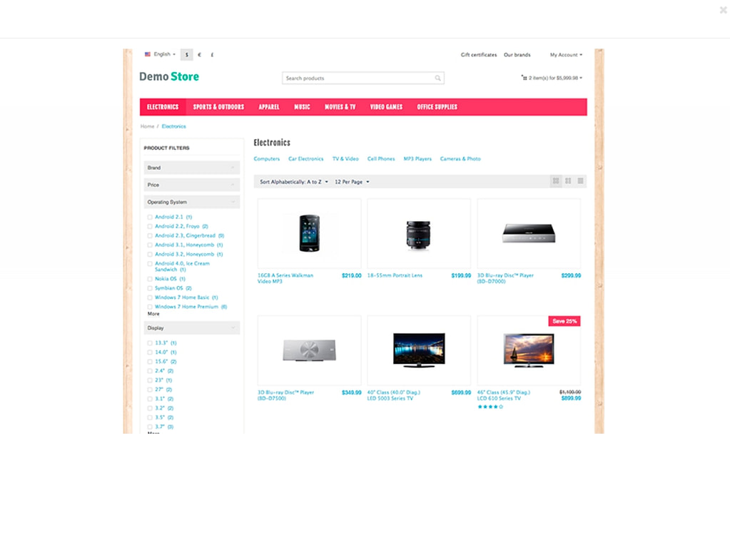
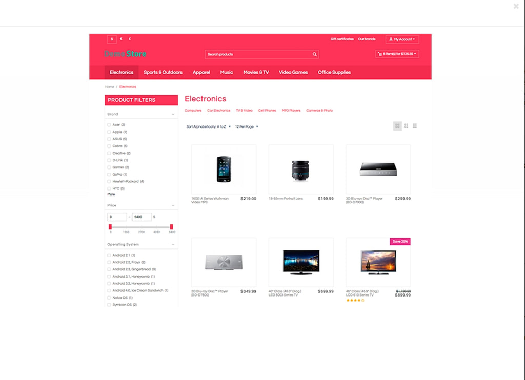
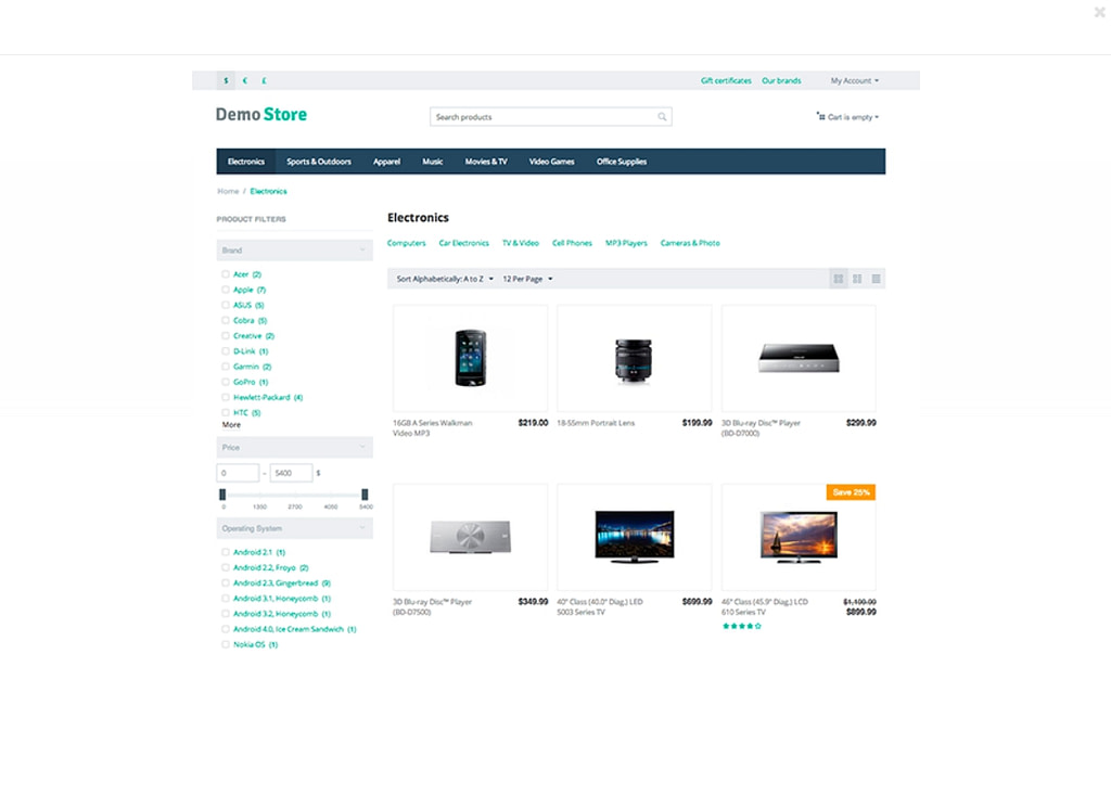
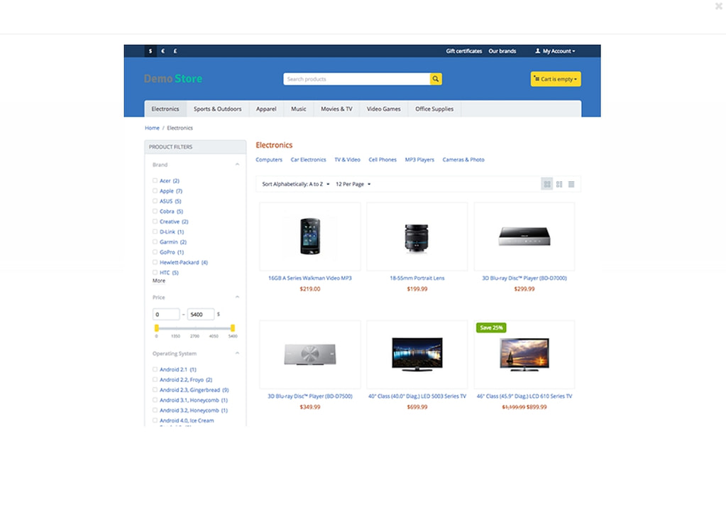
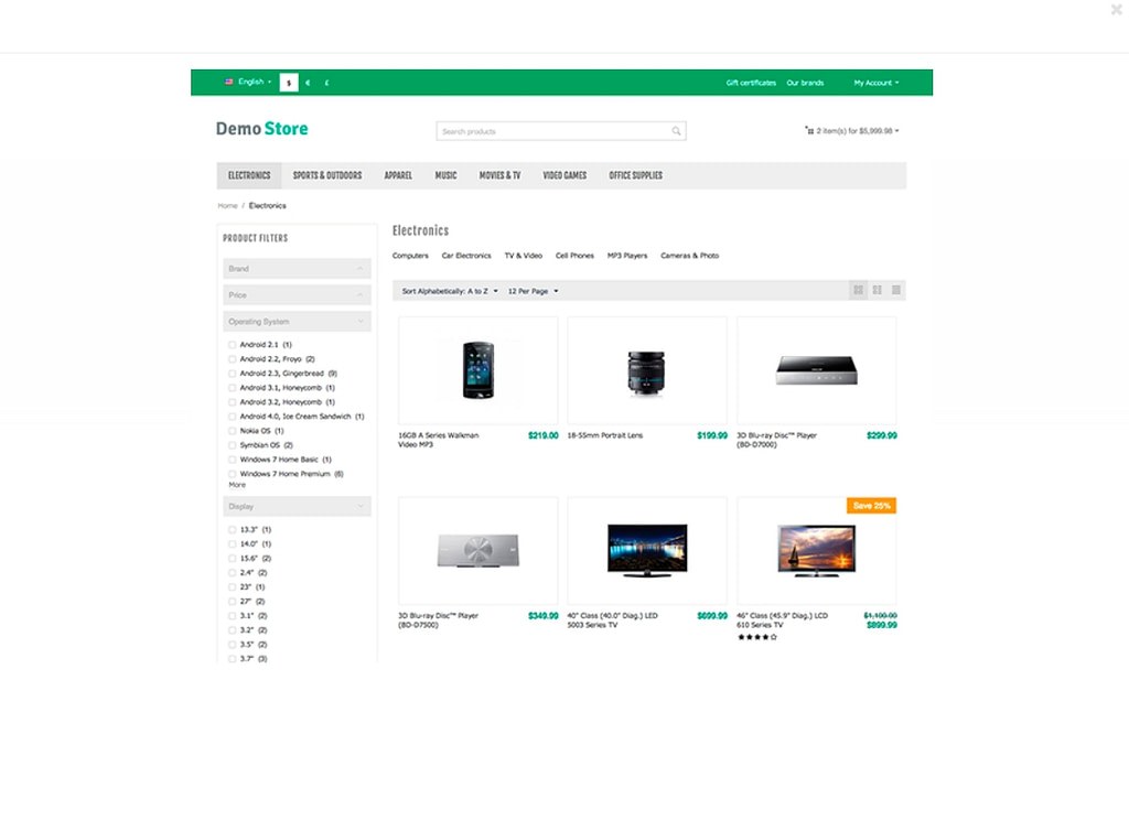
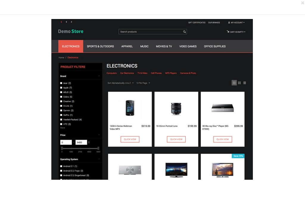
Out of the box, CS-Cart has a responsive theme designed with readability in mind.
How to adapt my add-ons to the Responsive Theme?
If your version of CS-Cart is lower than 4.1.4, then you need all your add-ons to be adapted to work correctly with a CS-Cart responsive theme. These changes will impact both the admin and storefront areas. To instruct yourself on how to fit your customer area, read this guide.
To adapt the admin panel to a Responsive Theme, go for this tutorial:
Need more help in adaptig, contact us!
What is the difference between styles and themes?
A Theme is more like an add-on. It contains styles that determine its look. For example, the default CS-Cart responsive theme styles are:
- Black
- Brightness
- Greeny
- MTronX
- Modern
- Posh
- Woody
You can opt for another theme having other styles for your store.
While selecting a theme, make sure that their developer complies with the strict coding guidelines of the CS-Cart original developer. As we are a licensed partner of CS-Cart, we do guarantee 100% compliance of our themes with its rules.
What is the difference between Widget and Layouts?
Usually, this ambiguity is caused by similar functionality implemented by Layout and Widget. However, Mobile layouts and Widget mode are two different notions.
- A Mobile Layout helps you set up blocks on the desktop, tablet, and mobile devices. It means that you can have a block with banners on the desktop and omit it for your store mobile version.
- The Widget Mode allows you to embed the CS-Cart site into another site, for example, WordPress. In this case, you have two interconnected channels to sell your products and/or services online. At this, if one of the sites is primary for you and you want some functions embedded into another platform separately for desktop and mobile versions, then you will need to have both a responsive theme and widgets. Thus, having a responsive theme and embedding a widget with the CS-Cart store to your other platform, you get a responsive widget that displays both on desktop and mobile.
How a Responsive Theme can be customized?
To take your theme responsive design further, introducing options to your website admin and storefront panels may be required. In this light, you will need to customize the design and typography for different devices: add a mobile-friendly checkout, or remove some unnecessary blocks that impede the user experience.
Case #1 Switching off some options/complete theme for mobiles
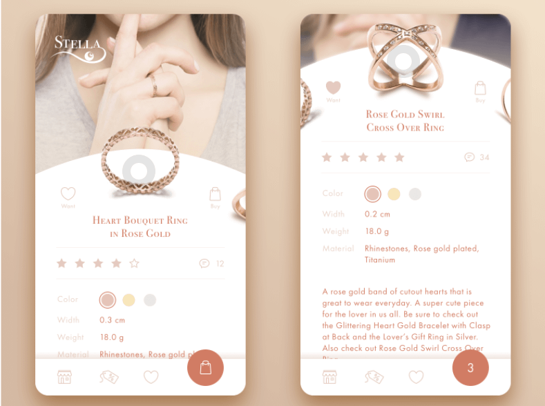
Mobile users don’t often need the full range of elements available on desktop. You may omit some of them to avoid diverting attention and focus customers on the target action – to buy. Take our Airy Mobile tailored for perfect user experience on mobiles. You can leave the theme for the mobile version and use another theme for desktop. By doing this, you better serve your audience preferences and expectations depending on the device type. However, this task is available through CS-Cart customization only.
You can also turn off some specific blocks for mobiles like, for example, some banners, text or other distracting elements. Instead, you can replace them by icons.
Moreover, even the size of blocks can be changed if you think that the width and length available in your responsive theme elements do not fit your store functional requirements.
We can easily help you with that!
Case #2 Checkout modification
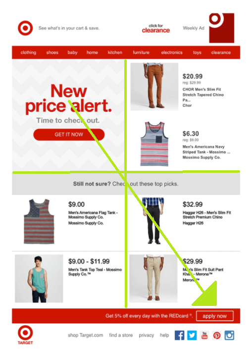
Switching to a responsive theme can help you with the adequate representation of the checkout page on mobiles. Of course, the best bypasses consider the mobile context. Linens N’ Things’ is an example of responsive checkout that presents tappable buttons, clearly labeled for both guests and registered users (with guests first) across all devices.
Adding a new element like Login, Register on the Delivery page (which is a step in the Checkout process) can be intimidating. Introducing a new CTA, ask your dev to comply with the CS-Cart coding rules in order to not break the checkout logic. Alternatively, you can ask our 15 years experienced team to do it for you. All you need is to attach a prototype or mockups describing the functionality to expand the default checkout (another page) functionality.
Read more: eCommerce Checkout Best Practices
Case #3 Resize or move blocks
If you want to save space to focus the attention of the mobile user only on the target action, then a mobile responsive theme won’t help you. You will need to regulate the size of blocks, use more icons instead of thumbnails, and, maybe, remove some text blocs to simplify the product details, or product cart view.
You can also rearrange blocs to highlight some products on mobile. For example, move the menu close to the search field to help your visitors find their wished products without scrolling the page but simply inputting the name in the search bar.
Take the Gestalt principles as an example to build a mockup of your mobile page. It says that any design should apply simplicity, similarity, proximity, order, closure, and symmetry. That means that if you want to sell more some sort of product in the first place, you should organize your blocks in such a way that your visitors’ eyes unintentionally fall on that product.
Let’s examine the proximity principle: items placed in close proximity to each other will save space and can help to upsell and cross-sell products you want.
The proximity can have a positive impact on user experience is the organization of diverse content blocks in the layout: these can be images, links, icons, controls, CTA elements, product cards, and loads other stuff. The principle of proximity allows you to arrange these blocks in a way that most seamlessly corresponds to the natural human abilities of visual perception.
The Gutenberg diagram is another method that can help in organizing elements. It describes a general pattern the eyes move through when looking at evenly distributed, homogeneous information. This pattern applies to text-heavy content and helps to organize the page according to natural human habits.
Etailers can adopt the best practices of the ATM menu organization. It is all about progressive disclosure. If you have ever used a bank ATM, you may have noticed the sequence of the UI elements called progressive disclosure. The first screen shows only the most important options, commonly used by the user. They are withdrawal, deposit, and balance inquiry. And while there are a number of other, less used, they are all tucked away behind the ‘Additional Options’ button. Think about applying this method to declutter the screen (Checkout page, especially) from diverting links, clickable banners, and images.
Closing
As you can see from examples, managing the attention of users is possible through a well-thought design of main pages. Of course, a responsive design can save you money and offer a readable and mobile tailored version of your eCommerce site. But you can do more with that responsiveness and go beyond conventional design by rearranging, removing, and expanding your mobile adapted version of the site to engage visitors, turn them into customers, and promote your online presence further with m-commerce.
Where to find more inspiration for web and mobile customizations?
Check out our cases to see the best practices in customization that really helped their owners to expand their website selling power and attract more vendors. You will get to know how to create a simple and basic design and keep it cohesive across devices with the same level of user-friendliness.