
![How to Choose the Right Color Palette for Your eCommerce Website [Guide for Beginners]](https://mldi5dmmdvnt.i.optimole.com/w:auto/h:auto/q:90/f:avif/https://simtechdev.com/wp-content/uploads/2019/10/robert-katzki-jbtfM0XBeRc-unsplash-scaled.jpg)
How often do we initially judge a product based solely on its color? How many times have our buying decisions been based on the product color alone? In fact, studies show that up to 90% of first impressions about a product are color-based, according to research from the Institute for Color Research and the University of Winnipeg. That’s why choosing the right color palette for your eCommerce website is more than just a design decision — it’s a business one.
Let’s take a moment to explore the fascinating science behind why something as abstract as color has such a powerful impact on us.
When our eyes take in color, they communicate with a region of the brain known as the hypothalamus, which in turn sends a cascade of signals to the pituitary gland, onto the endocrine system, and then to the thyroid glands. The thyroid glands signal the release of hormones, which cause fluctuation in mood, emotion, and resulting behavior.
In this post, we are going to cover how to choose the right color scheme, specifically focusing on “how to choose a color palette for an eCommerce website” and make the most of those 90 seconds while a customer is forming an opinion about your product as they land on your page.
What Is an eCommerce Color Palette and Why It Matters
Learn color components

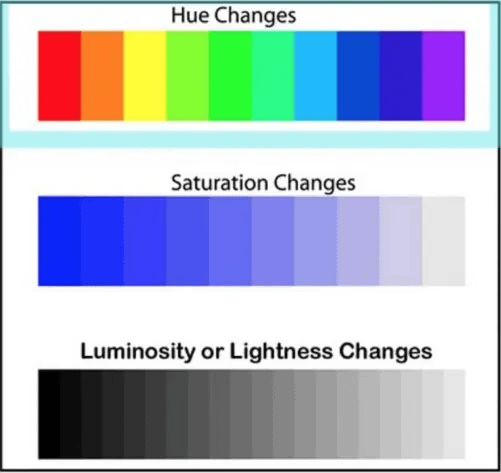
What if I told you that you’re not actually looking at colors but hues? Right, there is a difference between hue and color. You will need this information later in the article as you will follow the links to designers’ tools to create your own brand colors.
A hue refers to a specific point on the color spectrum — like red, orange, or blue. In web design, a “color” is a combination of hue, saturation, and luminosity. Saturation is how “colorful” the color is. “Rich” or “pure” might be better words. These qualities directly influence how colors are perceived in your eCommerce color palette and how they affect shopper behavior. As the color becomes closer to gray, it is less saturated. Luminosity is a measure of how bright or dark a hue is. Each of the three properties has a value (depending on a color space, but we won’t go into that one today). For example, a pastel mint shade might have the HSL values 147, 19, and 100.
Get started with your eCommerce website color scheme
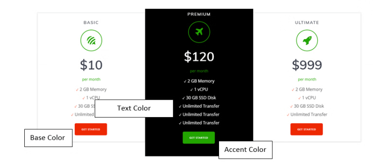
First, it is important to understand the interplay between the three key elements – base, accent, and text:
- A good starting point is to choose the base color for your online store. This is the fundamental color you will build on. You’ll build on this base by adding accent colors and combining hues and shades.
- Accent color – used for emphasis and contrast.
- The text color should be black, white, or grey. Depending on the background color, it should be adjusted for good contrast and readability. In terms of readability, it is convenient to have a black-to-white ratio of about 60 to 80%.
Do’s: the less color is used, the more likely it is to stand out. Good to know for calls-to-action.
Don’t: do not use complementary colors for text and background. Good to know for readability and visual aspects. *Complementary colors are those colors directly opposed to each other in the color spectrum.
Apply color harmony rules to your eCommerce website
A pleasing combination of colors is called color harmony. Artists and designers use these to create a particular look or feel. You can use a color wheel to find color harmonies by using the rules of color combinations. These harmony rules are especially useful when you want to create attractive, eye-catching color combinations that draw users in and guide them through your site. There are six rules of color combination:
- Complementary – two colors that are on opposite sides of the color wheel;
- Split-complementary – in addition to the base color, it uses the two colors adjacent to its complement;
- Analogous – three colors that are side by side;
- Triadic – three colors that are evenly spaced;
- Tetradic – four colors that are evenly spaced;
- and Monochromatic – three shades, tones, and tints of one base color.
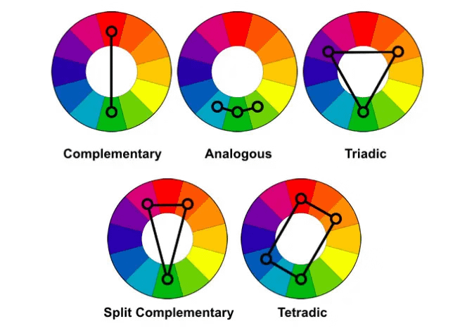
Rules of color combination for website store
Color combination rules for eCommerce websites
“Practice is the best of all instructors,” so let’s see color combination rules in action:
Target, the furnishing and decor brand, is complimentary (the main colors, red and teal/aqua, are opposite each other on the color wheel). This type of scheme adds vibrancy to your website.
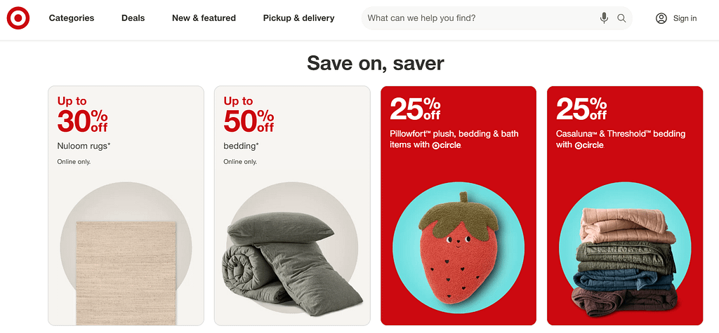
The complementary color scheme for the online store
Buch Mason, a men’s clothing brand, looks strong and persuasive with the monochromatic color scheme:

The monochromatic color scheme for an online store
And Gymboree, a kid’s clothing brand, causes enthusiasm with tetradic one.
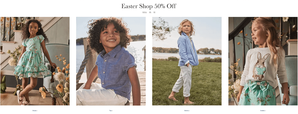
The tetradic color scheme for online store
Tools to Create Your Color Palette
Now it is time to go and experience unlimited possibilities of creating color palettes for an eCommerce website on your own. Use these free online tools to experiment and find combinations that work for your brand:
- Adobe Color CC. Apply the knowledge you have received in this article about color components, Hue, Saturation, and Luminosity, and create your own color! Next, complement it with other colors using one of the color combination rules, and voilà, you have your first color theme!
- Color Explorer and Canva. With these tools, you can quickly extract individual colors or a complete color palette for an online store from any image (like screenshots of web pages).
- Color Calculator. This interactive color wheel will show you which colors work together and why.
You can also use palettes created by others with Color Hunt.
How the Right Color Scheme Boosts Conversions in Online Stores
Choosing the right colors helps build brand recognition, helping customers associate specific colors with your brand and its values. The web design may evoke specific emotions and influence purchasing decisions. That’s why using attractive color schemes is key to drawing attention and keeping users engaged on your eCommerce site. For instance, a well-chosen eCommerce color palette can guide user attention to key elements on the page, such as call-to-action buttons or promotional banners, ultimately leading to higher conversion rates.
Colors also have a psychological impact that can enhance the overall user experience and build trust. By understanding color associations, online stores can strategically select appropriate schemes that not only reflect their brand identity but also resonate with their target audience, leading to better user engagement and increased conversions.
Color Psychology in eCommerce: How Shoppers React
Before diving into psychology, it’s helpful to explore the best colors for eCommerce website design based on general buyer behavior and expectations. Now it is time to consider the psychological implications of using some eCommerce website color schemes instead of others. Certain color schemes are pleasant to the eyes and subject to favorable perceptions, while other color schemes are “ugly” and negatively perceived by most people. Online store color palette selection depends on the message you want to convey to users of your eCommerce website, its tone, and its intended impact.
- Yellow conveys brightness, cheerfulness, energy, and optimism. However, it should be carefully used to avoid eyestrain.
- Orange expresses enthusiasm, passion, energy, and joy. Vitality, fun, and abundance are strongly represented by orange altogether.
- Red – a simple yet powerful color that appears nearer than it is and gives the impression of increased velocity. It suggests luxury and abundance, strength and warmth.
- Pink, a variation of red, has won a distinct name due to its expressive power. It is often associated with femininity and has a soothing, warm feel.
- Violet is generally associated with spiritual awareness and contemplation, as well as the power of introspection.
- Blue is often considered the best color for eCommerce websites due to its calming and trustworthy feel. It also conveys security, trust, and communication.
- Green represents nature, nature, freshness, growth, balance and peace. It’s commonly used by eco-friendly and wellness brands.
- Black is often associated with elegance, mystery, power, and authority. It can also be associated with the unknown.
- Brown instills a sense of reliability, support, and earthiness. It approaches the characteristics of black.
- White symbolizes cleanness, purity, hygiene, and both simplicity and sophistication. It has the property of making spaces look wider.
Knowing about the emotional impact of each color helps build your brand identity. But color preferences can also vary depending on who you’re selling to — which brings us to your audience.
Best Color Combinations for eCommerce Websites Depending on Audience Demographics
This is one of the most crucial considerations. If your business targets a broad demographic, it can be difficult to pick an appropriate color scheme. It speaks to the importance of niching down and catering to a well-defined group of people. When you have a narrow niche, factors such as gender, culture, and age do have an impact on color preference. You have to consider the people you serve.
Gender
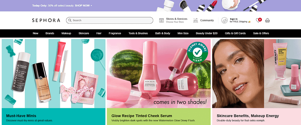
Let’s say your business targets women. Then you want to use a feminine color scheme.
Here’s how Sephora markets to a young female audience.
If you’re marketing to men, these are the colors to stay away from: purple, orange, and brown. Instead, use blue, green, and black. These colors — blue, green, and black — are traditionally associated with maleness. However, it comes as a slight surprise to some that brown isn’t a favorite pick.
Age
“With maturity comes a greater liking for hues of shorter wavelength (blue, green, purple) than for hues of longer wavelength (red, orange, and yellow).” – Faber Birren.
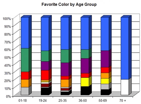
As you can see, blue, green, and purple are the most popular among all age groups. What’s interesting is the preference for green in the younger age groups and the preference for purple in the older age groups.
Notice the color orange and its lack of popularity among older people.
As you can see, audience demographics play a major role in how colors are perceived. Now let’s explore how different industries use color palettes strategically to reflect their brand and product types.
Best Color Palettes by Industry
When planning your store design, it’s helpful to look at the best colors for online stores across different industries. Certain colors appeal to certain markets. Some colors are more appropriate for luxury products, while others are more appropriate for food items. Color psychology is not an exact science, but you can leverage it to move in a general direction on your site.
Luxury goods
If you are selling luxurious goods, want to appeal to a classy audience, or are creating a business that’s bold in some way, then consider black as your primary color, as one of our clients did.
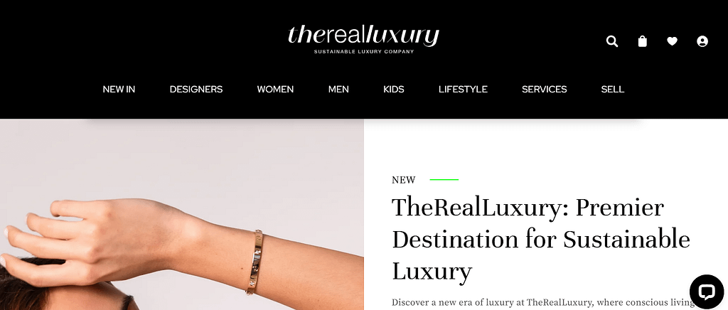
The Real Luxury’s fashion store color palette often incorporates bold, vibrant colors like red and black/gray.

Eco-products
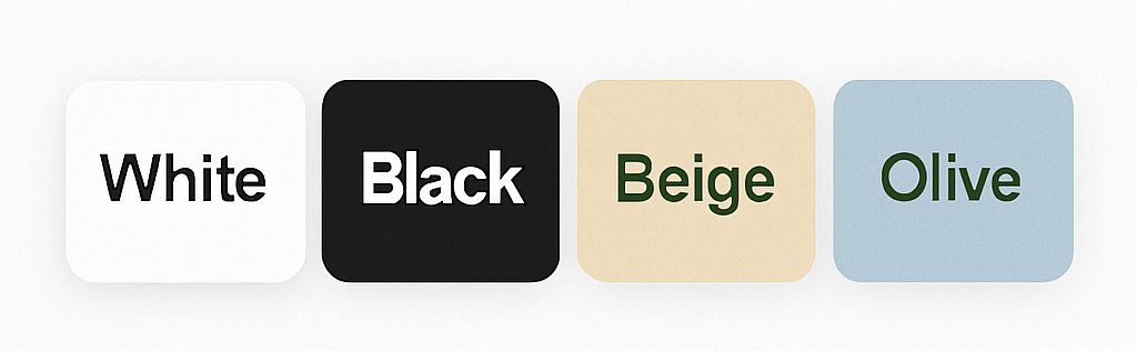
Brands with a health and eco-conscious focus, like our client Precious Plastic Bazar, gravitate towards greens, blues, and yellows.

Food
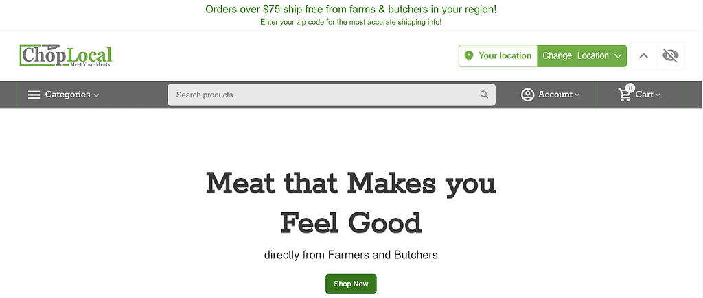
Although blue is pretty much an all-around great color, it should never be used for anything related to food. Dieters have used blue plates to successfully prevent them from eating more. This effect is supported by color psychology studies, which show that blue naturally suppresses appetite due to its rare presence in natural foods. Evolutionary theory suggests that blue is a color associated with poison. There aren’t very many blue foods — blueberries and plums just about cover it. Thus, never use blue if you’re selling foodie stuff. Here is how Chop Local made it.
Children’s products
Orange helps to stimulate physical activity, competition, and confidence. This may be why the orange color is used heavily by sports teams and children’s products. Another popular color is pink. It conveys tenderness and love.
Electronics
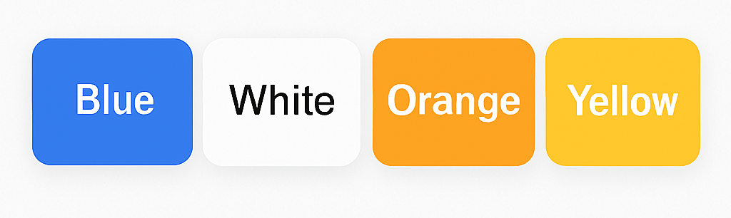
The best colors for an electronics store design include blue, gray, and silver. You can see them in the example of our client—Highflow.nl.
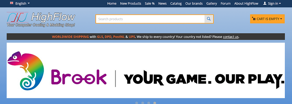
Effective color combinations like blue and white create a modern feel, while gray, black, and silver provide a sleek look appealing to tech enthusiasts.
Each industry tends to gravitate toward specific colors for a reason — whether to communicate trust, excitement, or luxury. Now let’s take a look at real-world examples of how popular brands use these principles in action.
Real Examples of eCommerce Color Schemes
So, we’ve just examined many brands. Let’s summarize their color palette experience and the reasons behind its usage.
- Highflow (Electronics Store): navy blue, and orange. Blue creates trust, and orange for call-to-action.

- Gymboree (Kid’s Clothing): red, green, and white colors for enthusiasm and excitement.

Chop Local (Food): green and white for freshness and eco-friendliness.

Target (Furnishing and Decor): red and teal/aqua convey vibrancy through complementary colors.
Buch Mason (Men’s Fashion Store): the monochromatic black-white-brown palette looks strong and persuasive.
Precious Plastic Bazar (Eco Products): blue and white for accent and yellow/orange for promotions.
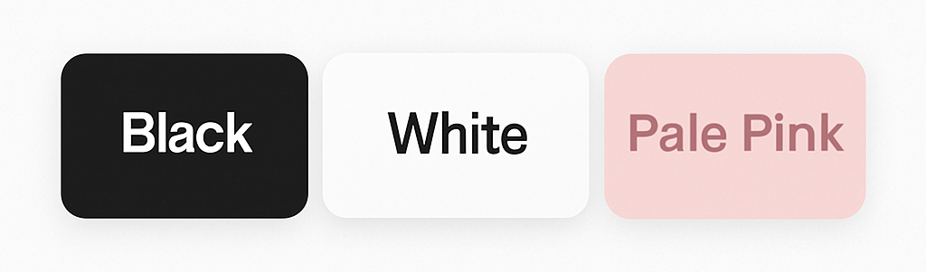
Sephora (Beauty Products): black, white, and pink are luxurious and feminine.
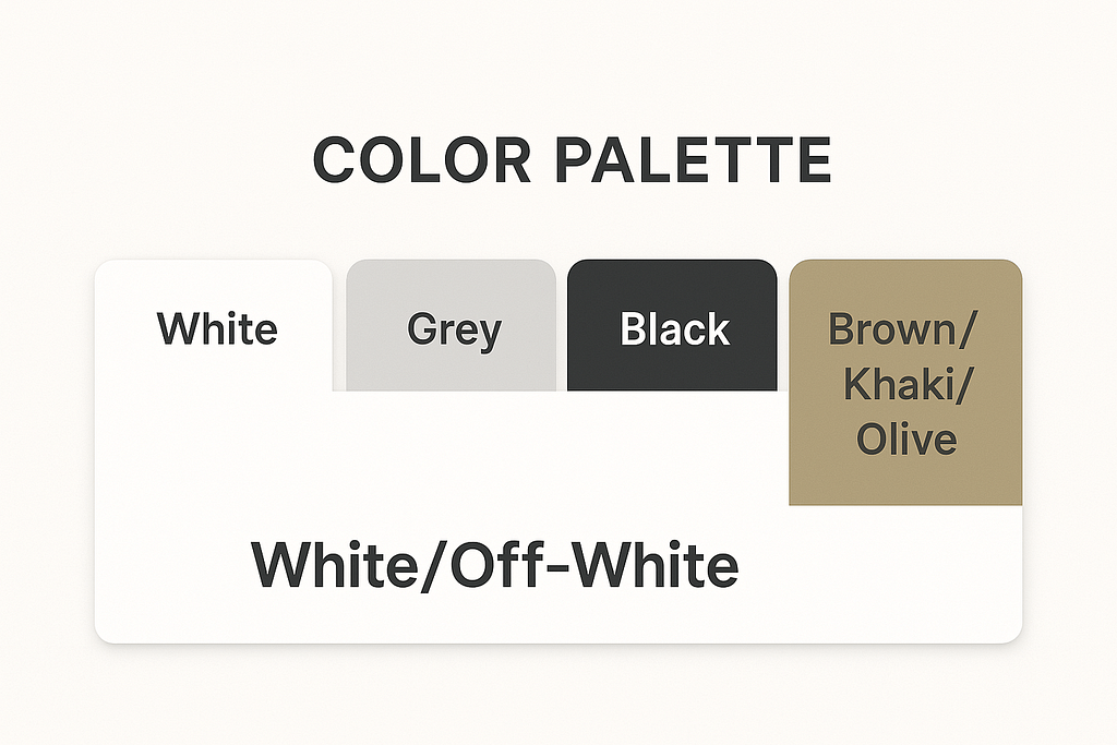
The Real Luxury (Brand Cloth): predominantly uses white, off-white, beige, or light gray to create exclusiveness and rich flavor.
These real-world examples show how carefully chosen color palettes enhance brand personality and guide user attention. Each of these brands has built a strong visual identity with a carefully selected online shop color palette tailored to its audience. But colors don’t live in a vacuum — they must work across devices, too.
Adapting Colors for Mobile and Desktop
Ensuring color consistency across devices is important for better consistency across devices. Here are our quick tips to match customer expectations.
Mobile Considerations
- Use larger color blocks for easy tapping
- Increase contrast for better readability on smaller screens
- Simplify color schemes to avoid overwhelming mobile users
Desktop Considerations
- Utilize white space more liberally
- Implement subtle color gradients for depth
- Use hover effects to enhance interactivity
Responsive Design Techniques
- Employ CSS media queries to adjust color schemes
- Use relative color values (e.g., HSL) for easier adaptation
- Test on various devices and screen sizes to ensure consistency
Designing for both mobile and desktop ensures that your color palette performs consistently across platforms. But even the best design can fall flat if you make common color mistakes.
Common Mistakes When Picking Website Colors
Choosing the right color palette creates a cohesive look and a professional and engaging user experience. However, many businesses make common mistakes that can negatively impact user engagement and conversions. Here are some pitfalls to avoid:
| Mistake | Solution |
| Ignoring Brand Identity | Use colors that reflect your brand values. For example, a luxury brand might use gold, black, or deep purple. An eco-friendly brand might focus on greens and earth tones. |
| Using Too Many Colors | Stick to a 3-5 color rule: primary color (dominant), secondary color (complementary), accent colors (for highlights). |
| Poor Contrast | Use high-contrast combinations for readability, such as dark text on a light background or vice versa. Test with accessibility tools like the WCAG Color Contrast Checker. |
| Overlooking Accessibility | Ensure your palette is inclusive: avoid relying solely on color to convey information (e.g., red for errors). Use patterns or labels alongside colors. |
| Ignoring Cultural Associations | Research your target audience’s cultural context. For example, red symbolizes luck in China but can mean danger in Western cultures. Colors have different meanings across cultures. For example, in Japan, white symbolizes both purity and mourning, while in India, it represents peace, celebration, and spiritual cleanliness. In Middle Eastern cultures, green is often associated with prosperity and Islam, while in Western branding, it might be more linked to eco-friendliness. If your eCommerce website targets a global audience, it’s crucial to research regional color associations before finalizing your brand palette. This helps you avoid unintended misinterpretations and ensures your color choices resonate with the right emotional tone. |
| Not Testing Across Devices | Test your color scheme on multiple devices and screen resolutions. |
| Overusing Bright Colors | Balance bright colors with neutral tones to create harmony. |
Measuring Your Color Palette’s Effectiveness
To ensure your website’s color palette is working as intended, you need to measure its impact on user behavior and overall performance. Here’s how:
1. Track Conversion Rates
- Monitor how users interact with key elements like call-to-action (CTA) buttons.
- A/B test different button colors to see which drives more clicks (e.g., red vs. green).
2. Analyze Bounce Rates
- High bounce rates may indicate that your color scheme is overwhelming or unappealing.
- Simplify your palette if users leave quickly after landing on your site.
3. Heatmaps and Click Tracking
- Use tools like Hotjar or Crazy Egg to track where users click and how they navigate your site.
- If users ignore CTAs, consider changing the button color to make it more noticeable.
4. User Feedback
- Conduct surveys or usability tests to gather feedback on your website’s design and colors.
- Ask questions like “Did you find the site visually appealing?” or “Were any elements hard to read?”
5. Accessibility Testing
- Use tools like WebAIM’s Contrast Checker or Lighthouse audits in Chrome DevTools to ensure compliance with accessibility standards (e.g., WCAG).
6. Engagement Metrics
- Measure time spent on site and page scroll depth.
- A cohesive and visually appealing color scheme encourages users to explore further.
7. Brand Recognition Surveys
- Test whether users associate specific colors with your brand.
- For instance, Coca-Cola is instantly recognizable by its red-and-white palette.
eCommerce Color Trends for 2025
Based on our experience, eight colors would be especially trending in the eCommerce season 2025:
- Earth Tones. Reflecting a growing focus on sustainability and natural products.
- Pastel Gradients. Soft, calming colors for a more relaxed shopping experience.
- Dark Mode Options. Offering users the choice between light and dark color schemes.
- Neon Accents. Bold, attention-grabbing highlights on otherwise minimalist designs.
- Monochromatic Schemes. Sophisticated, modern looks using variations of a single color.
- Inclusive Color Palettes. Designing for accessibility and diverse user bases.
- Virtual Reality-Inspired Hues. Vibrant, immersive colors that pop in both 2D and 3D environments.
- Adaptive Color AI. Personalized color schemes based on user preferences and behavior.
Summarizing: How to Choose a Color Palette for Your Store
Looking through curated website color scheme ideas can also spark creativity and help you find the right visual tone for your brand. The more unusual and unique color names can increase the intent to purchase. For instance, jelly beans with names such as razzmatazz were more likely to be chosen, according to a study published in the Journal of Consumer Research showing that unusual color names increase product appeal. This effect was also found in non-food items such as sweatshirts.
As strange as it may seem, choosing creative, descriptive, and memorable names to describe certain colors (such as “sky blue” over “light blue”) can be an important part of making sure the color of the product achieves its biggest impact.
Here, we’ve compiled the best practices:
- Color contrast is more important than brightness – a button may not be bright, but if it sharply contrasts with the background, it will still stand out and attract attention.
- Color influences the perception of urgency – warm colors (red, orange) are more often associated with action and urgency, while cool colors (blue, green) are linked to trust and safety.
- Breaking color hierarchy can be confusing – if secondary elements are emphasized more than the CTA, the user won’t understand what is expected of them.
- Button color can enhance the message – for example, green color + text “Start for free” = safety + ease of starting.
- The intuitiveness of the color scheme is more important than trends – even a trendy color can harm conversions if it isn’t associated with the expected action for the user.
- The optimal color scheme depends on the stage of the funnel – at the beginning of the journey, users may respond better to calm tones, while closer to purchase, they may react to more striking colors.
- Color can influence behavioral patterns in different cultures – for example, red in China = luck, in the USA = danger/urgency.
- A/B testing should consider not only color but also context – the same color may perform differently depending on the button size, text on it, and background.
- Button color works in conjunction with the environment – a dark button on a light background attracts more attention than just a “bright” button.
- A unified color strategy reduces cognitive load – if the user understands by color where and what to click, they feel confident and doubt less about their actions.
Final Thoughts on Your Store’s Color Theme
It’s not exactly rocket science — but creating the perfect color palette takes strategy and insight. Therefore, we recommend you use pre-made design solutions available on CS-Cart’s official marketplace.
With your customer psychology in mind and many years of web design experience behind us, we can develop conversion-oriented store themes that are made to grab your customers’ attention and guide them through the buying process.