

Today a large product range is not enough for online stores and marketplaces to see a sales growth. Your eCommerce site should seem to be convenient and visually appealing for the visitor. We have collected the best tips.
Clear navigation
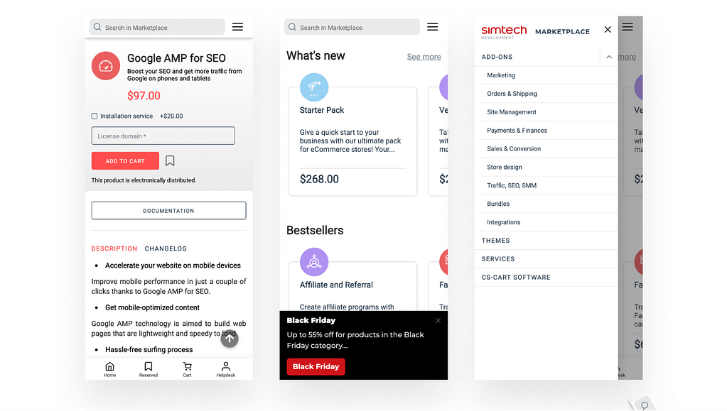
The menu and structure of the online store/marketplace should be clear to every potential buyer. The user should immediately see where to click to go to the desired section. And buttons, tabs, and links should be highlighted with the color so they don’t have to be searched all over the page.
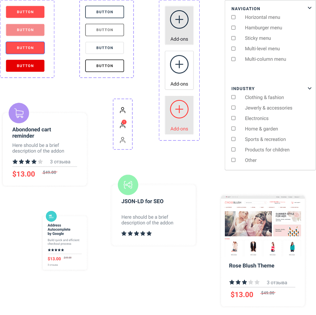
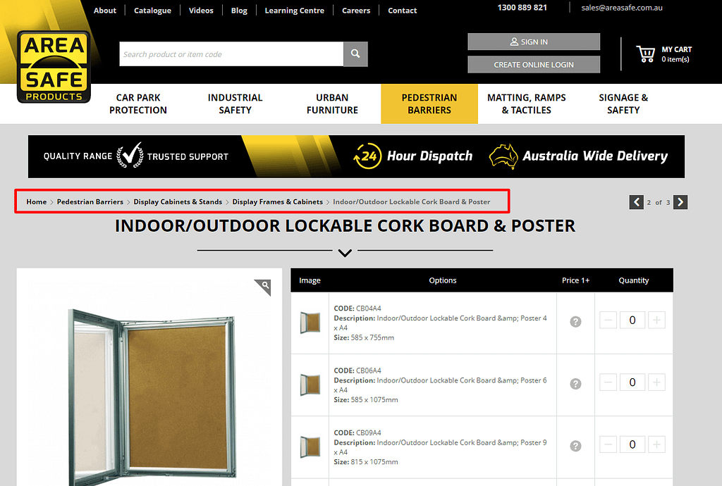
eCommerce sites usually have many levels of nesting due to product categories and subsections. This is where breadcrumbs come in, showing the user what page they are on and how to go back several levels. This is a great navigation tool!
Read also our article on how to create a selling product page.
Improve usability
All UI/UX design tips are based on human psychology. For example, consider Fitts’ law. Based on it, we can say that large visual elements of the site attract attention and clicks. Therefore, any important elements of the site must be increased in size and highlighted in color. First of all, this applies to clickable elements, for example, the “Add to cart” button.
We recommend adding bright banners with promotions to the main page, as well as telling why you need to buy from you.
And don’t forget that a selling site should have a design suitable for your target audience. Make it pleasant and friendly to the group of people you are targeting.
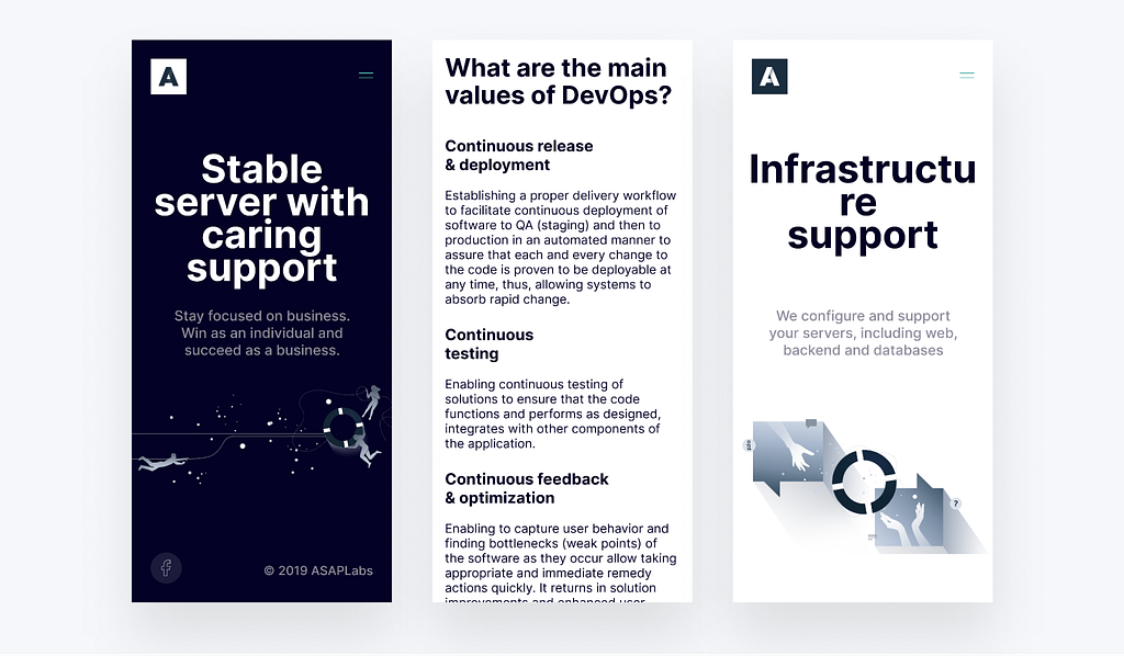
Responsive design for all devices
According to statistics, more than half of buyers enter the online store from smartphones. Therefore, the design of a marketplace or an online store should be optimized for viewing on smartphones and tablets. The essence of this design is that it adapts to the screen size of a particular device.
Using responsive design is not just good advice, but a necessary condition if you want to develop your online store. The best selling site will have this feature by default.
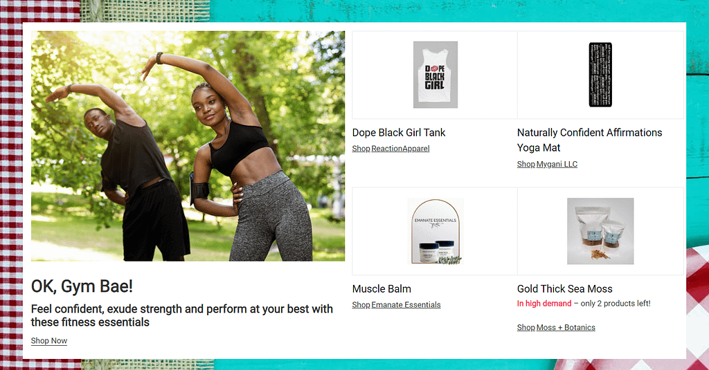
Value proposition
When designing a marketplace, keep in mind the portrait of the target audience and the value proposition. This is a concise and intelligible explanation of how your product or service can solve a potential customer’s problem.
Simply put, the visitor, having entered the site, should immediately see why he or she needs to buy this particular product from you. This is exactly what one of the most famous marketing models AIDA (Attention, Interest, Desire, Action) tells about how to create a selling website.
At the same time, it is absolutely not necessary to describe in detail all the advantages of a product or service. Nobody will read this. The value proposition should consist of several short sentences that clearly explain what exactly this product is, what benefits it will provide, and why it should be bought here and not in another store.
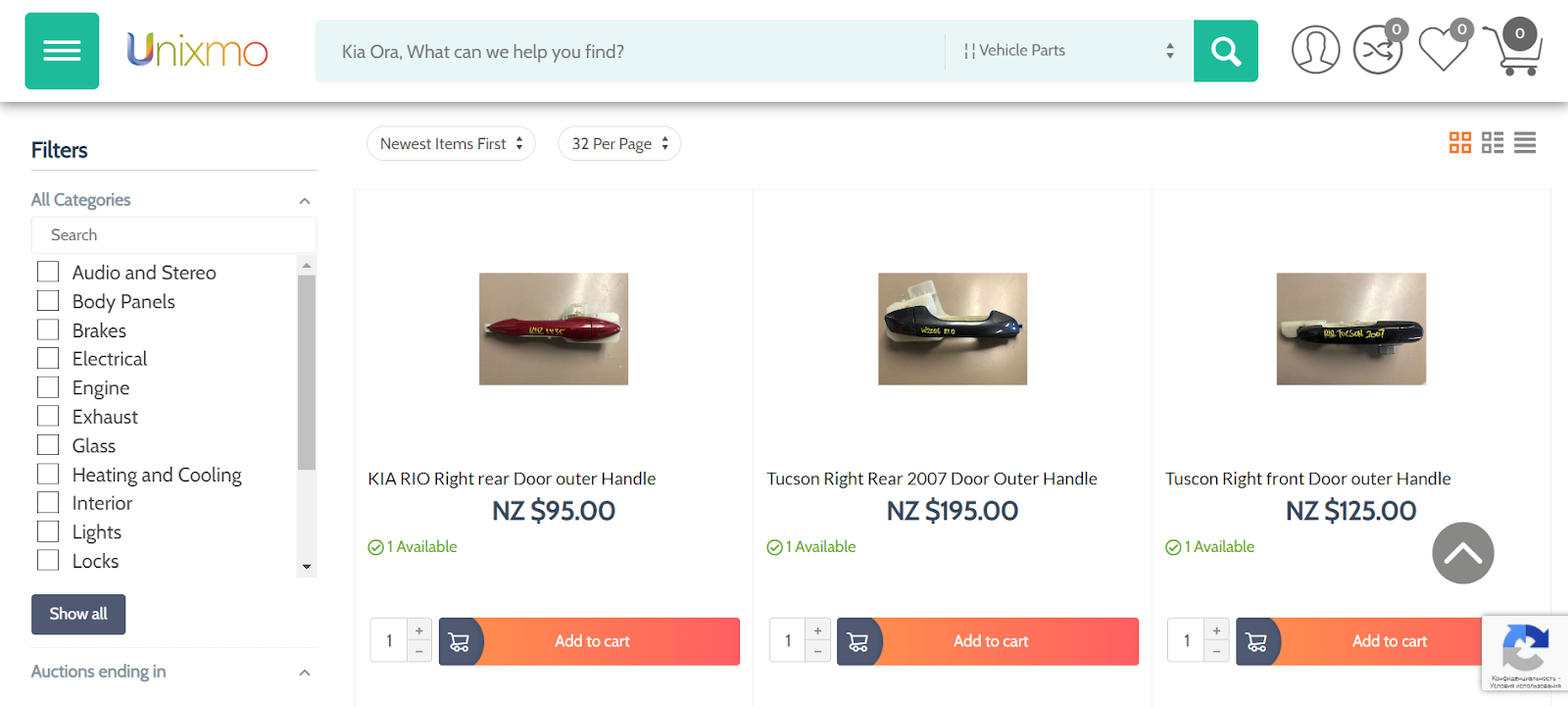
Large selection
Creating a selling design without a large selection of products is very difficult. However, this also needs to be approached wisely. If there are too many goods on the page at the same time, then the customer will be confused and simply leave your store for competitors.
But there is no need to reduce the assortment of the marketplace, just competently organize the choice of products by adding filters and sorting. So the user will be able to set all the parameters and get the right product.
Social proof
It is essential to show your customers that your store can be trusted. And there is social evidence for that.
For example, you can introduce the ability for users to leave reviews on a product page. At the same time, marketplace sellers must be able to respond to them. 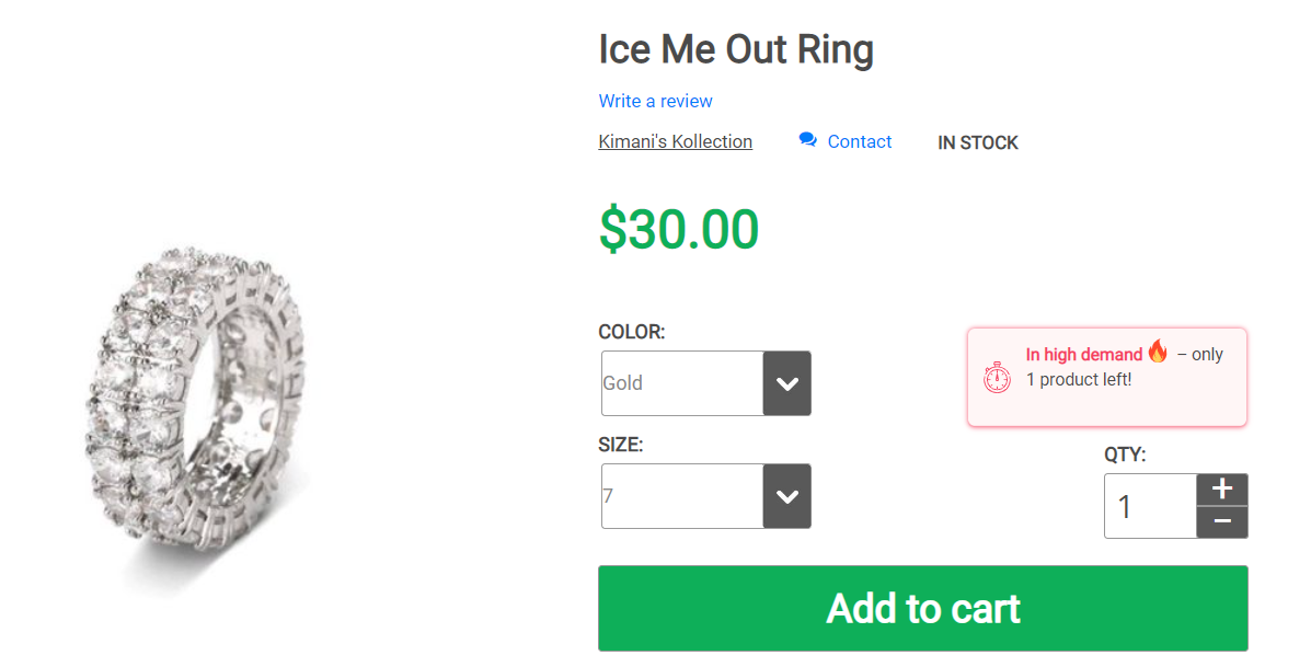
You can tell potential clients in numbers what exactly you have achieved during your work, with links to media mentions and interesting information.
Easy to buy
No need to overload customers with questions in forms, ask only what is really needed for order processing and delivery. The less the user enters data for authorization or order, the more likely it is that he or she will not close the tab with your store. Better yet, add a “Buy now with one click” button, this is the trend of recent years.
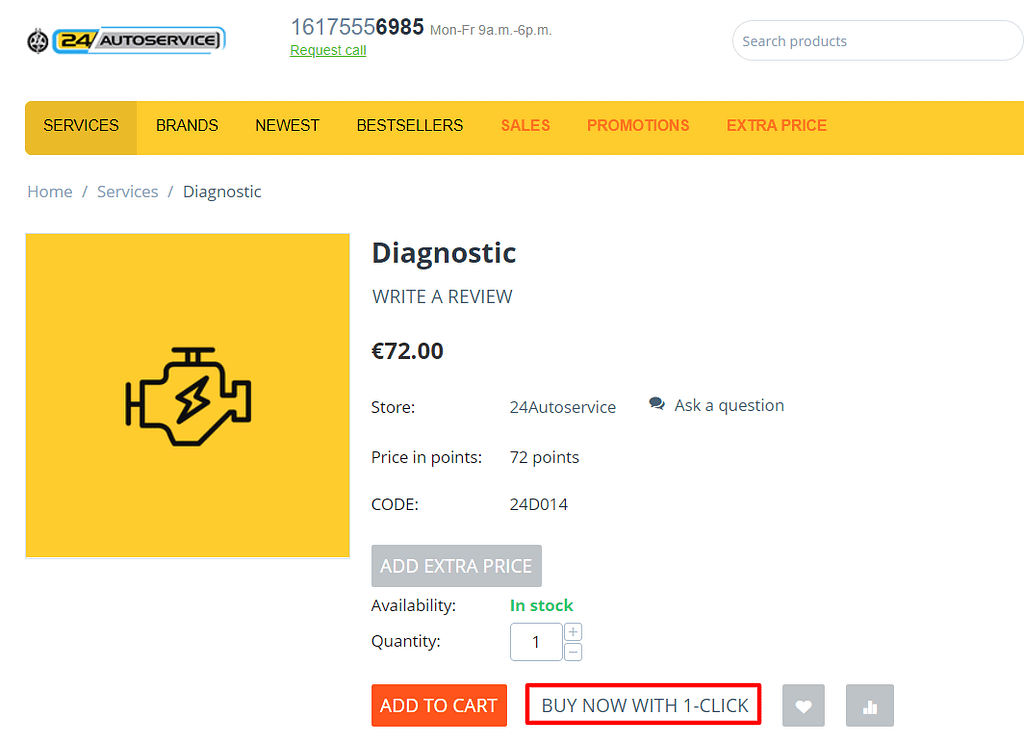
If the captcha in the store is necessary to protect against bots, then use the simplest one. These are all unnecessary barriers before buying on your site. Also don’t forget to add a bright order button.
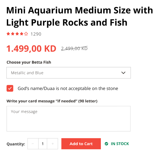
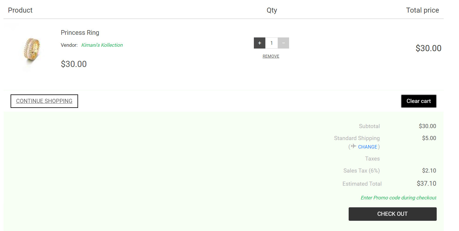
Cart page design
Display all product information, including photo, price and quantity. Show all delivery options and their prices, as well as the total price for the order with delivery. The user needs to clearly understand how much and for what to pay. Also, your customer should be able to delete products or change their quantity. And the button to go to the next stage of the checkout should be noticeable.
Conclusion
There are many ways to increase online store and marketplace sales, but the right store design is still one of the main components of a successful business. At the same time, as you can see from this article, creating a design that is convenient and attractive to buyers is not so difficult. So follow our advice and make a selling site. And the easiest way to implement this task is on the CS-Cart platform.