Today, we are interviewing Simtech Development designers. We will find out what challenges arise while working with client projects, how best to interact with the web design team to get the expected result, and what design trends are relevant this year.


What difficulties or features arise in the work of a designer?
Most often, designers point to the problem of communication and understanding. Communication between you and the designer is important to ensure that all terms and goals are understood correctly and unambiguously. In addition, communication is important for clarifying requirements and adjusting the assignment as the design develops. It is important to understand that one designer cannot create a “selling” design. Collaboration is the key. The customer better knows the specifics of the business and can guide the designer in the course of work.
Nat: In order to facilitate collaboration with a designer, it’s important to understand that design alone does not determine sales on a website. Sales are contingent on the product’s usefulness to the consumer and the level of interest it generates among users. This underscores the primary importance of content, with designers serving as architects of that content. Therefore, for successful collaboration, it’s essential to provide content to the designer. To define the content on the site, it’s helpful to articulate your objectives and the user needs you aim to address. In essence, you need to establish the purpose of the site, respond to the designer’s inquiries (complete the brief), and engage in cooperation. Experience demonstrates that delegating the entire website project to a designer or manager often leads to subsequent changes that could have been avoided, thereby saving both your money and the designer’s time.
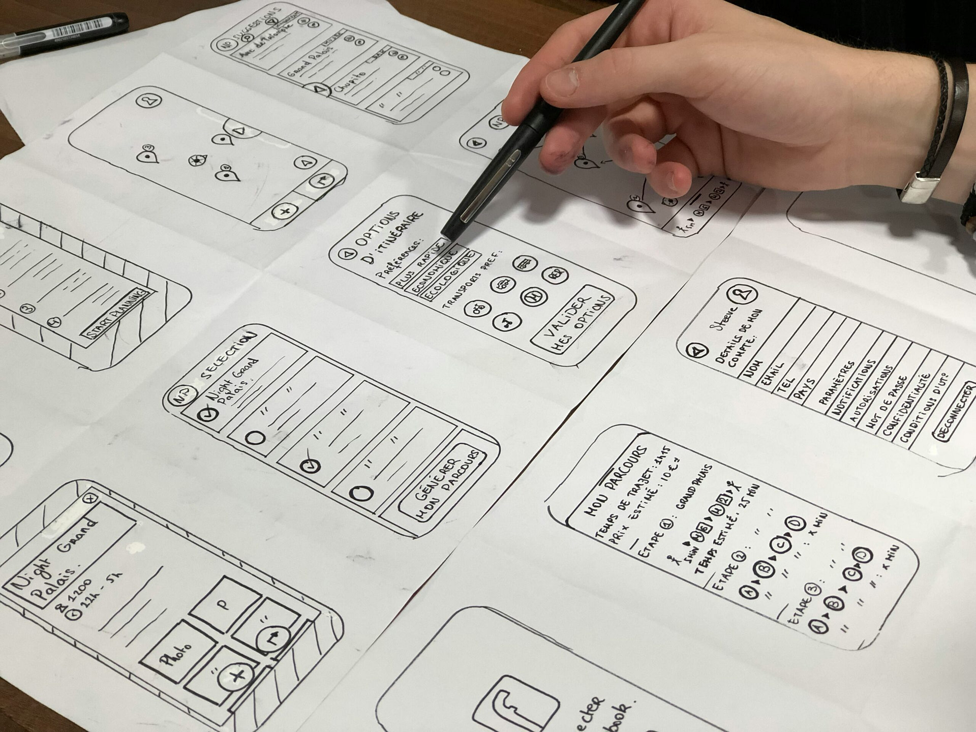
Jane: Most often, difficulties in work arise due to problems with terminology. For example, when designers talk about a prototype, they mean an animated mockup, while customers or colleagues mean just a mockup, without animations.

*Editor note: Animated prototype is a clickable layout where you can click buttons and links and navigate to other pages. The customer receives such a layout for acceptance of work and approval of the design.
What are the common mistakes? What are they connected with?
Our designers attribute design flaws to vague specifications and the lack of “course correction” – regular communication with the designer about changes in the project. Therefore, it is crucial to not only establish a clear design specification and ensure alignment between both parties, but also to maintain constant communication with the designer.
Nat: One common mistake is for a designer to immediately focus on “beauty” without considering the logic of the store from the outset, particularly when it comes to online stores. It is essential to first understand the nature of the store, its target audience, and the specific needs of its users. It’s important to emphasize that these are the users’ needs, not the designer’s.
A frequent mistake made by our clients is overlooking the work done by designers. Based on my experience, I believe that it is beneficial for the designer and the client to have weekly communication, where the designer can showcase the progress of their work and both parties can make any necessary adjustments. This approach leads to more efficient processes, as it keeps both parties informed about the project’s stage and the upcoming steps. This level of communication is comfortable for both parties and helps to avoid unnecessary revisions.
Jane: Frequently, mistakes arise when a clear software specification is not established from the outset, leading to a series of ongoing adjustments during the work process, such as “Add a button here, no, it’s better to remove it, wait, actually it’s better to add…” and so on.
What should the client pay attention to when accepting work?
Nat: Ensure that the website structure aligns with the pages outlined in the specification, that the design meets your requirements, and that all modifications have been implemented.
Jane: Start by confirming the presence of all pages, then review the spacing, fonts, and colors to ensure consistency and coherence. If the design includes a prototype, it’s important to thoroughly examine it from start to finish to ensure nothing has been overlooked. This thorough approach is the best way to ensure nothing is missed.
What are the current design trends? Which ones do you personally use?
Simplicity and minimalism continue to be popular. For added diversity, consider incorporating neon elements. Trust UX professionals who design websites based on user behavior patterns in online stores to leverage current trends.
Jane: Lately, holographic and neon elements have become trendy in graphic design, while minimalism continues to be visually appealing.
Nat: The prevailing trends emphasize cleanliness and organization. UX design research indicates that designs should not be overly simplistic; a degree of complexity should be maintained, and site architecture should be clear and intuitive. Users should be able to quickly understand where they are, why they are there, and the benefits they will receive.
We are well-versed in the user behavior patterns within online stores, comprehending the user’s desired destinations and motivations, and accordingly shape our design to align with these patterns.
What to prepare to make it easier for the designer to complete the task?
It’s crucial to brief the designer on the tasks at the outset, utilizing all available materials. If you have competitor analysis and target audience data, that’s great! Additionally, provide the brand book and logo developed by the company right from the start. It’s important to communicate your vision for the project to ensure alignment with the designer.
Nat: It’s highly beneficial when clients actively participate in calls, provide detailed answers, and engage in the design process. If the client possesses a logo/brand book, etc., it should be shared with the designer. Additionally, a list of competitors, including what aspects are appealing and what should be avoided, is valuable. It’s important to provide references with explanations of why they are preferred, as different interpretations can arise. For instance, a client may like the color palette or menu interaction on a website but fail to communicate this to the designer. Effective communication is essential to ensure mutual understanding.
Jane: The work progresses faster and more effectively with more information at the initial stages. I always inquire about the presence of a brand book or a vision for the end result, as this aids in swiftly establishing a system and understanding the requirements. Additional research at the initial stages will undoubtedly enhance the quality of the work.
Share your best cases with us
Nat: I believe that all of our projects can be deemed successful, as we assist clients in launching their own businesses, commencing sales, and generating revenue.
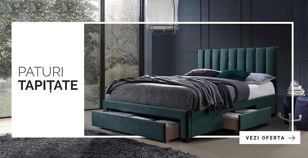
Jane: It’s challenging to select just one case, but I would say that the Kalenda furniture store project stands out as the most successful for me. The store owners are from Romania, and we had a great synergy. We had extensive and focused discussions about the design, and they provided all the necessary materials on time, including the brand book, icons, some of their own developments, content, and photos.
The most motivating thing is that each time you have to do different tasks, that is, the work of a designer requires you to be constantly aware of all the events in the world of technology, art and culture in general. The world is constantly changing, and design also does not stand still, one has only to compare the Internet as we saw it in 2000 and now, and the thought that everything will change ahead is very exciting.
Jane, designer at Simtech Development
Findings:
- Give detailed answers to the questions in the brief. Although not mandatory, this document greatly helps to understand the specifics of the site and other background information. The brief gives the designer an initial understanding of the direction in which to move.
- Provide additional materials so that the designer understands the task better. It can be a brand book, a logo, a list of competitors indicating the elements you like, examples of sites (also mentioning what you like).
- Hold regular meetups with the designer, for example, once a week, to keep abreast of the work and adjust the direction, if necessary.
- When accepting the design, pay attention to the presence of all pages, indents, fonts, colors, the entire path of the client according to the prototype, the compliance of the site structure with the pages listed in the specification.
- Don’t chase design trends, but trust professionals who know behavior patterns and can adapt your site’s content to them so that the design serves not only to attract attention, but also guides the client through the site, helping them find what they need and make a purchase.
