
In our previous article, we examined what the design audit stands for. This time, let’s take a closer look at the audit process itself.
The UX professionals at Simtech Development prepare a website usability audit document that can be conventionally divided by two parts: overview and report with recommendations.
Overview
The first part of the design audit is dedicated to the overview of the company: the corporate website main sections, categories, audience age, gender and location, problems the design should resolve, used colors, fonts, key competitors or examples to follow. This phase is required to capture a general picture of the audited website and detect problems or growth points at the surface.
Report
After the overall review is done, the inner factors’ analysis takes place. Experts examine the Google Analytics data and draw their conclusions with recommendations.
We gathered the most frequent mistakes of the CS-Cart based websites and suggestions for you here to give you the whole idea of what can be improved:
#1.
We do not recommend using too bright, ‘screaming’ colors for key elements like prices, labels or the Subscribe buttons if only the specifics of your website don’t dictate the same. These keys should attract but not to divert attention or scare. Think about the background it should not blend or interfere with the main content.
#2.
We recommend developing a font guide for the whole website to have a clear hierarchy for the titles and the main text. There should be a logic of using fonts, its size, word spacing, and capitalization. Apply the uniform spacing. Use a bulleted list to enumerate advantages in the product description because it is better for SEO. Avoid using serif cursive fonts for names – that’s complicated reading. The hierarchy of titles should be clear, text color – uniform. Changing the font size you can raise the visual profile and focus the visitors’ attention on the primary text fragments. Make all the key elements more visible using a different color and/or a greater font size. Usually, the larger the element is, the more important it is. If your target audience is the older people, take care of them – use bigger fonts.
#3.
Use the grid to arrange the content. The grid will help you to arrange the website elements and keep the whole website structure comprehensive. Our experts use the Bootstrap Grid System for block arrangement.
#4.
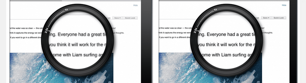
The images should be displayed taking into account Retina screens (Macbook, iPhone, and Android). For screens with high resolutions, we recommend using bigger images. It concerns the logo, product images, banners, etc.
#5.
Changing URLs of pages, don’t forget to set up 301 redirects. Your visitors will not see 404 errors due to your URL updates. Place a greater focus on SEO-texts and images. Use meta tags.
#6.
The phone number should be clickable. There shouldn’t be any unclickable areas left out. Think about making a clickable price, logo that would lead to the corresponding item or home.
#7.
If you use FAQ section, it would be a great decision to add the Contact Us button that would lead to the feedback form. If you do not want your customers to leave the product page, you can simply add the feedback form right to this page using the “Form Logs” add-on. Besides, we suggest using Real-Time Messenger for the client instant support. It allows exchanging messages with the clients in real time. A chat button will reduce the used space on the website mobile version.
#8.
We recommend adding as few of fields at Checkout as possible. You can use Google Address Autocomplete, that will autocomplete the user address.
#9.
Add a block with information about shipping cost. Add for example “Standard Shipping: Estimated 4-10 business days”. Alternatively, you can use the “Shipping Estimate” add-on and calculate the shipping cost automatically.
#10.
Use bigger icons on the mobile version of the site. It’s difficult to hit small buttons and the system may get these actions in a wrong way.
#11.
A security lock icon should be present to create trust. Change favicon from the standard CS-Cart one to your Company favicon.
#12.
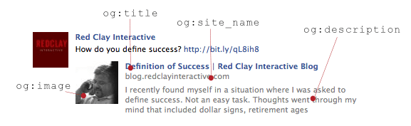
The social network is an important promotion channel in today business. Social nets give more opportunities to communicate with the company as compared with the website internal communication. Add Open Graph tags to get a nice profile for the products with photos, titles, and descriptions. To achieve this, use the Advanced Social Buttons add-on.
Closing
If you don’t want to lose yourself in the open sea of multiple data you can ask the help of CS-Cart design experts. Entrust the design job to professionals to save more time for the business itself.