
The primary task of each online store owner is to retain customers in the store and receive completed orders. If you see the conversion decreasing, that means users do not reach the checkout point or close the page.
To explain why that happens, we gathered a focus group and asked the participants one question: Will you make a purchase in this store? Their answers and comments are in this article.
The idea to conduct a small survey appeared spontaneously, says Olga Belotskaya, Head of Sales at Simtech Development.
Often our clients come with a common problem: customers abandon the carts, what is wrong? And when you look at their websites, you understand that problems are on the surface.
Of course, conversion obstacles are obvious for the employees of an IT company with involvement in 5000 + eCommerce projects. But for online store owners with no relevant expertise and technical background, everything is not that simple. Let’s have a look at the result of our experiment.
We made an experiment
For the experiment we gathered students from the Simtech Development Sales School. Those are young people between the age of 21 and 40 usually with higher education. Each of them makes purchases online on a daily basis, starting with groceries and ending with exclusive jewelry. Respondents were asked to explore several online stores as real customers. Then they had to explain why they would or wouldn’t buy from these platforms.
If you are the owner of an online business, this is a must-read for you. You will be able to evaluate the bottlenecks of your eCommerce product, understand how to fix them, and increase sales. All images below are based on real cases.
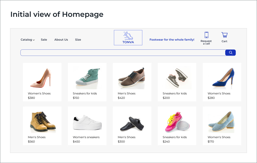
Poor UI/UX Design
Focus group responses
Andrew:
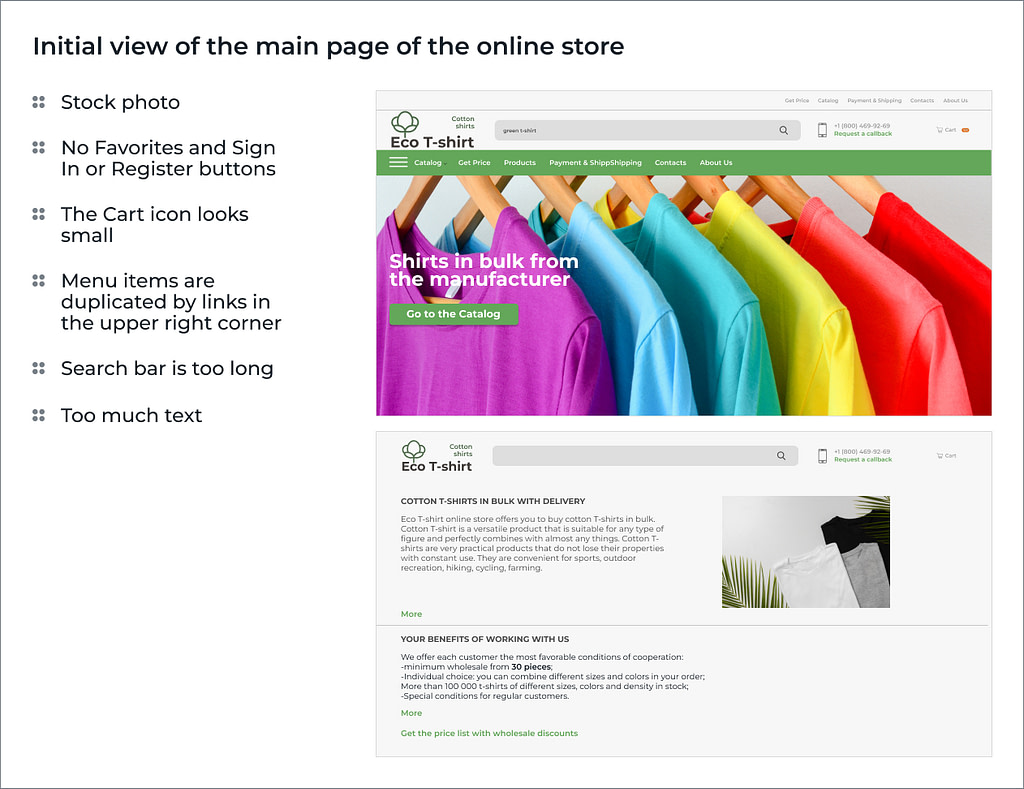
The design is poor: instead of video or slides, the pages are filled with boring pictures of T-shirts only. Probably, they chose stock photos over original professional images of real products.
Kristina:
There is too much text. It seems like the website was created a long time ago, so it looks old-fashioned. Good online stores look a lot different today.
Simtech Development expert evaluation
Katy, Account Manager:
Content is very questionable: too much information, and menu sections are duplicated with header links.
I agree with my colleagues – the photos are not good. And you can’t just ignore this tool: images are the best way to display items to customers. The website needs quality pictures from different angles.
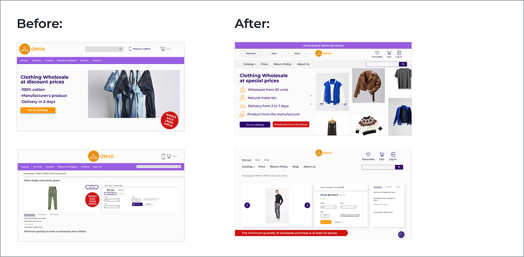
Another key point is the first page. It is exactly what customers see after the store is loaded. Here the owner should clarify the advantages of their products and services, so users will stay and continue engaging with the store. In our example, there are no strengths highlighted, but I assume there are some (free delivery, own sewing factory, for instance). Anyway, the customers weren’t able to know about them and went to competitors.
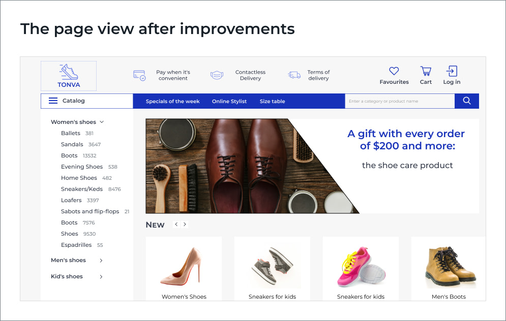
Eugeniya, Lead Designer:
To be honest, the design of an online store or marketplace is a fractious thing. There are too many details you need to consider. But most important, it should be based on the audience profile or buyer persona and business specifics. Is our example good for Koreans, where brightness and colorfulness are normal? Or is it for Sweden, where minimalism is appreciated?
If we sell toys for children, then we use bright colors, playful fonts, and cartoon characters. For the luxury watch website, we choose another pattern: a strict design, a black-and-white palette, and stylish, business photographs.
Moreover, there are always constant changes in the design. Something that was beautiful a couple of years ago, today is out of trend.
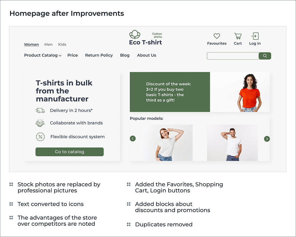
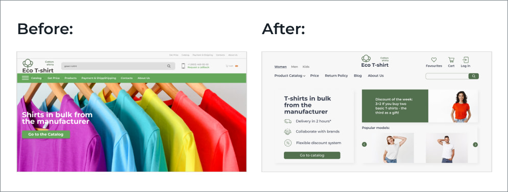
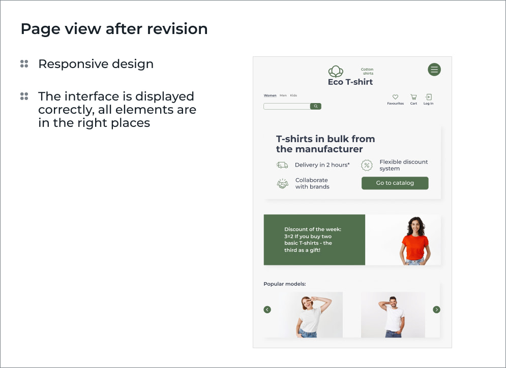
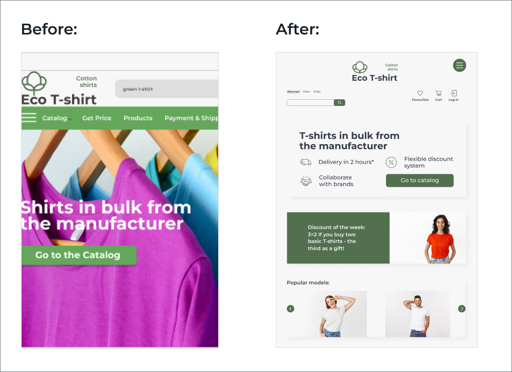
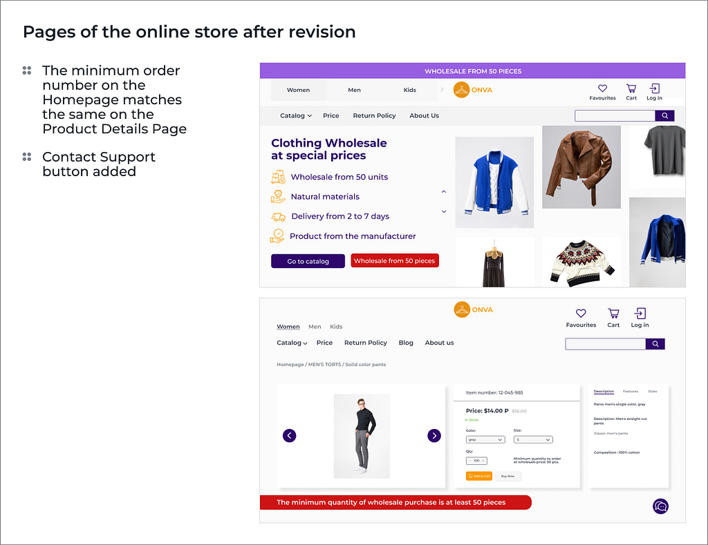
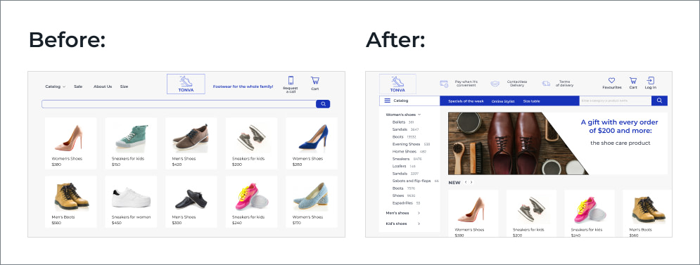
Here is how our website page might look after improvements.
Ignoring mobile users
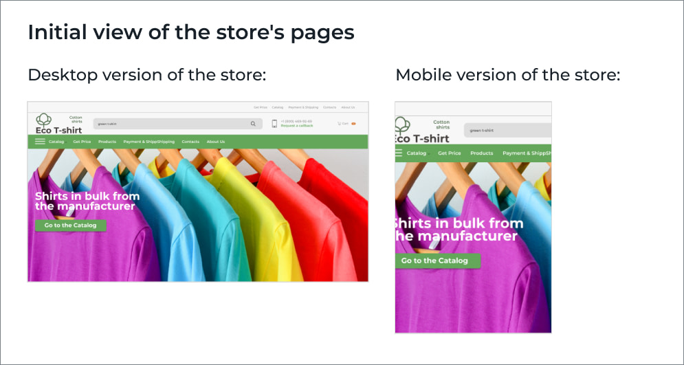
Focus group response
Dmitry:
I opened the page on my smartphone. Unlike the desktop version, many elements are placed unevenly.
Simtech Development experts evaluation
Eugeniya:
Often clients don’t pay attention to the fact that customers use the store on different devices. And sometimes get surprised that there are no universal layouts and mobile versions need a separate design. In our case, the mobile version of the store definitely needs some improvements.
Below is an example of how the mobile version might look:
Lack of consistency and absence of feedback
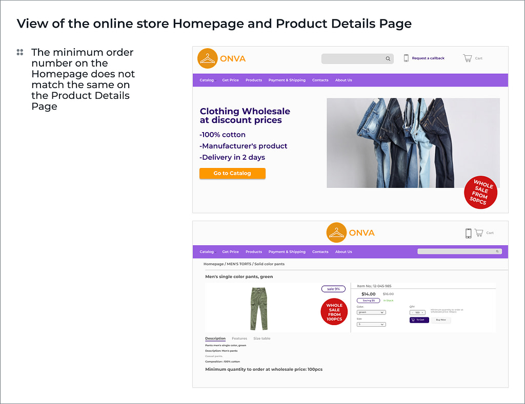
Focus group responses
Eliza:
9% discount, this is weird. On the main page, they say: the minimum wholesale lot is 50 pieces, and on the product card – 100. This is confusing. If I were a buyer, I would go to another store.
Angelina:
I agree with Eliza. And even if you’d like to clarify some information, it would be hard to do. There is no chat for consultation with the manager.
Simtech Development expert evaluation
Katy:
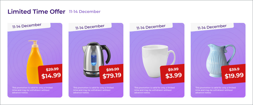
Today, the discount system in an online store is more flexible. You can see different numbers – 16% and 37%. Still, customers perceive round numbers better (5 or 10). They are not used to seeing 9%. On the contrary, the price number usually ends with 9 or 99. And this is normal.
Contradictory information in different sections of the website is an unacceptable thing. The chat that our respondents mentioned would be useful. Its integration is a simple modification that takes about 3 hours. An example after modifications is below.
Technical issues and broken links
What a twist!

Focus group responses
Mike:
I don’t understand, is the site broken? No comments.
Simtech Development expert opinion
Andrew, CTO:
This web resource really fell. The reasons could be different: starting from broken equipment and ending with poorly written code and hacker attacks. Most of these issues can be handled by DevOps engineers and managed hosting services.
All in all, poor website performance is a real disaster for any online business. You lose traffic, and potential customers go to competitors. Among the technical errors, “broken” links, errors 404 (the server cannot find the data according to the request), or 503 (closing the server for technical work or overloading it) are also common.
Katy:
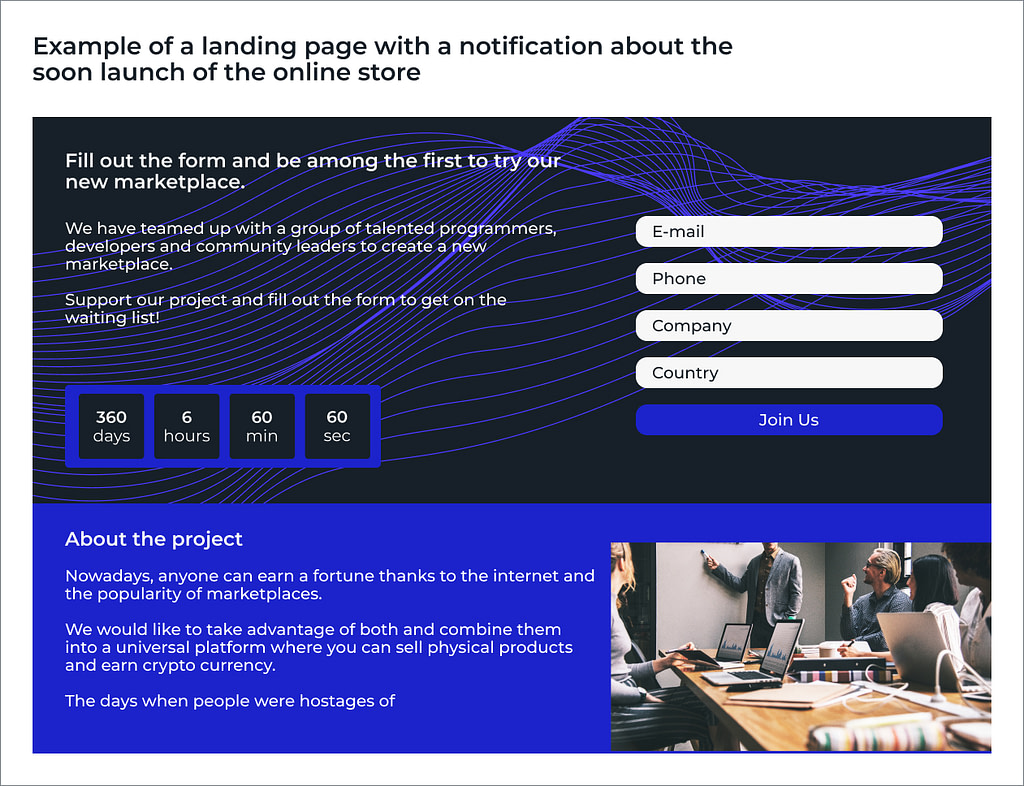
If the project hasn’t launched yet, we, at Simtech Development, offer to replace the “Service is not available” window with an appealing landing page notifying about sales start.
Here you can create a service for booking products, and right after the sales are open, customers who opt for pre-orders will be able to buy them first.
You can add a countdown timer before the launch of the store or a survey for potential buyers. It will take 4-24 hours to create and set up a landing page (depending on the complexity of the content used). But such a page can be a great tool for collecting leads and getting feedback from the target audience even before the project release.
No structure and searching filters
Focus group responses
Claire:
Too many different items are there on the pages, this is definitely disorienting.
Simtech Development experts evaluation
Katy:
There is a lack of structure in this marketplace. Products on the main page should be divided by categories, it is better to create filters, so customers can sort items by name, manufacturer, colors, or discounts. Here is an example:
A counter example: when the website offers convenient shopping and even more
Focus group responses:
Julia:
Great website! A beautiful banner hangs on the main page, saying that users can not only purchase the necessary goods but also donate to the children’s fund. You can round up the purchase amount to a whole number, and the difference will be donated to a charity. The site has bright photos, and smiling faces, and right below the main menu, the amount of funds already transferred is indicated.
I have 2 children, and as a mother, such an initiative captivates me. Most likely, I will return to this online store more than once.
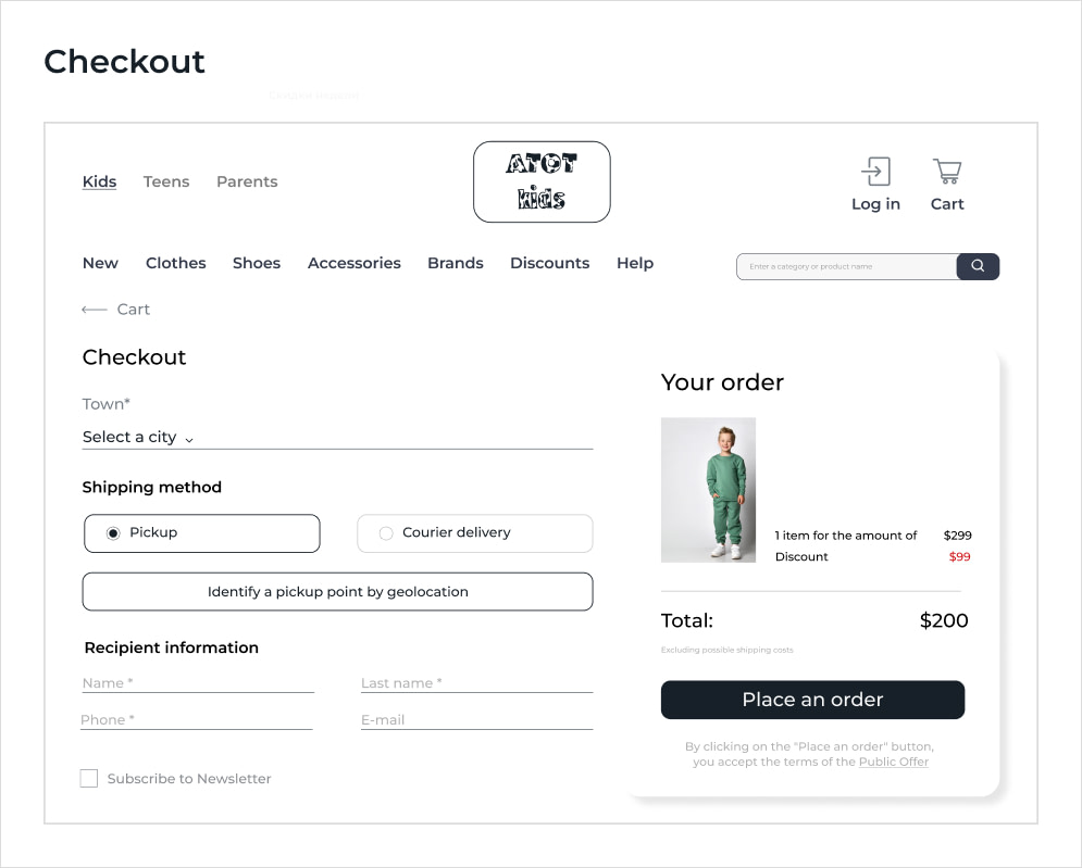
Ildar:
The checkout page looks good: it is intuitive and simple to fill out. There is a geolocation feature that helps find the nearest pickup points. Are you sure this is a bad site?
Simtech Development expert opinion
Olga:
I guess that was a trick question. That is the case where buyers don’t get lost but return. The owner of this online store knows his audience, their behavior, and pains very well. The service with charity was integrated by our developers about a year ago, and after 3 months the client noted positive changes: sales grew by 17%, customer loyalty increased, and the project became really competitive. The store even held several offline themed events and started a small community of regular customers who have become participants in charity events.
Katy:
There are so many other topics that can be used as lead magnets. Focus on sustainable products, women-owned businesses, and even garbage collection.
We worked on a project where store owners selling recycled plastic products arranged a waste collection service on their website! And thus attracted a lot of new customers.
Gamification (wheel of fortune, quests, constructors) will become lead magnets for the youth audience.
Andrew:
I will step aside from the interactive elements and comment on the checkout page. I like it too. First, there is no menu bar here, which is good, otherwise, the buyer may be distracted, and go to another section never returning for purchase.
Second, all the fields to fill out are simple and clear and displayed on one screen (name, address, delivery method, payment method). Practice shows that a multistep checkout with screen changes is one of the main reasons why consumers leave at the final stage of a transaction.
In fact, there are many more nuances on the checkout page. To help clients get it right, we at Simtech Development offer a free UI/UX audit. It will help to identify conversion bottlenecks along the customer journey and work out measures to prevent your website abandonment. We know exactly how to fix bugs and improve your online store so that customers come back again!