The single most important page on the website is the one where the customer decides on product options and adds it to the cart. A good product page design template should offer the freedom of rearranging elements of main content to allow adding something new to it (e.g. scroller, banner, dropdown menu, block with similar products or accessories, tabs’ content, etc.) or having simply a more unique design.
What to pay attention to make a conversion-boosting product page design
Should you choose a unique or a template design, there are always some proven steps to follow when designing your product page.
3 Steps to product page success
- Use high quality product images
- Show clear pricing including the original and the reduced prices
- Create strong calls-to-action
Typical product page layout designs
Depending on what type of information you want to put on the spot, there may be different types of layouts (not existing in their pure form):
- Text Content Driven;
- Visual Content Driven;
- User-Generated-Content (UGC) Driven.
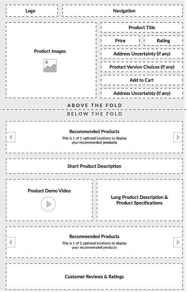
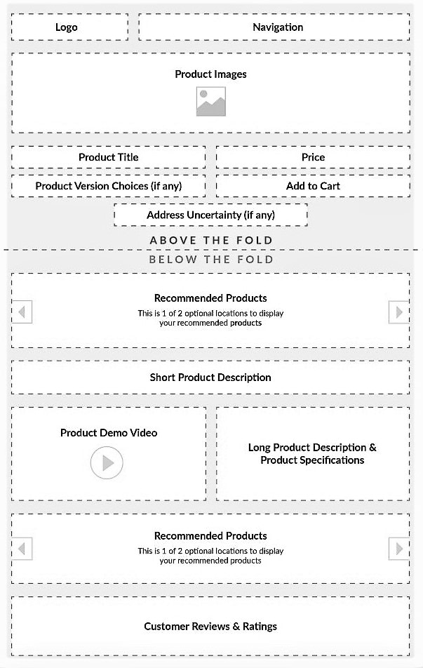
Below are the common templates representing these three main product page layouts:




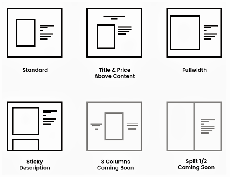
Or you can choose a mix of these main three:


Best product page designs found on our customers’ webpages
- Text Content Driven Product Pages
Text-driven product pages are the choice of websites where covering more keywords is essential to bring traffic. It suits the online stores and marketplaces that would like to stand apart from competitors and gain more traction to their sites with unique text content. To do this, the store owners can add a blog article quick view to the product page or, tell more about the vendor, connect user-generated content (like influencers’ reviews and recommendations in the form of a YouTube video, or an Instagram feed comment).


- Visual Content Driven Product Pages
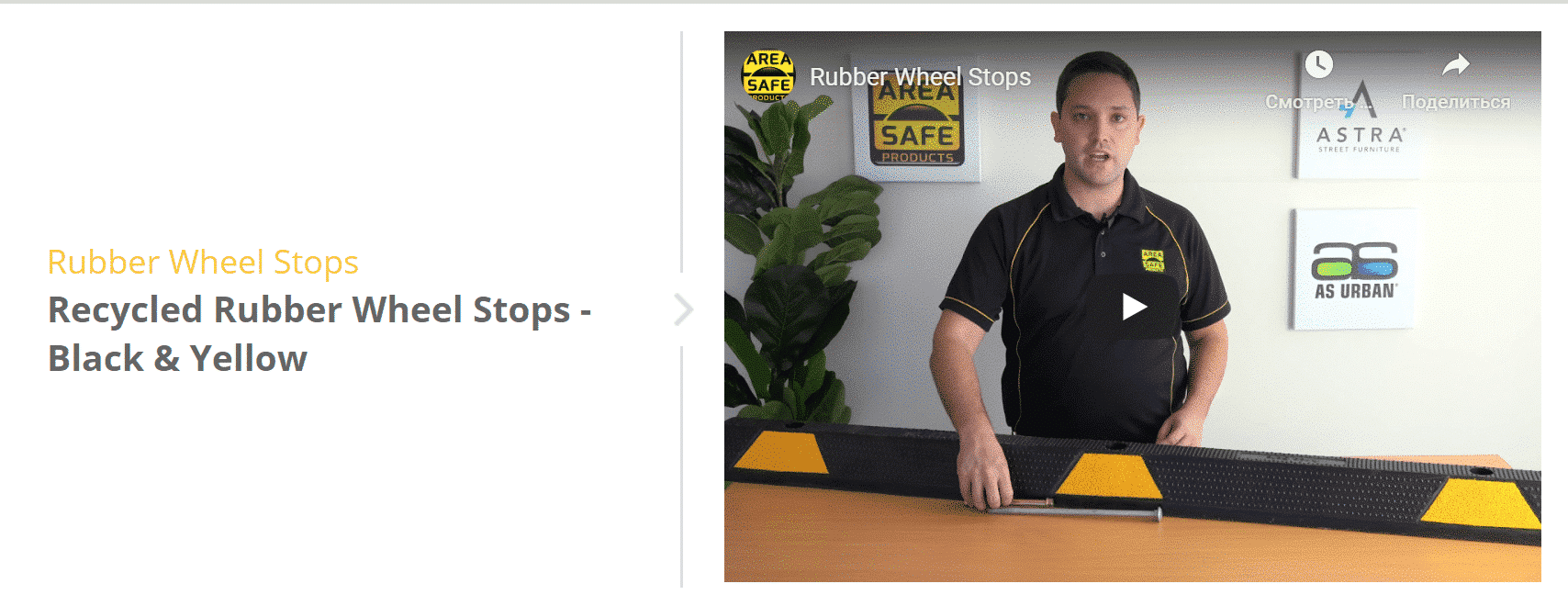
Quality images can sell your product even with a minimalistic product description. However, their quality should be fine: use detailed pictures and show all available sizes and colors. A good practice is to attach videos and 360 deg. round view. Websites with such content reduce customer friction and please the eyes of the modern visual learners. To increase the SEO power of your images, don’t forget to name your pictures using the right keywords.

- Social Proof Driven Product Pages
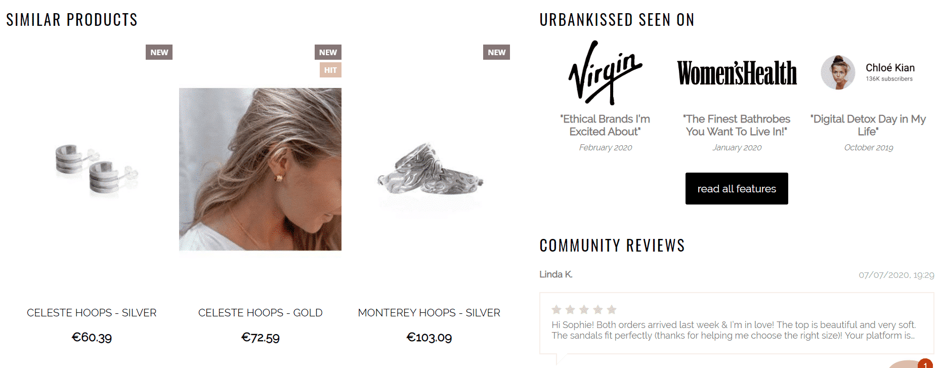
Putting customer ratings and reviews at the heart of your product pages, you add trust to your brand, but not only. Reviews and recommendations are not the only type of social proof. This can be also some awards or acknowledgments. Bringing your brand social proof to the product page creates a positive image of your brand on the most important page of the website!


Self-designing product page layouts in CS-Cart
Customizing your product page
So, you’ve chosen your type of layout and content to emphasize. Let’s figure out how to self-design your product page with CS-Cart.
The default bright theme installed with CS-Cart is the basic theme to design product page layouts. However, with the mobile-first approach, it’s recommended to change it to the responsive theme. By doing so, you avoid constantly updating the theme to improve its consistent look-and-feel on different devices.
The base is the base: it is intentionally un-styled. Taking into account how powerful CS-Cart is, there should be taken much more effort into a true boilerplate with skin installed by default. Skin 1 is what comes out of the box when the CS-Cart license is bought. You can customize the skin by yourself to benefit from all the advantages of shared CSS classes and variables to create a consistent colorization. The responsive layout has no boilerplate and fewer variables. If you are a beginner and try to change something like the base grey border or buttons, this task may seem confusing for you. However, after adding these elements to the top of an extremely well-glossed skin, you will make your customer onboarding easier.
If you need to change the layout of the product page elements in CS-Cart, you have several choices:
Some product page elements (product thumbnail, list of product options, and a promo text) are inside the ‘Main Content’ block. When you need to move around these elements, go to:
Design > Template Editor > YOUR THEME > Templates > Blocks > Product_Templates > Default_template.tpl.
Here, you will see the product page code where you can edit the default template. Note, when editing, make sure you clear the cache using:
Administration > Storage > Clear Cache.
Selection of ready-made solutions to improve the product page design
Even if you opt for manual customization of your product page look-and-feel, some commercial-off-the-shelf solutions can significantly reduce the amount of toile and remove the necessity to reinvent the wheel. We prepared a list of product-page-boosting plugins for CS-Cart:
Although these are the ‘ready-made’ add-ons, they are also customizable. You can send us a request to add features that you think are missing in those plugins.
Closing
If it’s beyond your skills or you don’t have much time to teach yourself scanning the CS-Cart tutorials, hire us to do a custom product detail page layout for you. We’ve been making custom designs of all possible pages including the product, category, and home ones for +14 years. It is much easier when experienced experts develop designs. Moreover, if they apply quality assurance testing and comply with the strict CS-Cart coding rules, re-design becomes safe and efficient for you!
