A product page can be full of text, reviews, image galleries, and all kinds of other information that aims at convincing the user to add a product to cart. It’s really important that your customers can easily access the Add to Cart button when they are about to place an order.
According to the research the sticky Add to Cart button gets more orders by 8% compared to the not sticky one. The test ran for 14 days and recorded about 2,000 conversions (orders) per variation.
The Sticky Product Bar add-on by SimtechDev provides revenue increase by streamlining and simplifying adding products to the cart and checking out.
The add-on allows you to improvise and test different variations of buttons in one sticky CTA bar:
- Add to Cart;
- Add to Wishlist;
- Add to Comparison List;
- Buy Now.
You can customize the content and design of the sticky bar to your taste and needs from the admin panel.


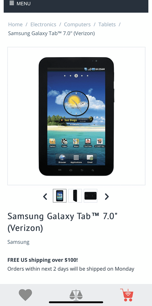
For mobiles and tablets, the buttons are designed as icons, incorporating sticky CTA buttons. They add a sophisticated look and feel to the online store and contribute to better UX.


While you scroll through the product page, the sticky CTA bar is displayed prominently, yet non-intrusively. It becomes invisible as soon as you reach the footer in order not to conceal the content.
Highlights:
- For mobiles, tablets, and desktops;
- Ability to change the color of the buttons and texts in Admin panel;
- Ability to change CTA texts and upload your icons as SVG file;
- Ability to turn on/off certain buttons at will.
The add-on is compatible with CS-Cart and Multi-Vendor 4.11 and above and is ready to purchase from the marketplace.

