Here is a dilemma: you are launching a new project from scratch and want to keep to the budget. First impressions count and you don’t want to get a bad reaction from your visitors. Your freshly-baked online store is lacking design to set you apart. Themes can help you there.
Any design is not only about beautiful colors and fonts. A savvy placement of the key elements throughout the site helps to lead a visitor from the first touchpoint to a purchase. This path should be intuitive and simple for users to follow without distraction. Expert assistance costs much.
How to raise the funds for a customized design if you aren’t even released and don’t have real revenue?
The solution is already there. Design themes are those ready-to-use solutions that soak up the best features and practices of color matching and grid-based arrangement of every website element already tailored to their use in a specific domain.
All you need is to select the one fitting the most your needs and business area.
Choose a unique design for CS-Cart or Multi-Vendor
Here is the top of the default themes of your choice.
1. Airy Mobile Theme
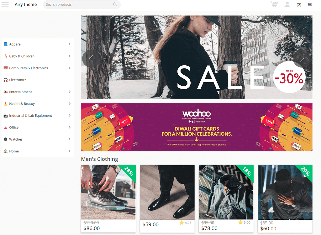
Invite your customers to taste a new experience in shopping online. This theme allows a seamless operation independently on the device: desktop, tablet, or mobile. Mobile users will estimate how fast your website is loaded and how easy to surf it with a two-column product feed. It suits the e-malls with vast product inventories: apparel, food, or tourism.
A large number of awesome functionalities designed to keep an ongoing buying process on your store includes:
- Amazon style multi-layered menu,
- Easy navigation,
- Product image zoom and rollover,
- Count-down timer,
- Persistent cart.
This solution will work better for marketplaces than for online stores. Its specific configuration is tailored for large inventories where multiple items of various vendors can be sold.
2. Vanilla Theme
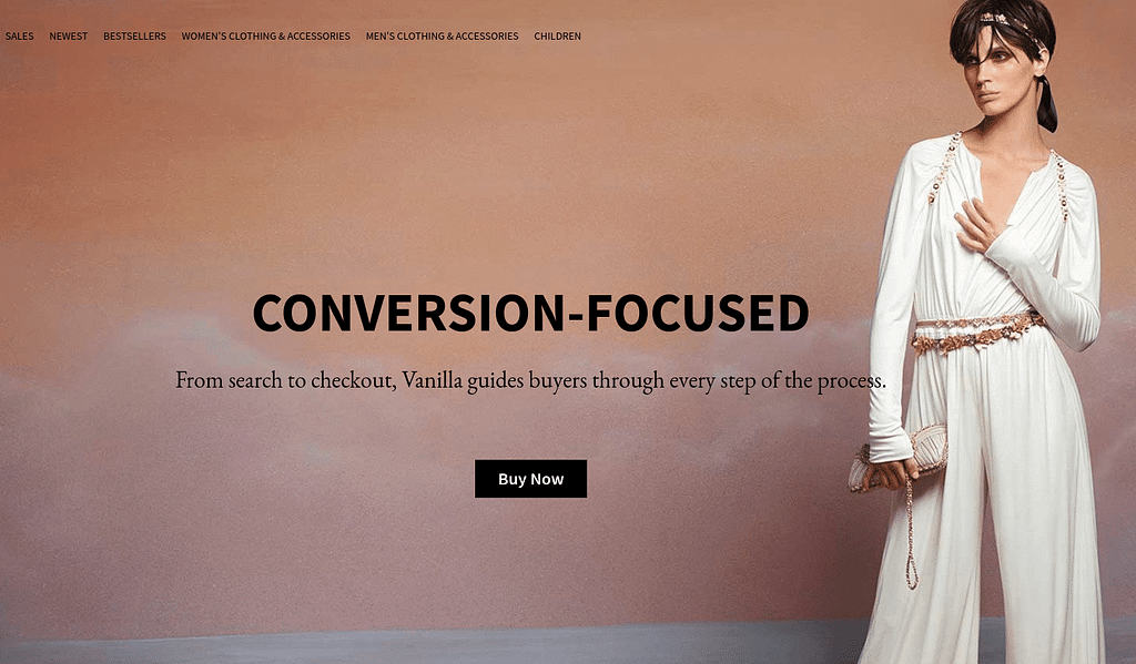
It is a perfect solution for fashion-oriented businesses: garments, jewelry, cosmetics, and similar areas. A clean and stylish template with soft tints attracts avid shoppers without sidetracking. The theme is mobile-friendly and perfectly renders on any screen. It is completed by lots of extensions:
- Social buttons for easy sharing across multiple social channels,
- Full-width banner to catch an eye and prompt to buy.
Having the main focus on fine pictures, Vanilla is the great choice for brand representation and mostly oriented for CS-Cart-based stores.
3. Rome Theme Front Pack
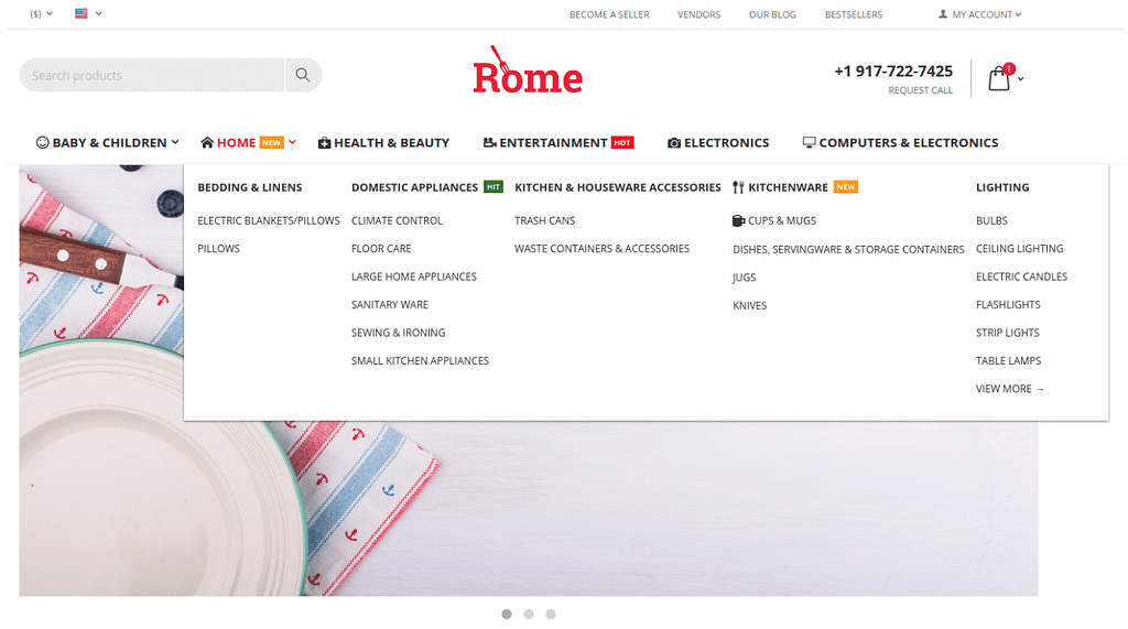
The Rome Theme Front Pack is mobile-responsive and adapted to a wide range of products from tableware to sporting goods. The pack goes together with 10 add-ons and a sea of rich functionalities:
- Mega-menu,
- Back-to-top button,
- Animation,
- Wishlist popup,
- “New”, “Hit”, “Cyber Monday”, ”Sale” labels,
- Product likes.
This pack was specifically designed to match the Multi-Vendor business model.
4. Urban Shift Theme Front Pack
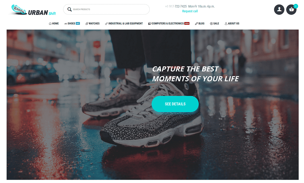

The theme suits any business where contemporary urban culture matters: clothing and sports goods and equipment, homeware, and many more. A packaged solution with 11 extra add-ons provides a smart design. Its impressive list of features includes:
- A mega drop-down menu like on Amazon,
- Hamburger and sticky menu,
- Parallax background,
- Animation effects, and
- One-page checkout.
Show me more functionality invites visitors to enrich their shopping experience and fill their basket with extra goods.
This pack has a look-and-feel of a landing page and serves as a business card for an individual brand.
5. Asia Theme Front Pack
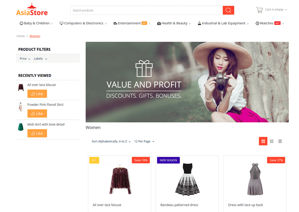

The Asia Theme Front Pack is designed with the eastern minimalism and refined taste and featured with an Amazon-style look, animation effects, wishlist pop-up, sticky menu, product labels, and 5 more enhanced solutions to warm up your visitor and cook a new hot deal in quick time. It looks perfect in whatever aspect: desktop, tablet, or mobile, and whatever environment: food, apparel, or gadgets. The Asia Theme Front Pack suits better marketplaces.
Cases: Urban Shift Theme Front Pack
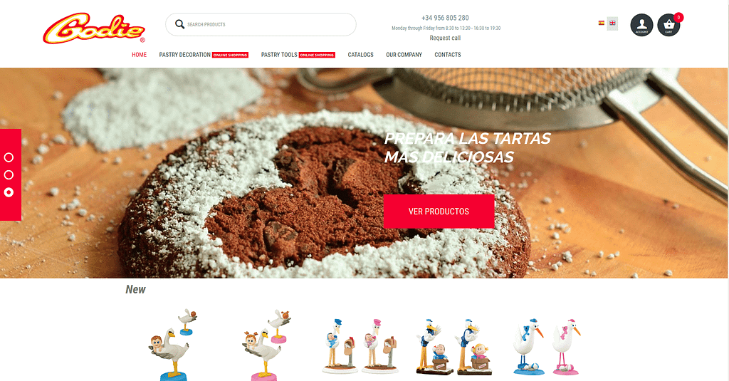

A default theme is not a limit to your imagination. The design pack is more like a framework. You can expand or reduce functionality if desired.
Take a real-life example of a modified Urban Shift Theme Front Pack. The below image may give you an idea of what can be changed and how:
Homepage of a customized store made with the Urban Shift Theme Front Pack
The project belongs to a Spanish company offering several lines of decorations and tooling made of PVC and figurines of sugar, wafer, and pastillage. We added the Cart and Account icons being constant reminders to a user of an order left in the cart and a sign-in necessity. Zoom is now activated upon hovering over a product to help the user to focus on the selected item. GDPR position and tax details underwent modifications to serve the customer business need better.
Cases: Asia Theme Front Pack
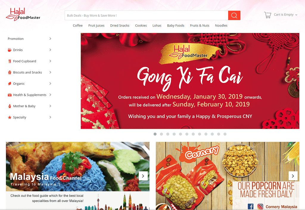

One more example shows how the Asia Theme Front Pack can look like with minor modifications:
Homepage of halalfoodmaster.com marketplace made with the Asia Theme Front Pack
By fusing the inherent theme features with the bright ideas suggested by the client, a more effective and appealing e-shop can be obtained.
Need consultation?
You can choose a theme matching your business goals, tweak it to your needs and create your own success story. And we can stand by you and help in customizing a default theme!
