AreaSafe Project
Industry
- Equipment
- Safety and Security
Services
- Code Review
- Custom Development
- Design Integration
- Support Services
- System Integration
Location
Challenge
Implementing the Project
New Storefront
We found out that the client modified the code to block automatic script displacement down the page. This modification decreased page loading time.
We brought the code back to original view.The newly installed Apollo storefront with the compatible third-party theme has been released and is ready for use. Although the storefront awaits finishing touches to be made, the client is happy with the result and keeps on cooperating with us on other matters.

Development of additional functionality and integration with third-party services
The task was to create a new checkout pop-up to increase the conversion rate. It should have to be a lightbox popup checkout triggered from the cart success popup after the user clicks Checkout.
The Shipping address section would also have to be reworked to remove the existing fields (address and postcode) and rename as:
City > Delivery Suburb
State > Delivery State


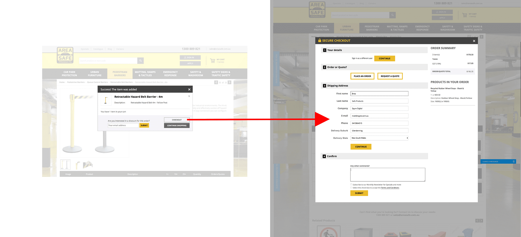
The request implied redefining the whole checkout process. Our CTO, Sergei Minyukevich, personally got in touch with Matt and confessed: ‘My professional recommendation is not to proceed with this customization. The current request would require serious customization to move checkout into a pop-up. Additionally, even such a customization would be designed as an add-on it would have minimal compatibility with future upgrades. Moreover, I failed to find any professional article proved conversion rate by having a popup in the checkout’.
The client agreed with our opinion and didn’t undertake the modification.
We estimate our reputation and our goal is the fruitful and long-term cooperation. We do not sell a modification for the only reason to sell and then forget not caring about how it will serve the client’s needs. That is why we always ask about the purpose of any modification to advise a better solution to the client sometimes implying canceling the work in full.
Customization
One more request implied the creation of a floating button on the left side of the browser which included a pull-out form. The goal was to promote the price match guarantee and allow customers to submit the form if they have found a cheaper price elsewhere.
We integrated the look-and-feel of the floating button with pull-out form in accordance with the mockup provided by the client.
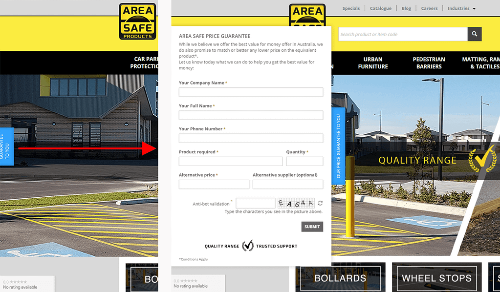

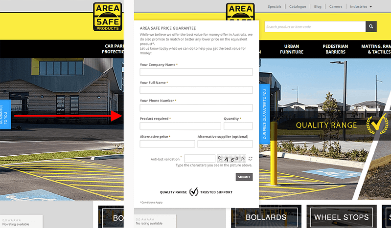
When the button is clicked, the form slides out. The form is closed automatically after the customer submits it or clicks away from the form. This form increased the user-friendliness and simplified the process of sharing the required details. Matt is happy with the result as customers love this button.
Results
Whilst sourcing a web developer, I wanted to make sure I would be working with someone who had proven expertise in CS-Cart. Simtech Development was an obvious choice, and I've since been working with them successfully for the past 2 years. Unlike many other agencies I've outsourced to, Simtech understands the importance of transparency and management workflow, offering a higher standard of quality assurance and a friendly, responsive team.
