Babies deserve the best we can give

Malishok is an online store based in Russia. The store specializes on products for children - diapers, baby food, baby strollers, child car seats, baby clothing, clothes for pregnant women and other useful goods. The design project of this store was based on our CS-Cart theme and adapted to the brand style.
Industries
Baby Store
Services
Location
Challenge
To create user-friendly and engaging design appropriate for selling goods for newborns and their mums and dads.
Quick start
Background
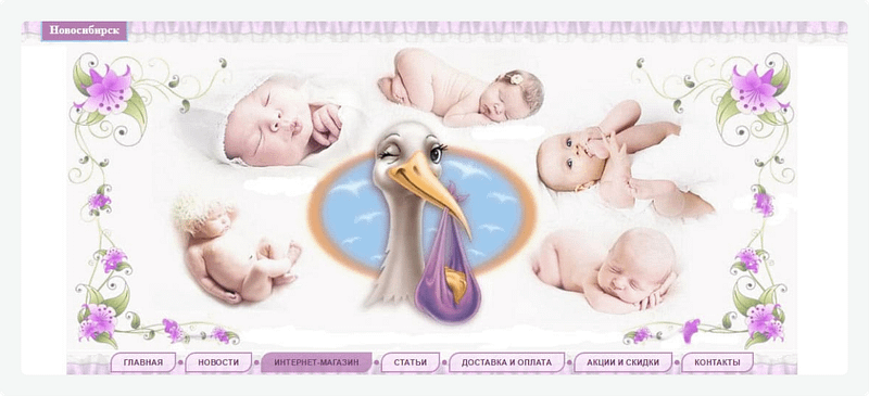
Our client has an online store on another CMS. You can see it on the screenshot below. According to the client’s wish it was decided to take some design elements, logo from the previous website and create new store on its basis. The new CS-Cart store did not contain any template, so we designed the store from scratch.
Analytics and Solution
The new CS-Cart store was clean and the client’s budget was limited, so our task was to change the design within a small budget. We have analyzed the existing design and decided to take our ready-to-use theme Cute Baby Toys as a basis for the future design. According to our client’s wishes we changed the color palette and created new UI elements.
Project steps:
Quick start
Using Cute Baby Toys
The client chose this theme for the online store because the color pallette was similar to his old site and perfectly suit his niche. The key feature of the Cute Baby Toys Theme is that it is secure and safe in servicing because it does not contain heavy and complex functionality. It has several advantages: easy installation, easy updating, compatibility with all third-party add-ons, quick page loading and other features that keep store safe and nice.

Implementing the Project
Brand Colors & Typography
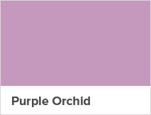
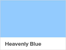
The pallette of the online store Malishok.org includes 2 main colors: Purple orchid and Heavenly blue. Purple orchid creates the association to the brand, while accent color provides additional depth. The combination of these two colors creates gentle view and recalls mother care.




Subtle drawings of rainbows, animals, balloons are similar to children’s pencil drawings and set a unique style.



We used incredibly readable and simple font Roboto regular and Roboto bold. The font Roboto underlines and does not distract customers from shopping.






Design integration
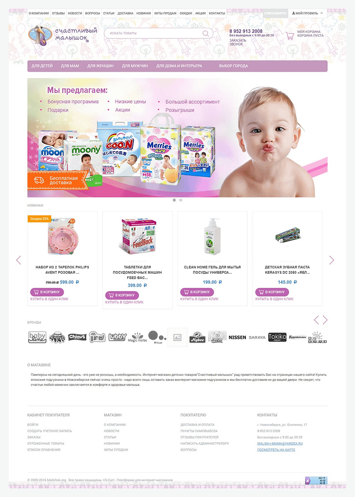
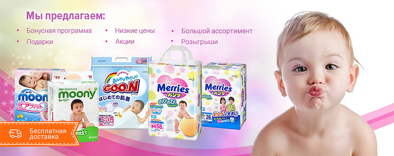
For the home page we changed the main banner, making it more attractive. The previous banner was old-fashioned and uninformative, so we decided to show products and highlight free shipping, discount programs, gifts and other important information in the picture. The photo of a nice baby attracts customers’ attention.


According to our client’s wish we changed the standard pattern of the theme in the header. Subtle drawings of rainbows, animals, balloons are similar to children’s pencil drawings and set a unique style.
Previous store
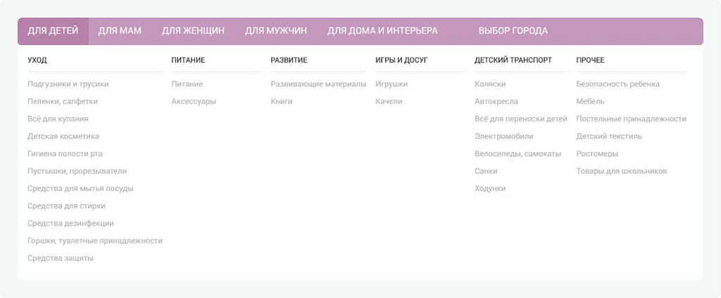
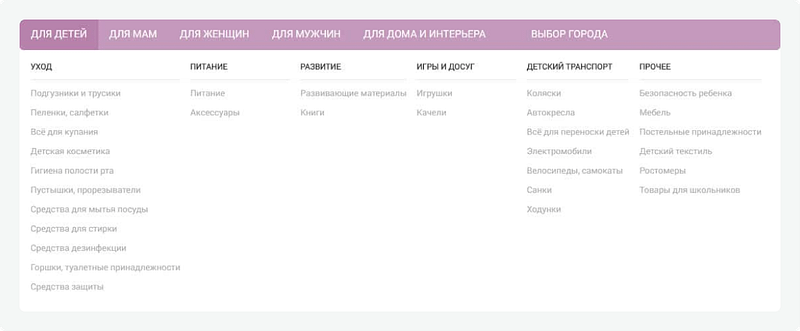
The previous menu was unattractive and unhandy for customers, with megamenu we solved the problem of navigation. Its simple design with a minimal look do not confuse customers and focus attention on the product categories.
The old footer was cut down and did not benefit. We used the standard CS-Cart footer. This well-planned and organized footer will help shoppers to find all the necessary information.



Standart theme


New design




UI Elements
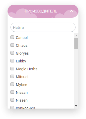
New buttons for the filter with nice clouds which highlight elegant style of the online store.
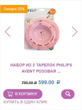
Big and purple “Add to Cart” buttons are more contrast in comparison with other elements which make it stand out from the crowd and attract more clicks.




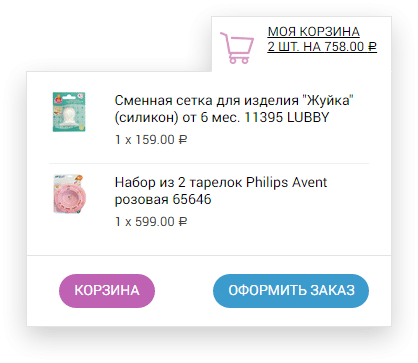
The mini cart is made according to the common design of the store and helps customers to preview the contents of the cart on the main page.
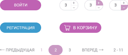
All UI Elements have a unique style with rounded edges. We tried to avoid sharp and square elements to note that the store sells goods for babies and their moms.




Results
A full-fledged online store with minimal investment.
