Even a perfect-looking online store may fail with sales if there is no navigation in place. For large stores, it is even more important as buyers will bounce to explore your site looking for a specific item and not finding it due to a confusing site structure. You need to build a wise navigation on your site to drive visitors, improve your SEO, and get more sales. Here we will talk about ways to improve your eCommerce site navigation to provide more value to your customers and eventually get more sales on it.
1 Maintain a balance in the number of products and categories
Try not to overcomplicate the navigation bar with too many categories. That’s what the dropdown feature is for. The dropdown feature is a great way to indicate that there’s more to see without cluttering your homepage with too much text, overwhelming your customers.
If you show your visitors too many options, they will try to analyze the pros and cons and eventually will get tired quickly. Customers will be immersed in details, but won’t be able to make a choice and leave. On the other hand, having two or three items within one category will make visitors think that the store is under construction.
Try to maintain a balance in the structure and design of the product catalog. According to our experience, the best option is 5 to 6 categories. This number can be increased to 10, but more categories will make visitors feel overwhelmed by the abundance of information.
Don’t forget about subcategories. For example, the large category “Dresses” can be subdivided by:
- Purpose: Casual, Club & Night Out, Cocktail, Formal, Work, Wedding
- Style: Fit & Flare, Fitted, Gown, Maxi, Straight
- Length: Mini, Above the Knee, Midi, Maxi, Floor Length
Think about including some categories as filters if their number is too big.
You can add more visualisation to your categories to make it easy to find the right category from the start. Eye-catching images for categories create a better customer experience and encourage customers to move deeper into the site. With the Category Gallery, it is all possible.
2 Use multilevel menu for large catalogs
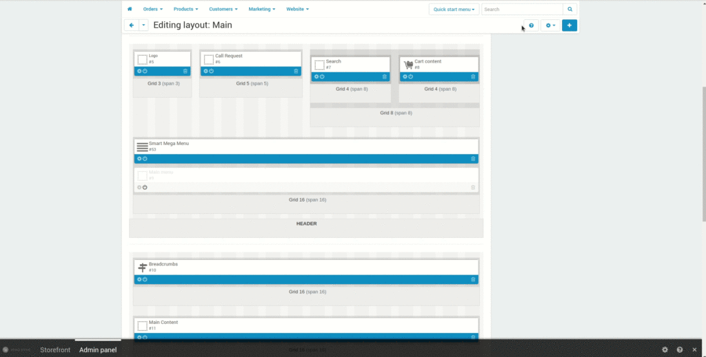
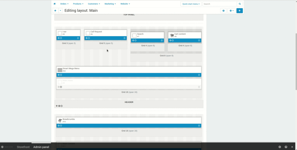
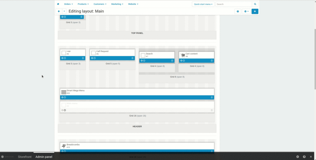
If there are a lot of categories and subcategories, it will take a long time for a buyer to reach the desired product. In this case, a multilevel menu will help: you can evaluate the entire assortment of the store at a glance and move from one category to another in a couple of clicks. The Smart Mega Menu add-on improves top eCommerce navigation with its well-designed dropdown multi level menu.
With Smart Mega Menu, you get:
- 3-level dropdown menu
- Categories and subcategories loaded up instantly
- Mega menu supporting icons, labels, and banners
- Right-to-left/left-to-right layout direction
- No delay in activating submenus
3 Make it visible
Place the menu on top or on the left. These are the most familiar places for customers.
Use various ways to draw attention to the menu. Play with menu positioning and representation. There are 5 templates available in the Smart Mega Menu add-on for different positioning of categories allowing you to choose the one which is more convenient for your site. These templates turn your menu into a compact list to show more content on a page.
- Horizontal list with scrolling – to post more information while scrolling

- Horizontal list with collapsing – to display content in a compact manner and open additional items with the More ▼ button
- Dropdown list by content width – multi-level menu and the Hamburger icon for better menu representation on mobile devices
- Dropdown list by window width – to use all the width available and place everything needed
- Dropdown list in popup – to have the menu appeared as a popup

Dropdown menus are good for navigation. They declutter the sidebar, place the most important information in the most visible place above the fold, improve content layout and design.
With Smart Mega Menu, you can also add icons, labels, and banners to categories and subcategories to focus customers’ attention on the bestselling options.
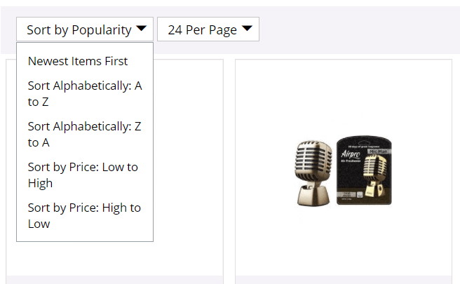
4 Set up sorting
Products should be ordered according to some principle. Sorting will help to arrange products for buyers in the preferred order. The method depends on the goal you want to achieve:
- Entice buyers with a low cost. Show the lowest-priced products in the beginning – buyers will definitely pay attention to the best offer.
- Create a “price anchor” and sell expensive goods. Set the price from high to low by default. The first price is perceived as the base price. All goods following the anchor will seem like a great deal. For example, if you sell T-shirts and first show the customer a product for USD 200, a T-shirt for USD 100 will seem a great deal for customers.
- Build customer trust through reviews. Start with products with a lot of positive reviews. When sorting within categories, first show the products that customers like.
- Sort alphabetically. If you are an online record store and would like it to sort by the artist’s last name, then it is more rational to offer alphabetical sorting.
5 Connect filters
Filters help you find the right product by selecting the appropriate parameters. They can be:
- price
- the size
- discount
- color
- product composition
- ingredients (when it comes to food delivery)
It is better to create simple filters with a few points. Visitors will be able to quickly adjust parameters, and long lists which make them feel frustrated. To visually distract users, apply different colors to controls.
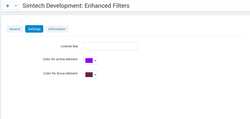
The Enhanced Filters add-on can help you in smart filtering of products in your online store. Enhanced Filters has:
- Ability to hide inactive filters to declutter the interface
- Ability to convert regular filters into switches for a more comfortable fine-tuning of the query
- Switches ‘In Stock’, ‘Free Shipping’ and ‘Rating 4+’ to facilitate the decision making process
- Toggle Switches for better UX/UI experience on your site
- Filters shown as sliding menu in the mobile version – no inch of space is lost
- Multilevel structure to make filtering more granulated
- Tag Style Filter Display to spotlight what is really important and guide the user looking for the best fit to his/her need
- Components Coloring to arrange proper accents
- Filter description helping customers to get more information about the filter
- Filter priority allowing buyers to focus on the main things without diverting attention
6 Ease your visitors’ search
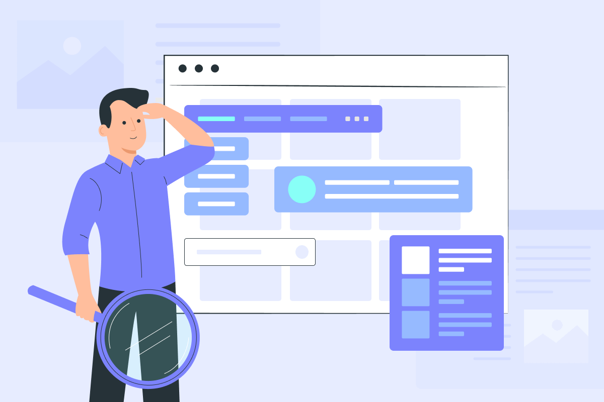
Sometimes visitors don’t just browse products, but are looking for something specific. In this case, the search bar will come in handy. Search is one of the more effective elements of efficient eCommerce site navigation. You need to make a prominent search bar on your homepage for your customers to use to deserve their loyalty.
You can ease your visitors’ search with an autocomplete function, which helps customers fulfill their search queries, saves them time, and ensures that an accurate search result will be returned in case they are unsure of how to spell the name of a certain product correctly.
The best place for your search bar is at the top of the site, on the left or right. We can connect a smart search from Searchanise to your CS-Cart store. The add-on allows you to find products, even with a typo, and also offers similar products directly from the search on the site, helping to avoid zero results.
7 Rely on the best design practices
There are typically two types of navigation designs you will find on eCommerce sites – site navigation at the top of the page placed directly under the search bar and company logo, and site navigation on the side of the page. When it comes to responsive design, some eCommerce platforms resort to the hamburger menu, which is most recognized by the three horizontal lines. Users familiar with the hamburger’s functionality know it’s designed to open and reveal a number of hidden menu options in an effort to make the landing page easier to read and less chaotic on mobile devices.
To conclude
Navigation is the guiding light that leads a visitor through your entire site. If it is dark, your prospect won’t find what he/she needs and never turn into a thankful buyer who will be eager to come back to you again. To spotlight the journey of a visitor, consider connecting these useful solutions to your CS-Cart/Multi-Vendor Store:
- Smart Mega Menu for better organized menu with banners and tags
- Enhanced Filters to make filters handy, colorful and powerful
- Hamburger Menu to have simple drop-down menus saving space on mobile devices
- Searchanise to avoid zero results in search
- Category Gallery to turn categories into images
And if you need more help in customizing your store for better on-site navigation, connect with our developers.