In the world of online retail, the checkout process stands as a pivotal moment where transactions either flourish or falter. As eCommerce continues to thrive, mastering the art of a frictionless and intuitive checkout experience has never been more crucial. From optimizing form fields to implementing secure payment gateways, the best practices for eCommerce checkout encompass a myriad of strategic considerations aimed at enhancing user satisfaction and driving conversions. Join us as we delve into the essential principles and innovative strategies that define a successful eCommerce checkout, empowering businesses to elevate customer engagement and maximize sales
What is eCommerce checkout?
eCommerce checkout is the process through which a customer completes a purchase on an online store. It involves entering shipping and billing information, selecting a payment method, and confirming the order.
Checkout Types
There are different types of eCommerce checkout processes, including single-page checkout, multi-page checkout on one side, and account-based and guest checkout on the other side. Each has its own advantages and disadvantages.
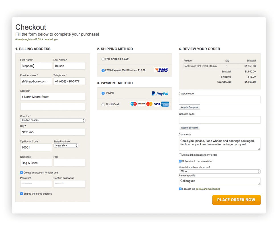
Single-page checkout
Pros:
-
- Simplified process: Customers can complete the entire checkout process on one page, reducing the steps required to finalize the purchase.
- Faster completion: With all the necessary fields on a single page, customers can quickly enter their information and complete the purchase.
- Reduced cart abandonment: The streamlined process can help minimize cart abandonment as customers find it easier to complete the purchase.
Cons:
-
- Information overload: Having all the fields on one page can be overwhelming for some customers, especially if there are many details to enter
- Slower loading times: If the single page contains a lot of elements, it may take longer to load, potentially leading to a poor user experience.
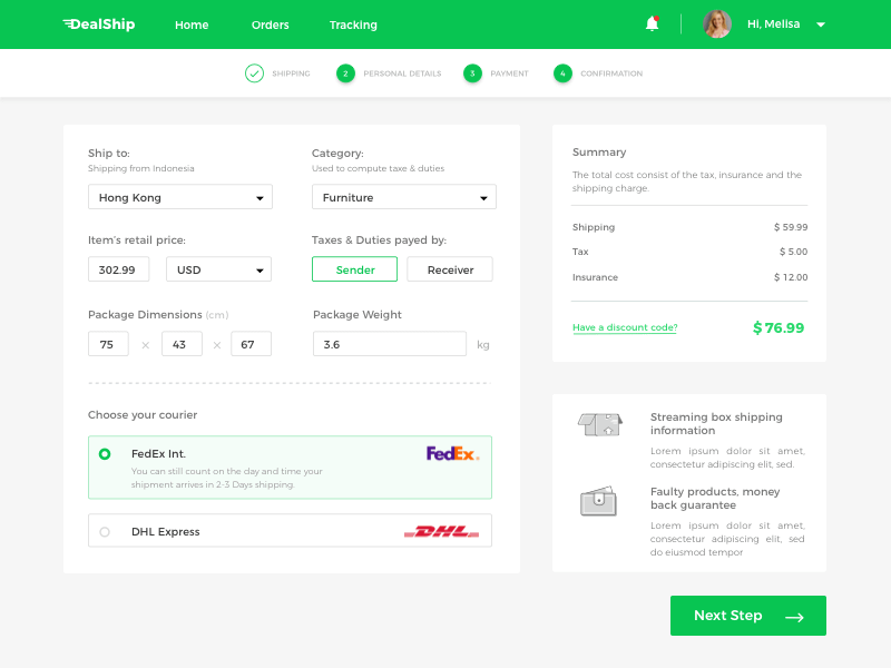
Multiple-page checkout
Pros:
-
- Step-by-step process: Breaking the checkout process into multiple pages can make it more manageable for customers, guiding them through each step.
- Clear progress indicators: Customers can see where they are in the checkout process, providing a sense of control and understanding of the steps remaining.
- More flexible design: Each page can focus on specific details, making it easier to design a user-friendly and visually appealing checkout process.
Cons:
-
- Increased steps: Having multiple pages can potentially increase the time and effort required to complete the purchase, leading to higher abandonment rates.
- Higher complexity: Some customers may find the multi-page process confusing or cumbersome, especially if they have to navigate back and forth between pages.
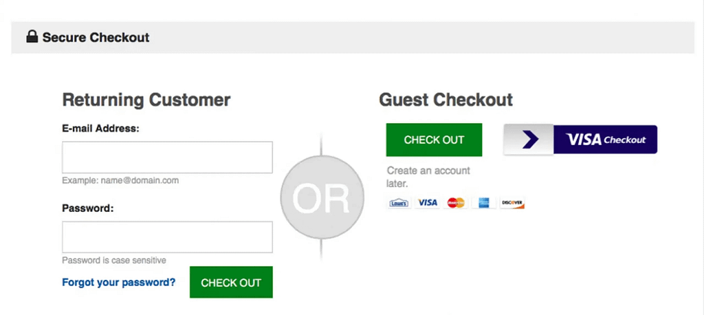
Guest checkout
Pros:
-
- Faster checkout: Customers can complete their purchase without having to create an account, saving time and effort.
- Reduced friction: For first-time customers or those looking for a quick purchase, guest checkout eliminates the need to create an account, reducing barriers to completing the purchase.
- Enhanced privacy: Some customers prefer not to create an account, and guest checkout allows them to make a purchase without sharing personal information.
Cons:
-
- Missed opportunities for customer retention: Without creating an account, businesses may miss the chance to capture customer data for future marketing and personalized experiences.
- Limited access to order history: Customers using guest checkout may not have access to their order history or tracking information, potentially leading to a less personalized experience.
The best choice among eCommerce checkout solutions depends on the specific needs and preferences of the eCommerce business and its customers. Many businesses opt for a balance, offering multiple options to cater to different customer preferences and needs.
Checkout and conversion rates
The eCommerce checkout page indeed influences the conversion rate significantly. Here’s how it can impact conversion:
-
- Ease of Use: A complex or confusing checkout process can deter a customer and lead to lost sales. Simplicity in steps, an intuitive interface, and minimal form fields contribute to increased conversion.
-
- Security and Trust: Having security certificates, clear payment options, customer data protection, and reviews build trust and reassure customers of a safe transaction. Read more: How to Build Trust in an eCommerce Store?
-
- Visibility of Additional Costs: Clearly displaying all extra costs (shipping, taxes, fees, etc.) on the checkout page helps avoid negative surprises for the customer and encourages them to complete the purchase.
-
- Mobile Optimization: Considering the growing number of mobile purchases, it’s crucial for the checkout page to be optimized for mobile devices, adaptive, and easily accessible for users on various devices.
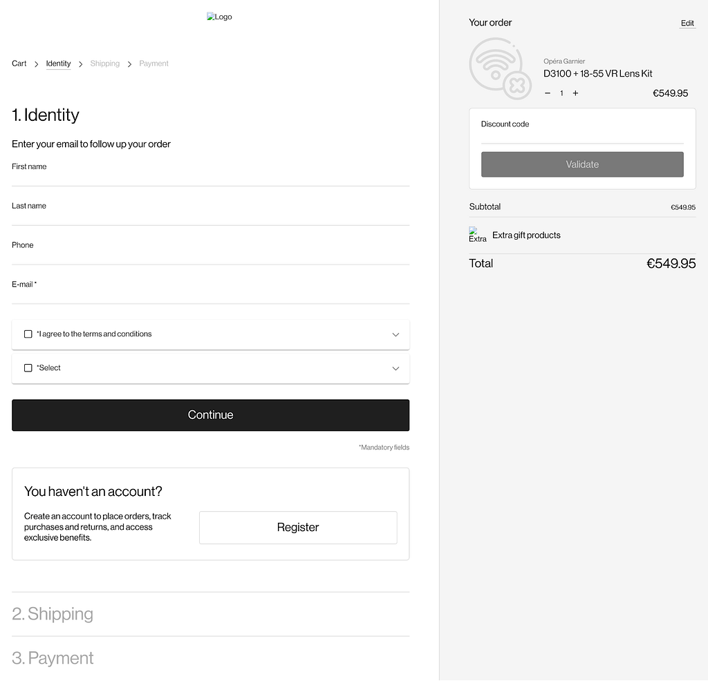
Let’s have a look at one of our cases – a well-known French platform that showcases museum products. Their success was partly due to integrated payment processing, which provided a faster, more reliable checkout experience across devices. The successful integration of a new modern checkout using PWA technology has revolutionized the client experience. By leveraging client layouts, our team of developers embraced a cutting-edge checkout process, enhancing user interaction and streamlining transactions. This resulted in improved performance, increased user engagement, and ultimately better mobile optimization of the website.
Read more:
Components of a good checkout
What to indicate on the checkout page? On a typical eCommerce checkout page, you will find the following information and elements:
-
- Order Summary: This includes a breakdown of the items being purchased, their prices, and any applicable taxes or shipping fees.
- Shipping Information: Customers are prompted to enter their shipping address, and in some cases, they may have the option to ship to a different address.
- Billing Information: Customers are required to enter their payment details, such as credit card information or other payment methods.
- Payment Options: Customers are presented with various payment options, such as credit/debit card, PayPal, Apple Pay, Google Pay, etc.
- Order Review: A summary of the entire order is presented for the customer to review before finalizing the purchase.
- Promotional Code or Discount Box: Customers can enter any promotional codes or discounts they have to apply to their purchase.
- Terms and Conditions: Customers may be prompted to agree to the store’s terms and conditions, privacy policy, and return policy.
- Order Confirmation: After the purchase is completed, a confirmation message or email is typically sent to the customer, providing details of the order and the transaction.
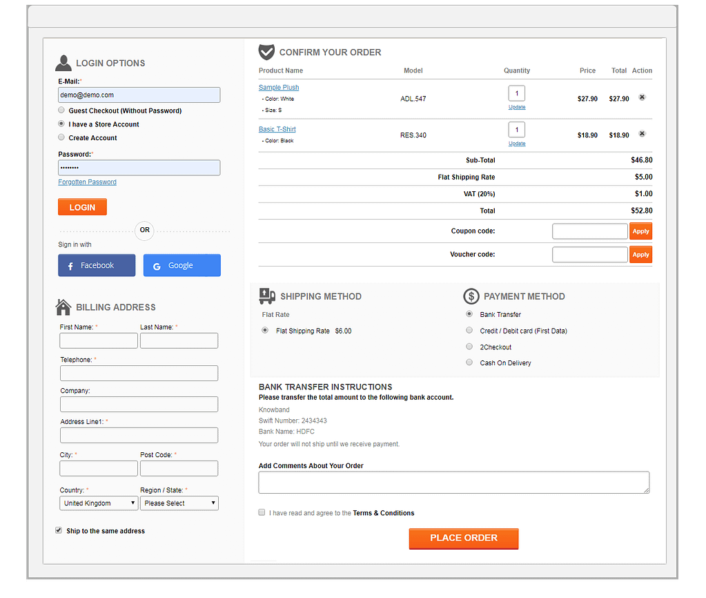
These elements are crucial for a smooth and transparent checkout process, ensuring that customers have all the necessary information and options to complete their purchase.
There may be cases when some components require their modification to tailor the platform for the business needs. That was the case of boxed.gr, our client. We reworked the checkout process to align with local laws. By replacing ‘I have a different billing address’ with ‘I have a different shipping address,’ the user experience was tailored with local requirements, recognizing that each client in the country possesses only one billing address. This seemingly simple adjustment presented complex implications, necessitating meticulous adaptation of delivery calculation functionality. Through careful planning and execution, our team successfully navigated these challenges, enhancing user convenience and operational efficiency.

eCommerce Checkout integration
Integrating the checkout process with Customer Relationship Management (CRM) and other systems (like CMSs, payment gateways, customer support systems, etc.) can bring several benefits to an eCommerce business:
-
- Streamlined Customer Data: By integrating the checkout with CRM, you can ensure that customer information captured during the checkout process seamlessly flows into your CRM system. This helps in maintaining accurate and up-to-date customer records.
-
- Personalized Marketing: With data from the checkout integrated into your CRM, you can personalize marketing campaigns based on customers’ purchase history, preferences, and behavior.
-
- Enhanced Customer Service: Integration with CRM allows customer service representatives to access order information and customer details easily, enabling them to provide better and more personalized support.
-
- Inventory Management: Integration with inventory management systems ensures that stock levels are updated in real-time as orders are placed, preventing overselling or stockouts.
-
- Analytics and Reporting: By combining checkout data with CRM and other systems, you can gain deeper insights into customer behavior, sales trends, and overall business performance.
Enhancing checkout with a CRM help effectively manage customer data, provide better service, and make informed decisions based on data insights.
How to enhance checkout security?
Checkout security in eCommerce is a critical aspect for safeguarding the confidentiality and security of customers. Here are some key security measures to consider when developing and maintaining the security of the checkout page:
-
- Data Encryption: Use SSL encryption to protect data transmitted between the user’s browser and the server during checkout.
-
- Payment Data Protection: Never store customers’ payment data on the server. Use payment gateways with proper PCI DSS certification for processing payments.
-
- Two-Factor Authentication: Implement two-factor authentication mechanisms to enhance security during login and checkout.
-
- Monitoring Suspicious Activity: Implement monitoring systems to detect and prevent fraudulent activity on the checkout page.
-
- Security Updates: Regularly update software and libraries to prevent security vulnerabilities.
-
- Privacy Policy: Provide a clear and concise privacy policy explaining what data is collected and how it is used during the checkout process.
-
- Ensuring robust security measures in the checkout process helps build trust with customers and protects sensitive information from potential threats.
Overall, ensuring checkout security is a collaborative effort involving various teams such as development team (secure coding practices, encryption protocols, and integrating secure payment gateways to safeguard customer data during the checkout process), management (responsible for setting the overall security policies), compliance team (ensures that the checkout process adheres to industry standards and regulations related to data security and privacy, such as PCI DSS compliance for handling payment card information) to protect customer information and maintain trust in the eCommerce platform. If third-party vendors are involved in providing payment processing or other services related to the checkout process, they share responsibility for maintaining security standards and protecting customer data.
How to measure checkout page efficiency?
To measure the effectiveness of a checkout page in eCommerce, you can utilize various KPIs. Here are some ways to measure checkout page effectiveness:
-
- Conversion Rate: Monitor the conversion rate of the checkout page to see how many visitors complete a purchase compared to the total number of visitors who initiated the checkout process.
-
- Cart Abandonment Rate: Track the percentage of users who add items to their cart but leave the site without completing the purchase. A high abandonment rate may indicate issues with the checkout process.
-
- Average Order Value (AOV): Analyze the average order value for completed transactions on the checkout page. Increasing the AOV can indicate that customers are successfully proceeding through the checkout process.
-
- Checkout Page Load Time: Measure the load time of the checkout page, as slow loading times can lead to increased abandonment rates. Faster load times can improve user experience and conversion rates.
-
- Form Completion Rate: Track how many users start filling out the checkout form and how many successfully complete it. A low form completion rate may indicate user experience issues that need to be addressed.
-
- Error Rate: Monitor the occurrence of errors during the checkout process, such as payment processing errors or form validation issues, to identify areas for improvement.
-
- Mobile Performance: Assess how well the checkout page performs on mobile devices in terms of usability and conversion rates, as mobile traffic continues to grow in eCommerce.
By analyzing these metrics and KPIs, you can gain insights into the effectiveness of your checkout page and identify areas for optimization to improve conversion rates and enhance the overall shopping experience for customers.
Checkout page in online stores and marketplaces: what is the difference?
The difference between an online store’s and a marketplace’s checkout pages lies in their functionality and structure.
Online Store Checkout Page
-
- Single Seller: In an online store, there is typically a single seller or brand offering products for sale.
-
- Direct Transaction: Customers purchase products directly from the store owner, and the checkout process involves completing the transaction with that specific seller.
-
- Branding Consistency: The checkout page reflects the branding and design of the online store, providing a cohesive shopping experience.
Marketplace Checkout Page
-
- Multiple Sellers: In a marketplace, multiple sellers list their products on the platform for sale, offering a wider range of products and options.
-
- Indirect Transaction: Customers may purchase products from different sellers within the marketplace, leading to a more complex checkout process involving multiple transactions.
-
- Unified Checkout Experience: Marketplaces often have a unified checkout experience that allows customers to purchase products from various sellers in one transaction, streamlining the buying process.
-
- Commission Handling: Marketplaces may handle commission fees, payouts to sellers, and logistics coordination behind the scenes, which can impact the checkout flow.
While both online stores and marketplaces facilitate online transactions, marketplaces offer a more diverse selection of products from multiple sellers and often provide a seamless checkout experience for customers purchasing from various vendors.
eCommerce Checkout Best Practices
Best practices for eCommerce checkout include minimizing the number of steps required to complete a purchase, providing clear and transparent pricing, offering guest checkout options, and ensuring that the checkout process is mobile-friendly.
Some real-world examples of eCommerce websites with user-friendly checkout processes include Amazon, Etsy, Walmart, and Zappos. These websites have streamlined checkout processes that make it easy for customers to complete their purchases quickly and efficiently.
Amazon checkout

Amazon’s checkout process is designed to be user-friendly and efficient, allowing customers to complete their purchases with ease. Here’s an overview of the typical Amazon checkout process:
-
- Shopping Cart: When a customer is ready to make a purchase, they can click on the shopping cart icon to review the items they have added to their cart. They can also modify quantities, remove items, or apply promotional codes.
-
- Proceed to Checkout: After reviewing the items in their cart, the customer can click on the “Proceed to Checkout” button to begin the checkout process.
-
- Sign In or Create an Account: If the customer is not already signed in, they will be prompted to sign in to their Amazon account or create a new account.
-
- Address Selection: The customer is prompted to select a shipping address from their list of saved addresses or enter a new one.
-
- Shipping Method: Amazon offers various shipping options, and the customer can choose the desired shipping speed and associated costs.
-
- Payment Method: Customers can select their preferred payment method, such as credit/debit card, Amazon Pay, or other available options. They can also apply gift cards or promotional balances if applicable.
-
- Review Order: A summary of the order, including items, shipping address, shipping method, and payment method, is presented for the customer to review.
-
- Place Order: After reviewing the order details, the customer can click on the “Place your order” button to finalize the purchase.
-
- Order Confirmation: Once the order is placed, the customer receives an order confirmation page and an email confirmation with the details of the purchase.
Amazon’s checkout process is designed to be seamless and intuitive, with clear steps and options for customers to complete their purchases efficiently. Additionally, Amazon’s 1-Click ordering feature allows returning customers to bypass the entire checkout process by using their pre-saved shipping and payment information with a single click.
Zappos checkout

Zappos, an online retailer specializing in footwear and clothing, offers a streamlined and user-friendly checkout process. Here are the typical steps involved in the Zappos checkout process:
-
- Shopping Cart: Customers can review the items they have added to their cart, including sizes, colors, and quantities. They have the option to modify their selections or continue shopping.
-
- Checkout Options: Customers can choose to sign in to their Zappos account, create a new account, or proceed as a guest.
-
- Shipping Information: Customers are prompted to enter or select a shipping address. They can also choose to ship to multiple addresses if needed.
-
- Shipping Method: Zappos provides various shipping options, including standard, expedited, and next-day delivery. Customers can select the preferred shipping method and view associated costs and delivery estimates.
-
- Payment Information: Customers can securely enter their payment details, including credit/debit card information, billing address, and any applicable promotional codes or gift cards.
-
- Order Review: A summary of the order, including items, shipping address, shipping method, and payment method, is presented for the customer to review before finalizing the purchase.
-
- Place Order: After reviewing the order details, the customer can click on the “Place your order” button to complete the purchase.
-
- Order Confirmation: Once the order is placed, the customer receives an order confirmation page and an email confirmation with the details of the purchase.
Zappos’ checkout process is designed to be straightforward and efficient, allowing customers to complete their purchases with ease. The website also offers features such as saved addresses and payment methods for returning customers, simplifying the checkout process for repeat purchases.
Checkout design tips for digital entrepreneurs
Online entrepreneurs should consider the following tips while designing a checkout page to enhance the user experience and increase conversion rates:
-
- Simplicity and Minimalism: Make the checkout process simple and intuitive. Ensure that form fields are minimal and steps are clearly structured.
-
- Information Visibility: Display information about product costs, shipping, taxes, and total order amount clearly for customers to easily assess their expenses.
-
- Security and Trust: Use SSL encryption for payment data security, show security badges, and privacy guarantees to build trust with customers.
-
- Mobile Optimization: Consider mobile traffic and ensure the checkout page is well displayed and easy to use on mobile devices.
-
- Guest Checkout: Offer guest checkout options to streamline the process for new customers without mandatory registration.
-
- Multiple Payment Options: Provide various payment methods (credit cards, digital wallets, etc.) to accommodate customer preferences and increase convenience.
By implementing these strategies, online entrepreneurs will definitely create a user-friendly checkout page that encourages conversions and enhances the overall shopping experience for customers.
