

If you are the owner of an online store, then you probably use analytics and know that mobile traffic prevails over desktop traffic. In this regard, the question of why an eCommerce site needs a mobile version does not arise. But here comes another one – what solution to choose? Mobile optimization can be implemented differently. More precisely, there are four options to get a mobile appearance: mobile website, responsive design, mobile application and PWA. If your online store does not have a version for smartphones yet, it’s time to dive into the problem and choose the best option for your business.
According to Statista, 61% of online shoppers worldwide have made at least one purchase using their mobile devices in the past six months.
Smartphone user behavior and options for developing a mobile version for an online store
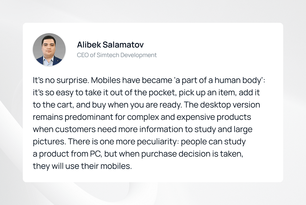
Eugenia, Simtech Development Lead Designer, says:
The behavior of smartphone owners during shopping is different from those who shop on the desktop version. In the first case you have only a small screen at your disposal, purchases are made “on the go” (in transport or at lunch), so the pictures on the gadget’s display should be large, and the information should be concise and useful.
Instead of a computer mouse, such users have fingertips, and “flipping” on the touch screen will not work for a long time. This means that the wish list and cart buttons should always be in sight, and the checkout process is reduced to a minimum number of steps.
As for the implementation, at the moment there are 4 options for developing a mobile version of an online store
- Mobile site
- Responsive design
- Native app
- PWA
Let’s examine each variant in more detail.
Mobile site
A mobile site is a site developed separately, it is the “little brother of the desktop”. Both have a similar design, common elements, and yet they are not clones. The mobile site has its own code, it is placed on a subdomain like “https://m.site.ru” or “https://mobile.site.ru” and contains the design, functionality and structure in a simplified form.
With the right settings (experienced developers assign different tags for both sites), users will be redirected to one or another version of the site, depending on which device they accessed it from.
An interesting paradox: the features of a mobile site can be both advantages and disadvantages at the same time. The main ones are listed below.
Mobile Site Pros and Cons
| Feature | Pros | Cons |
| A standalone website | Gives you the opportunity to develop a strategy for promoting goods and services that is different from the desktop version | Requires additional costs and time for development and further maintenance |
| Simplified functionality or cut down content | High page loading speed, the site contains the most important content and functionality. A good style is to place buttons that open the full version of the site on all pages of the mobile site (in the header or in the footer) | The lack of full information on the site can cause irritation to users |
| SEO | Fast loading speed of the site allows it to rank better in search engines | For a search engine, mobile and desktop sites are two different sites. Duplicate content will lead to their competition |
Given the controversial character of a mobile site, it is increasingly replaced by responsive design.
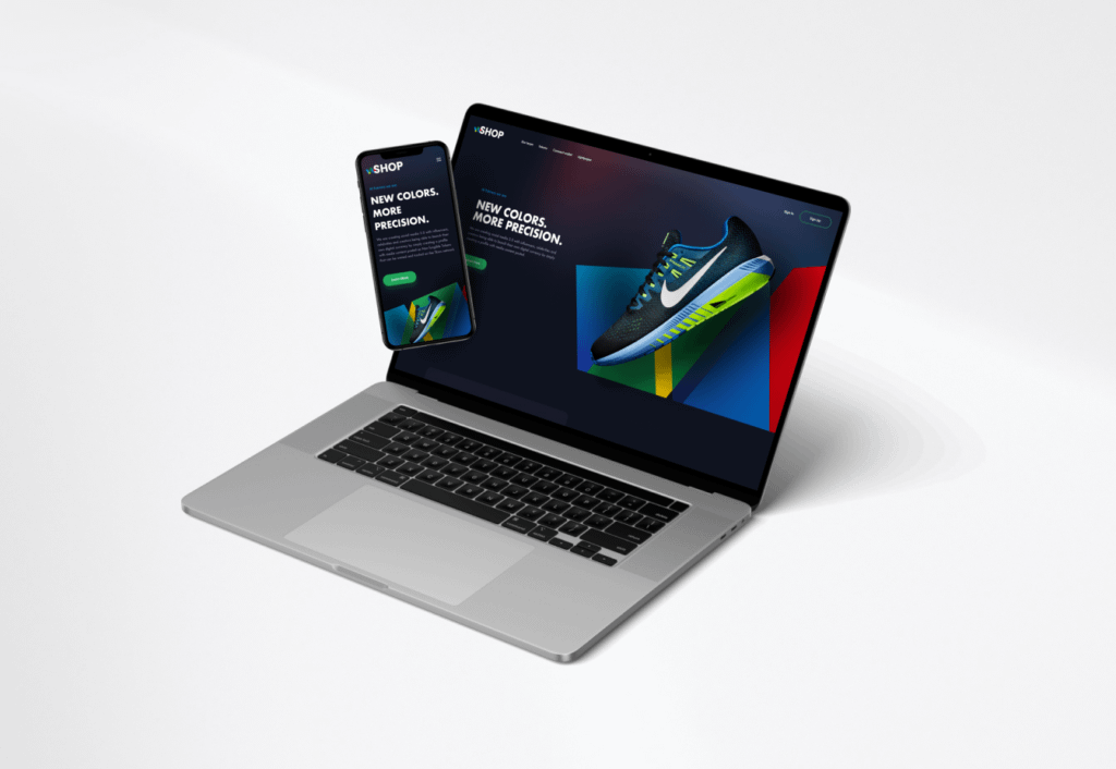
Responsive design
Responsive design is a design created for different types of user devices. It can fit a small smartphone screen and a more elongated tablet display. For clarity, the example below demonstrates website responsible versions created by the Simtech Development team for Nespresso (Switzerland), which specializes in the sale of coffee machines. eCommerce mobile optimization plays a crucial role in ensuring these designs provide the best user experience across all devices.
The responsive design has a single code for all devices. Thus, the entire code is downloaded to the smartphone. As for the content, it duplicates the content of the main site in whole or partially (some of the blocks can be hidden if desired).
Responsive design looks similar to a mobile site. Then what’s the difference?
Comparison of Mobile Site and Responsive Design
| Feature | Mobile Site | Responsive Design |
| In the spotlight | A standalone website | Standalone design, prototypes and front-end development |
| Budget | ХХХ (you need to develop and maintain two sites) | Х |
| Content | Cut down version | Duplicates the content of the main site in full or partially |
| Simplicity to change the content | Changes are made separately for the mobile and the desktop versions | It is enough to edit the desktop version, the responsive design will update accordingly |
| Page loading speed | Instant as the content and functionality are in the limited form | Relatively fast: mobiles download the same amount of information as a computer (with the ability to hide some blocks) |
| SEO | Requires a separate strategy | A responsive site ranks higher by search engines |
Antony, designer at Simtech Development, says:
Today, most online stores and marketplaces are developed with responsive design by default. This is a must-have for a self-respecting business, as well as for a client-oriented IT company.
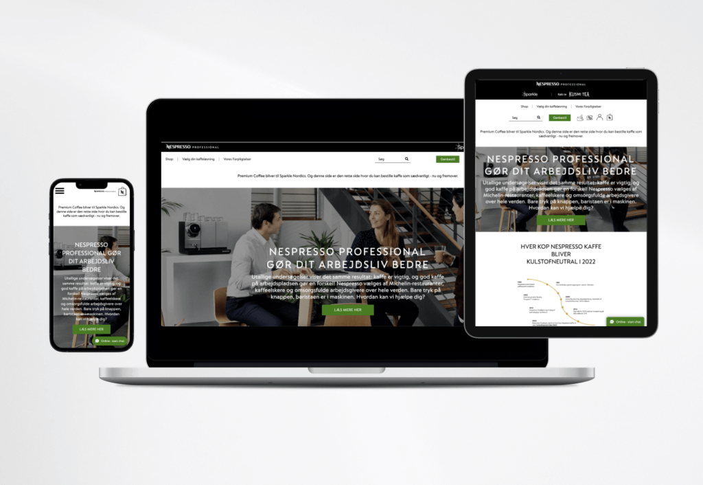
The case when an online store exists without a mobile version indicates that it was developed at least 8-10 years ago, when responsive designs were rare. Now it is easier to redesign the website and “put” a responsive version on the updated site. Our team did that job for a store selling dishes for bars and restaurants. The site was created in 2015, became outdated in 8 years and no longer met modern user interface requirements. Our team breathed a second life into it: updated the general design and created a responsive design for smartphones.
Read more:
Outdated websites: When do you need a website redesign or website relaunch?
From the point of view of labor intensity, this is a simple refinement: after 30-50 hours spent on editing and approval, the responsive design is transferred from designer to developer. And after 150-200 hours of the developer’s work, the final version is ready for release.
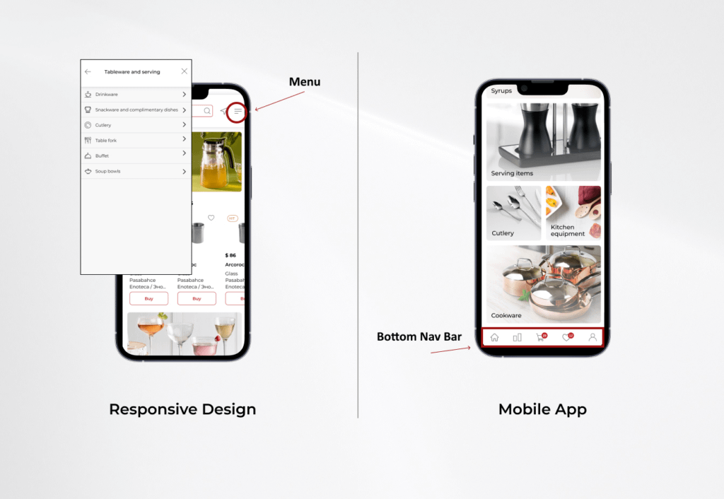
By the way, responsive design is also good for clients who want to go further – launch their own mobile application. All components are already in place (buttons, fonts, product pages, banners, and covers for blog articles), but the user behavior will be different. In the responsive version, a person moves from one section to another thanks to the “burger menu” icon (a button with three parallel horizontal lines looking like an American sandwich). In the mobile application, the user navigates the site thanks to the bottom navigation bar.
However, these are far from all the differences. To dive into the topic in more detail, let’s move on to considering a mobile application. Moreover, this is the third and one of the most common options for creating a mobile version of an online store.
Mobile app
A mobile application is a fundamentally different solution from those listed above. This is software that is downloaded from app stores (App Store, Google Play, Windows Phone Store, and others) and installed on the user’s phone.
Mobile App Pros:
- Allows you to be closer to the audience (you do not need to look for a store in the browser – just click on the application icon on the smartphone screen).
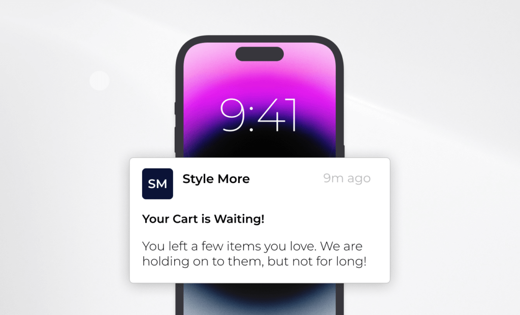
- Involves re-engagement with customers through push notifications. You can remind the user of the abandoned cart, for example. Having opened such a notification, the user immediately gets to the checkout page.
- Simplified payment process. Users are ready to download a mobile application to their phone when they really often visit this store. At the same time, connecting a credit card to a personal account saves the client time and effort.
- Offline usage with lots of options.
- User location. Starbucks, for example, shows the addresses of the nearest outlets and offers to order coffee in advance so as not to wait in line.
Mobile App Cons:
- Large investment. Application development will require tangible costs. You should not turn to this tool just because “others have it.” It is worth thinking about if an online store has a high percentage of repeat sales and at least 10,000 users per day. Only in this case, the application will help create additional brand value and will not be a waste of money.
- Lack of space for applications in smartphones (a mobile application weighs up to 200 MB, which is why users often delete it after a couple of weeks or even days after downloading).
Who else needs a mobile app?
Mobile applications add comfort not only to users, but also to businesses if they become a link between the seller and the buyer. This is especially true for marketplaces with numerous orders, suppliers and complex logistics.
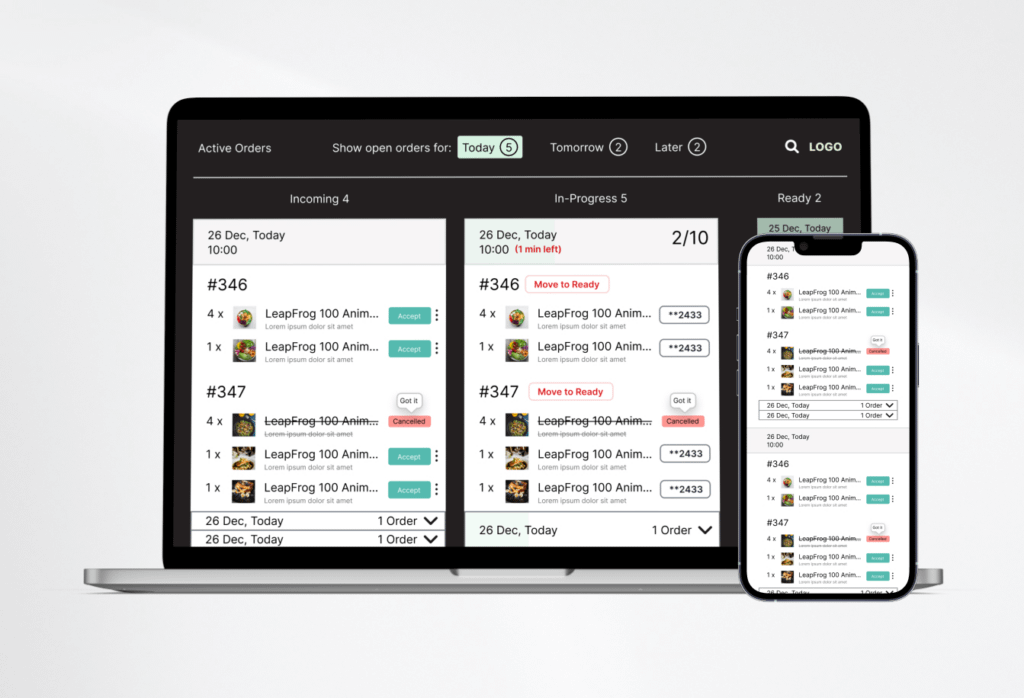
In 2020, a large company for the delivery of ready-made food from cafes and restaurants became one of the Simtech Development clients (the service operates in 35 countries of the world, and due to its great fame, we cannot name the company). The customer was looking for an opportunity to combine the functionality of websites of different retailers into a single platform, and CS-Cart’s Multi-Vendor became the closest framework for implementing this idea. A mobile application was needed to connect food producers and couriers. With its help, drivers were able to see ready orders, pickup points and optimal delivery routes to customers. And it’s all right in their smartphones! The mobile application has made the food delivery process fast and easy to manage.
One of the first questions that arises when a business owner decides to develop a mobile application is: What to choose: Android or iOS? StatCounter global traffic research company states that, Android wins in terms of the number of users – 72% globally, while iOS supporters represent only 27%. However, in terms of user income, the latter wins. So what to choose?
There are two options there:
- Develop a native mobile application (provided for a specific platform, written in the native programming language: Swift or Objective-C for iOS, Java and Kotlin for Android);
- Develop a cross-platform application (developers write code suitable for two platforms at the same time).
Each approach has its pros and downsides represented below:
Comparison of Native App and Cross-Platform App
| Feature | Native App | Cross-Platform App |
| Development time | ХХ | Х |
| Cost of development and maintenance | УУУ | У |
| Adaptability of the interface for platforms | High, but only for the native platform | Low |
| Integration with third-party functionality | Simple, but only for the native platform | Can be difficult |
| Performance (speed, stability and scalability of the application) | ZZZ | ZZ |
| Audience reach | 30-70% (if you choose the development of one application). 100% – if you cover both Android and iOS. | 100% |
To make a decision, ask yourself the following questions:
- What devices does my audience use?
If the percentage ratio is 80/20, then it is better to choose the native application only. If 50/50, then consider cross-platform development.
- How much time is allotted for development?
In general, a cross-platform application requires less time, but it has its own nuances in the form of weak interface adaptability or difficulties in integrating services.
- How complex is the project?
Native development is suitable for products with great functionality and complex logic. For simple projects without complex design and a large number of animations, cross-platform is enough.
If you need more expert advice, contact us! We’ll select the most appropriate opinion for your business.
So what is better: a mobile site, responsive design or a mobile application?
We considered 3 options for implementing the mobile version of the online store. It’s time to move on to the analysis.
Comparison of Mobile Site, Responsive Design, and Mobile App
| Feature | Mobile Site | Responsive Design | Mobile App |
| In the spotlight | A standalone website | Standalone design, prototypes and front-end development | Application that is downloaded from the AppStore and Google Play stores |
| Budget | ХХХ (you need to develop and maintain two sites) | Х | ХХХХX |
| Content | Cut down version | Duplicates the content of the main site in full or partially | Different from the desktop |
| Simplicity to change the content | Changes are made separately for the mobile and the desktop versions | It is enough to edit the desktop version, the responsive design will update accordingly | Changes made to the mobile application must be approved by the Apple Store and/or Google Play developers |
| Page loading speed | Instant as the content and functionality are in the limited form | Relatively fast: mobiles download the same amount of information as a computer (with the ability to hide some blocks) | High, a number of functionalities are available offline |
| SEO | Requires a separate strategy | A responsive site ranks higher by search engines | Can be done as a standalone activity called ASO |
As you can see, each implementation has its strengths and weaknesses. However, we’re left with one final solution that we haven’t covered, which is a web application, or PWA. We suggest paying close attention to it, because in the world of development it is considered as the most progressive and technologically advanced.
PWA
PWA is a hybrid of a website and a mobile app (that is why it’s called a web app). Today this technology is chosen by such corporations as Twitter, AviaSales, Alibaba, Forbes, Uber, AliExpress.
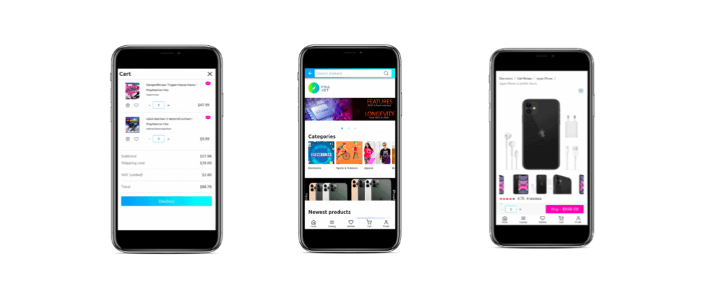
The peculiarity of PWA is that when displayed in search engines as a website, it looks like a full-fledged mobile application. And it is not downloaded from Google Play or the Apple Store, but from the main page of the online store.
Unlike traditional mobile apps, a web app is an affordable option. It is easy to manage and secure to store data.
For online entrepreneurs, PWA is often interesting for two more reasons:
- This technology can be used as an MVP before launching a full-fledged mobile application (you won’t spend a lot of money, but check how interesting such a sales channel is for your audience);
- PWA is a cross-platform solution, and this allows you to avoid the need to develop a native application (which will significantly save time, budget, and help you stay ahead of competitors because of the use of advanced technologies). Simtech Development team developed its own PWA solution for online stores and marketplaces on CS-Cart.
Key features of PWA development by Simtech Development
- Easy connection to CS-Cart Standard and Ultimate versions, Multi-Vendor Standard, Plus or Ultimate
- Looks like a native app with an attractive UX/UI design
- Provides high speed for loading the online store on the screen of your customer’s mobile device
- Works offline
- Does not take up much space in users’ phone memory (only 2 MB vs 200 MB as the mobile application)
- Can be installed on any gadget
- There is a “quick buy” functionality – an abbreviated checkout using the buyer’s email address or phone number
Our customers are increasingly opting for PWA stores. Here is a review from the owner of a multi-product marketplace: “We decided to try PWA for our project. We have good results in terms of loading speed and displaying the store on mobile devices. Recommended!”
Finally, let’s take a look at our comparison table in order to get a complete picture of the options for implementing the mobile version of the online store.
Comparison of Mobile Site, Responsive Design, Mobile App, and PWA
| Feature | Mobile Site | Responsive Design | Mobile App | PWA |
| In the spotlight | A standalone website | Standalone design, prototypes and front-end development | Application that is downloaded from the AppStore and Google Play stores | App that can be added to the mobile home screen |
| Budget | ХХХ (you need to develop and maintain two sites) | Х | ХХХХX | ХХ |
| Content | Cut down version | Duplicates the content of the main site in full or partially | Different from the desktop | Same as in the desktop version |
| Simplicity to change the content | Changes are made separately for the mobile and the desktop versions | It is enough to edit the desktop version, the responsive design will update accordingly | Changes made to the mobile application must be approved by the Apple Store and/or Google Play developers | Changes made to the desktop version of the site are automatically reflected in the PWA application |
| Page loading speed | Instant as the content and functionality are in the limited form | Relatively fast: mobiles download the same amount of information as a computer (with the ability to hide some blocks) | High, a number of functionalities are available offline | High, a number of functionalities are available offline |
| SEO | Requires a separate strategy | A responsive site ranks higher by search engines | Can be done as a standalone activity called ASO | Generates additional organic traffic: by setting SEO on the website, you add a lead generation tool in PWA as well |
Final word
Modern online shoppers are increasingly using mobile phones to explore the product line and make a purchase decision. If your eCommerce site does not yet have a convenient and beautiful mobile version, it’s time to fix it with proper mobile optimization for eCommerce. To solve this problem, you can develop a mobile version of the site, responsive design, mobile app or PWA. We are ready to assist you in the development of each of the proposed solutions – we can develop the design, usability and functionality based on the characteristics of your business, the timing and budget for the project.