It’s now more important than ever to have a mobile-friendly website, but which approach should you choose? In our previous article we told you about mobile apps and builders for CS-Cart store owners.
I believe that after you have read it you understood that building a separate mobile site is a costly venture, both in terms of time and money. In this article we will try to prove that responsive design and modern mobile browsers is the best way to make your CS-Cart store mobile.
Approximately 7 in 10 consumers prefer mobile websites over mobile applications across devices. Look at the picture below.
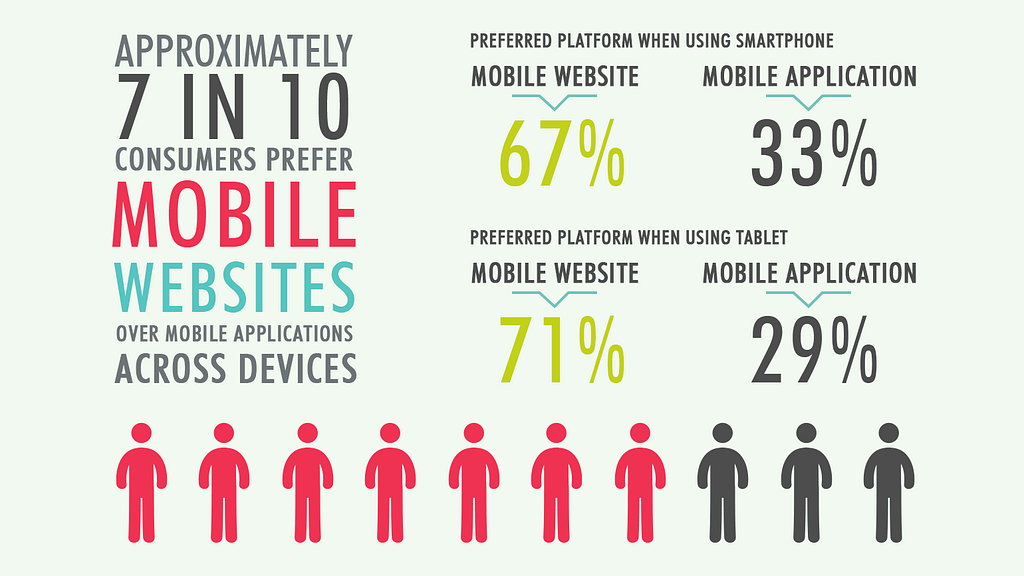


So, what is the best way for your CS-Cart business to go mobile? We recommend to confine yourself to responsive web design because it adapts an online store to different screen sizes, using one set of code. Also you should trust mobile browsers because their modern features provide users an impressive performance.
According to the article in Martech mobile browser audiences are 2 times larger than app audiences and growing faster.
It means that if you have responsive design features of mobile browsers will help you to enhance customer’s experience.
Let’s review some of them on the example of Google Chrome.
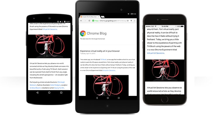


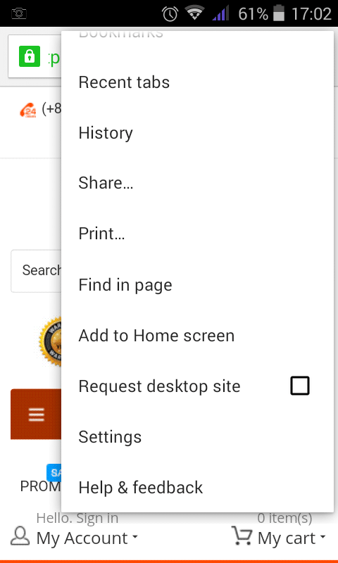
Add to Home Screen
If your customers constantly go shopping to your store they can add the icon of the website and it’ll look like a native app icon. See the screenshots below.





Push Notifications
In comparison with mobile apps websites, however, have to take permission from their users to send them push messages.



As soon as someone arrives on a website, an opt-in box is triggered. If the visitor clicks on “Allow”, they are added to your subscriber list.
As soon as a visitor becomes a subscriber, you can send them push notifications from your website. These notifications will arrive in real-time even if the browser is not open at that point of time. Clicking on the notification will take the subscriber to the URL specified.
You can use Push notification services that enable Push by adding the javascript code to your site without requiring your website to implement HTTPS. On quora.com you can find a thread about the best push notification provider.
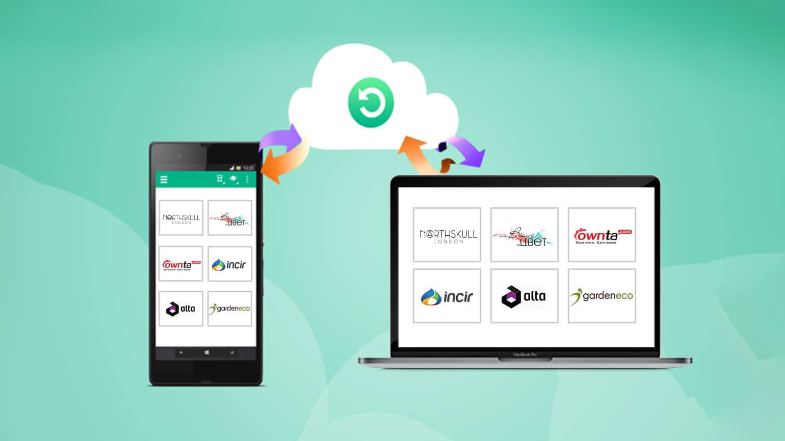
Sync Across Devices
Users can seamlessly access and open tabs and bookmarks from the laptop, phone or tablet. So, they’ll never lose a bookmark with your store.

Voice Search
With the magic of Google voice search customers can find the product they need on-the-go without typing.



Privacy
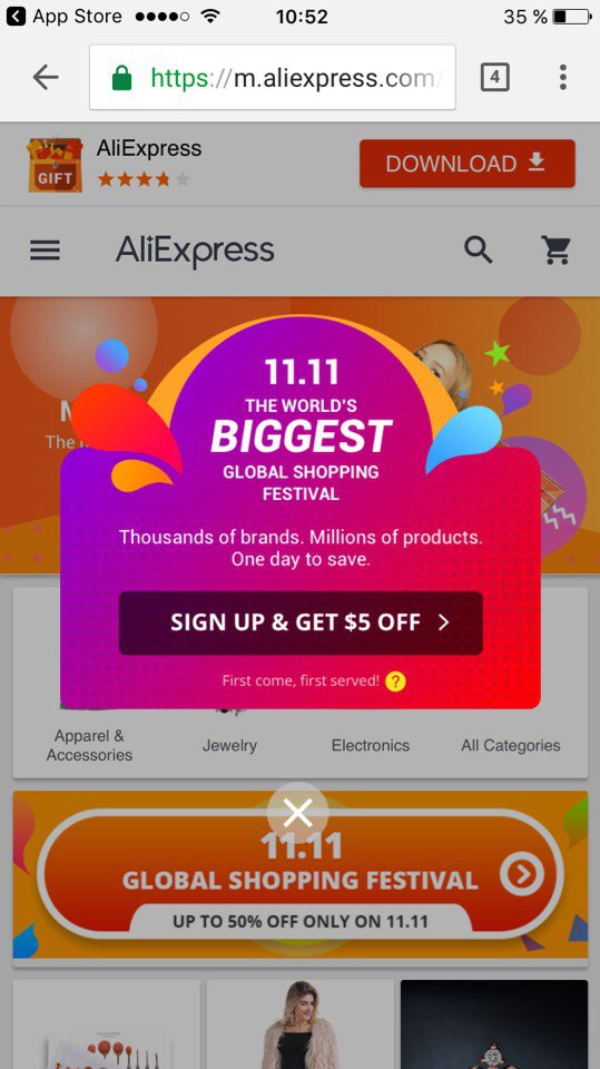
If the customer does not want somebody to know that they visited this store, the Incognito mode will help them. So, you see that browsers with a responsive design is an excellent alternative to mobile apps.
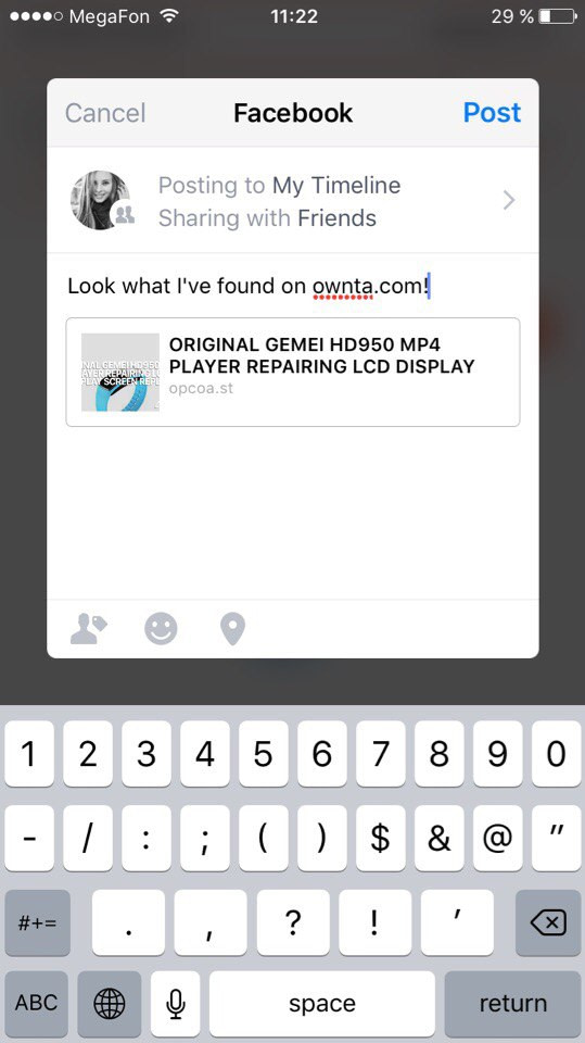
Other browsers also give different opportunities for users. For example I’ve tried Opera Coast and found it amasing. Except features that Google Chrome has it has a feature to share with a personal touch. It means that you can easily share your purchase or news about special promotion or sale, and you can even add a personal message to let the world know why you’re sharing it.



You can also enjoy smooth browsing experience. Opera Coast lets you navigate with simple swipe, touch and 3D Touch gestures on IOS. It makes websites look just as good as those apps you love.
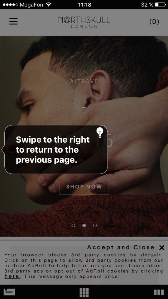

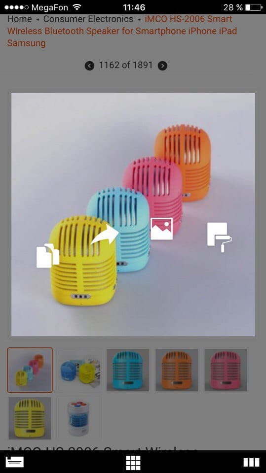


So, you see that today’s browsers are very smart. All you need is to make your store responsive and nice-looking.
As starting from version 4.1.4 CS-Cart and Multi-Vendor are responsive by default, the easiest and most money-saving way to create a mobile website is to create an appropriate layout.
But it’s not just the fact that it is simple and cheap, such a design has a number of advantages. Let’s mark them quickly:
Consistent design across all devices
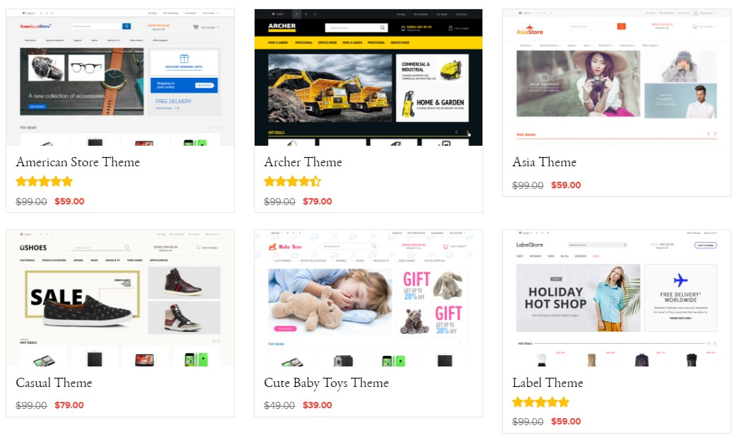
The most preferable way of creating a nice-looking CS-Cart mobile site is through responsive themes. Responsive themes usually use similar HTML files along with different CSS files. Google prefers responsive designs as it streamlines experience over a number of screens without using a lot of resources.
If starting fresh, we highly recommend using a responsive template from the get-go.


Improve SEO rankings
Having one single URL makes it easier for Googlebot to crawl your site, Google’s external link algorithm reduces the chance of on-page SEO errors. For all these reasons, responsive sites typically perform better and are easier to maintain than a separate, mobile template site.
One URL
Responsive design makes it easier for users to share and link to your content with a single URL.
One set of code
You only need to maintain one set of code, one set of pages for your website so any changes or new functionality you offer to the desktop version are automatically available on mobile as well.
The same content everywhere
The advantage of this approach is that the store’s core content, features and business logic remain the same across each device, while the template of the website adapts to the screen increasing text size, making buttons bigger, or changing the grid structure. It also requires less programming time to maintain multiple pages for the same content.
Easy to promote
For marketing, responsive sites also have an advantage in terms of brand coherence, because you have a single site to think about, rather than having to maintain your brand across two websites. Our CS-Cart marketing tools may help you in building promotion strategy.
You see that responsive design with the help of modern browsers builds a powerful tool that every eCommerce manager should consider for improving both sales and overall shopper engagement.
On our website you can read about mobile commerce service. We will be glad to make your store better for mobile shoppers. You can get a free quote on our website.
