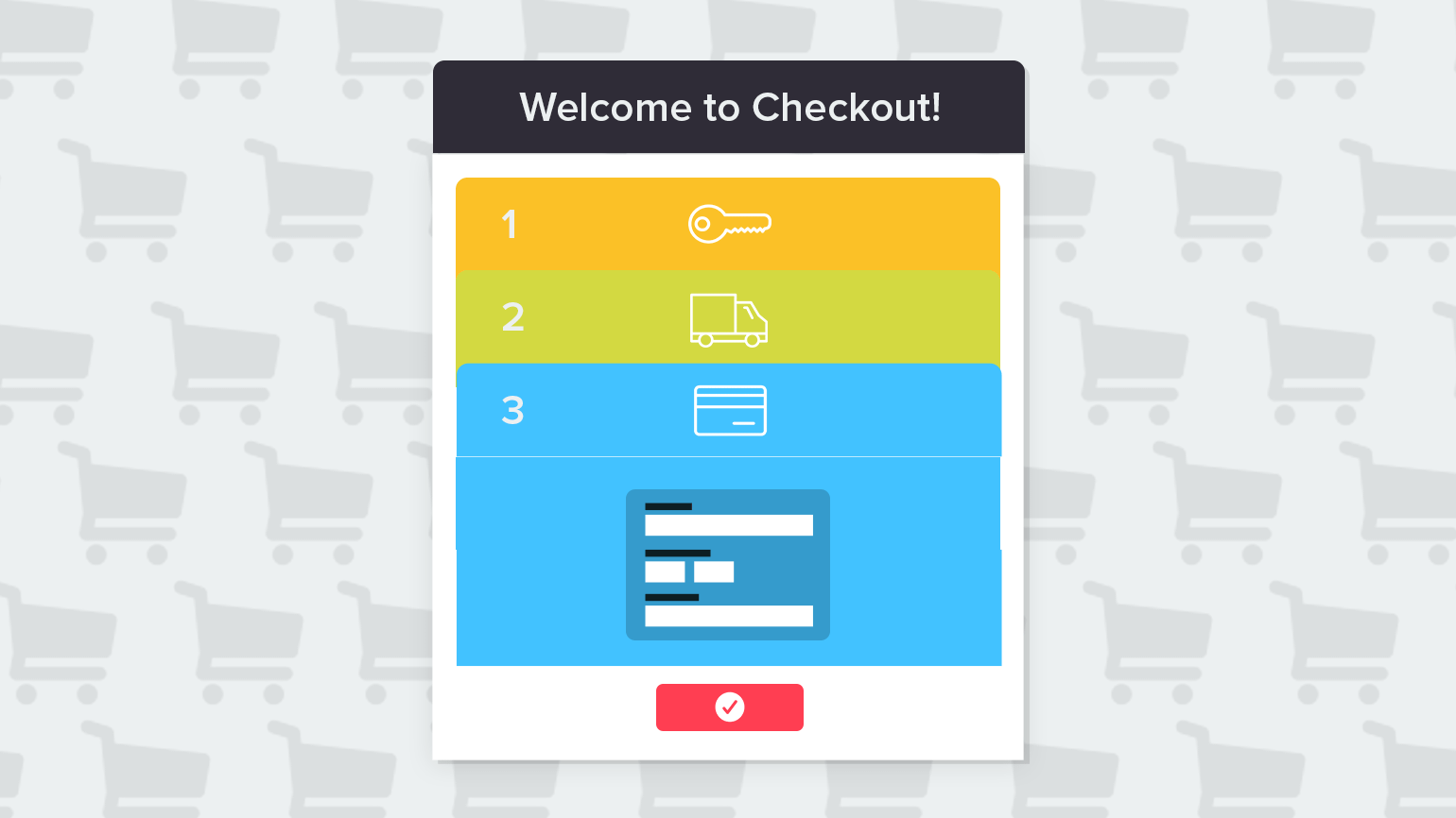
Every month, we receive requests from CS-Cart owners to integrate an optimized one-page checkout into their CS-Cart stores. According to research by Internet marketing specialists, the one-page checkout process involves an average percentage of conversion no less than 50%. Is the multi-page checkout a bad idea? Let’s explore the advantages of both UI solutions.
The benefits of a multi-page checkout
Despite the popularity of the one-page checkout, the monsters of eCommerce, like Amazon and ASOS, continue to use a multi-page checkout. True, it is less user-friendly, but this type of checkout process has benefits.
1. For major purchases or for products that require further consideration, customers might want to confirm that all information was entered properly and double check the subtotal, shipping, and taxes before placing an order.
In this case, the best way to attract loyal customers will be to allow them to review all the information as they move along each step and let them feel sure that they made a good decision by placing an order from your website.
2. Multi-page checkout will be useful for you if you apply in a store three or more billing or shipping methods. A lot of fields in a billing/shipping block will look unfriendly in the one-page checkout
3. Multiple pages may be necessary when you are working with third-party partners like credit card processors or PayPal. If you use services like Give.it to enable your customers to send a product as a gift, it might be more convenient for them to use a multi-step checkout.
The benefits of a one-page checkout
1. The one-page checkout performs better for fast and impulsive purchases. Customers click the “Add to Cart” button, enter their shipping and billing info, and complete their orders.
2. It is also the preferred option in mobile stores where convenient navigation and performance play a leading role in the conversion.
3. The fewer number of abandoned carts in single-page checkouts proves that a quick and painless checkout process means less time for customers to get distracted or change his or her mind.
If you are in doubt about which checkout scenario is more suitable for your CS-Cart store, we recommend you take an A/B split test. Only the A/B test will tell you what your customers prefer.
_____________________________________________________________________________
Do you interested in the best ways to make CS-Cart checkout more user-friendly? A tutorial is coming soon. Follow us on Twitter and Facebook to get the latest posts.

