Gemsquar
Precious jewelry company
Gemsquar is an online multi-storefront marketplace. Its offline store was first founded back in 2015 in Geneva, Switzerland to sell precious stone jewelry. Since then, the company has decided to go online. In 2021 they chose us as their technology partner for hosting, add-ons and customizations as the company CEO believes we are the ones who can implement their goal at the best – to build a jewelry marketplace.
They always advise the best solution based on our ideas and requests.
Implementing the project
Design Creation
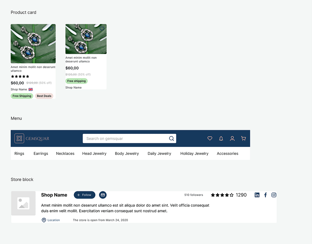
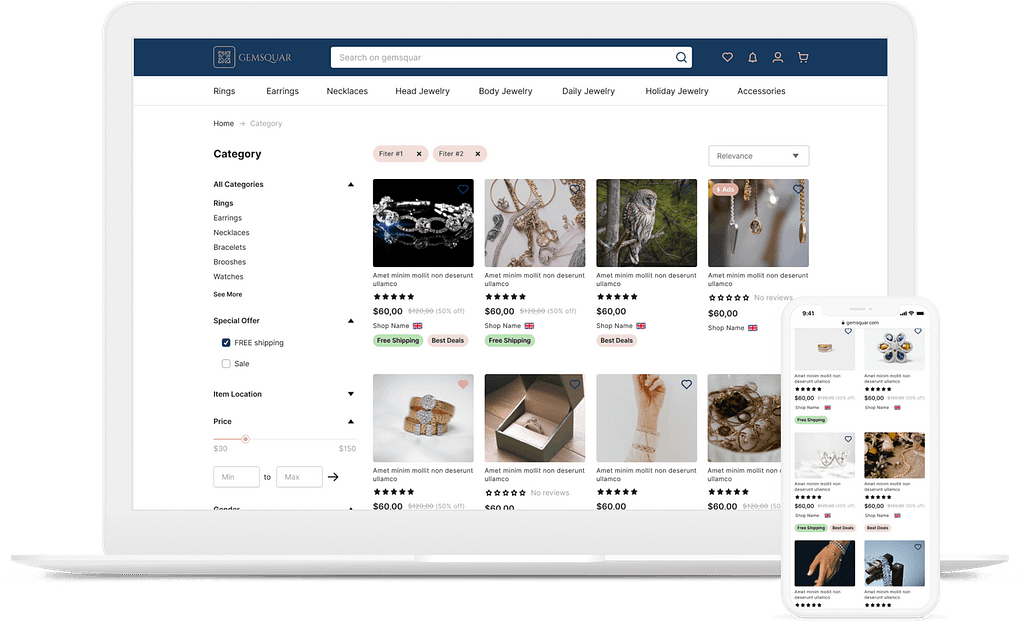
The prototype for the future marketplace was created in Figma by our designers’ team. We developed the page structure and main elements (header, footer, content area) for the desktop, mobile, and tablet versions of the site. Our designers also created mockups for Homepage, Category Page, Product Page, and the Vendor Profile (Micro Store).
Our technology is based on CS-Cart licence. First we started by buying the licence from Simtech Dev. Second we asked Simtech to work on a web design mock-up for us, and they built exactly what we were asking. Last, we are now working to build the marketplace and all functionality based on the mock-up.
Calendar modification
We adapted the calendar functionality – start and end times and additional settings – with a margin of available time of 30 minutes. The choice of time is not available if it is less than 30 minutes until the current time. We changed the functionality of the “Rental dates” on the “View cart” page and undefined the selected date if the current date is greater than the pickup date.
The mockups were designed to show the page structure and main elements with visual effects (color, fonts, etc.) to better convey the brand values to the audience.
All the visual content is implemented according to a style guide – a description of standards and rules for the corporate style. This file was also developed by our designers in Figma on the basis of agreed mockups of the website design.
Design Integration
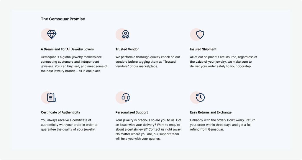
We introduced the “The Gemsquar Promise” title to the block with the advantages’ list.
The My account icon appeared in the mobile version header and if it is clicked the link to the wishlist page is shown.
The hamburger menu is implemented in the expanded view on the mobile page.
We changed the logic of product search in the header search bar. A new selector was added to the search bar in the header on all website pages in the storefront. It contains 3 options:
- Search by products – default product search;
- Search by vendor name – on the search results page we display the products of vendors whose names match with the value entered by the user in the search bar.
- Search by vendor location – on the search results page we display the products of vendors whose country, state, or city matches the value entered by the user in the search bar.
For the Category details page, we used the default product filter by distance which is a part of the Vendor locations add-on for the Item location filter. We also used default filters for the following filters:
- Sale (a filter by the ‘Sale’ (checkbox) product features.
- Price (a filter by product price).
- Gemstone (a filter by product default feature).
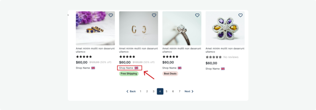
We added the vendor name and vendor’s country flag icon to the product in the product lists and product blocks.
Our developers replaced the display of the average product rating with the average vendor rating across the storefront.
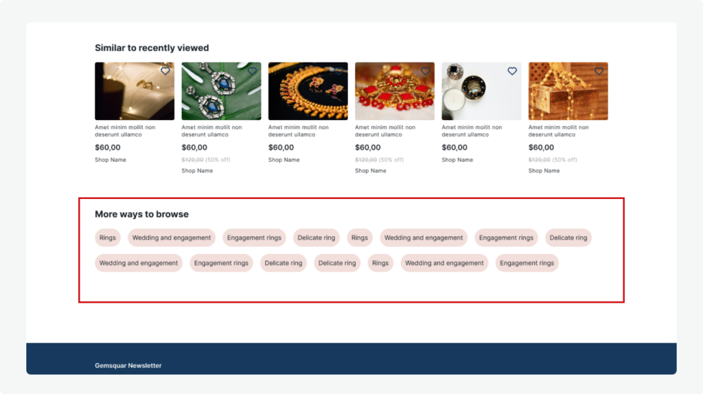
Now, the “More ways to browse block” is displayed in the bottom part of the category page’s main content. This block contains the most popular product tags in this category.
We created a new filling for the default Tags block that displays the most popular product tags of a specific category.
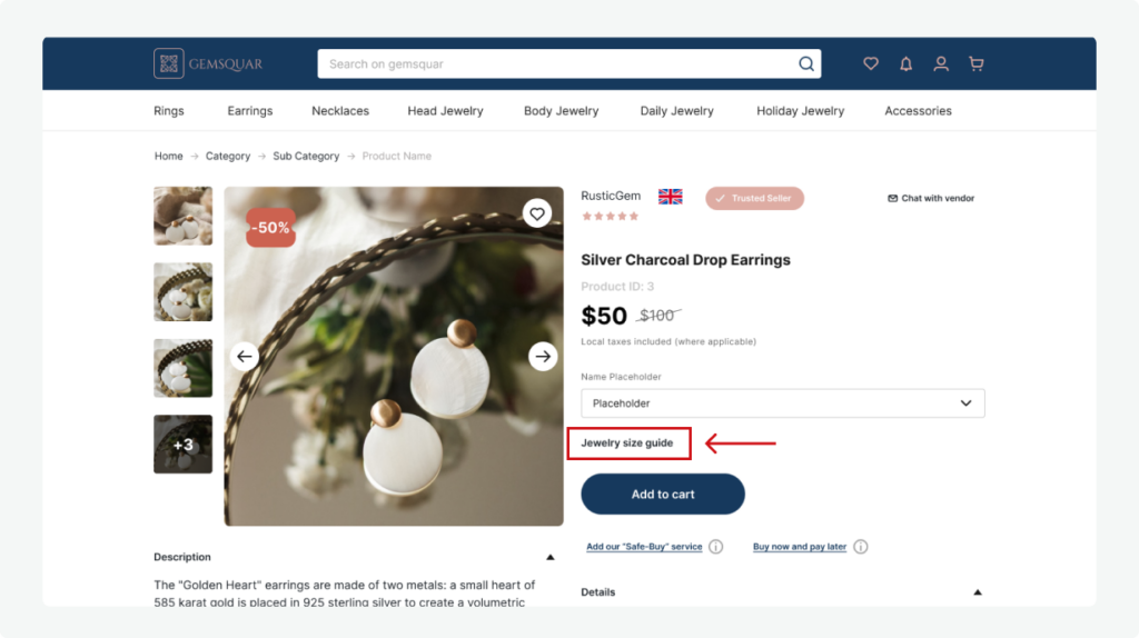
For the Product details page, we added the new “Display the Jewelry size guide” checkbox to the category editing page. If this setting is enabled, the Jewelry size guide appears. After clicking the link a customer sees the Jewelry size guide table in the popup without redirecting to another page.
We added a new Jewelry size guide template so that the admin could edit the template.
We introduced the “Trusted Seller” checkbox setting on the details vendor plan page. If the setting is enabled, the label of a trusted seller comes up next to the vendor name on the product details page.
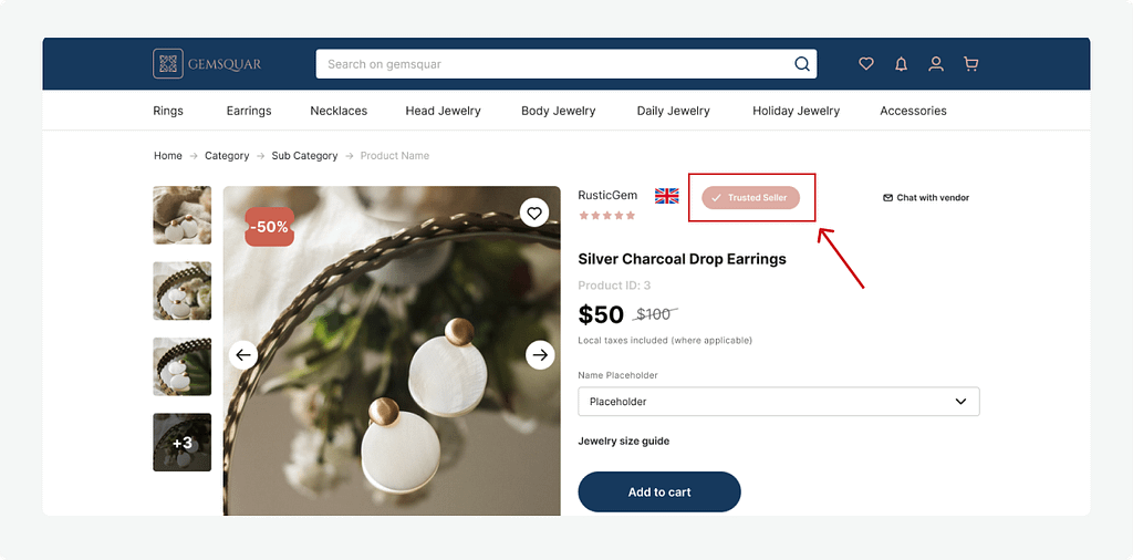
The vendor country flag icon was introduced and can be seen next to the vendor name on the product details page.
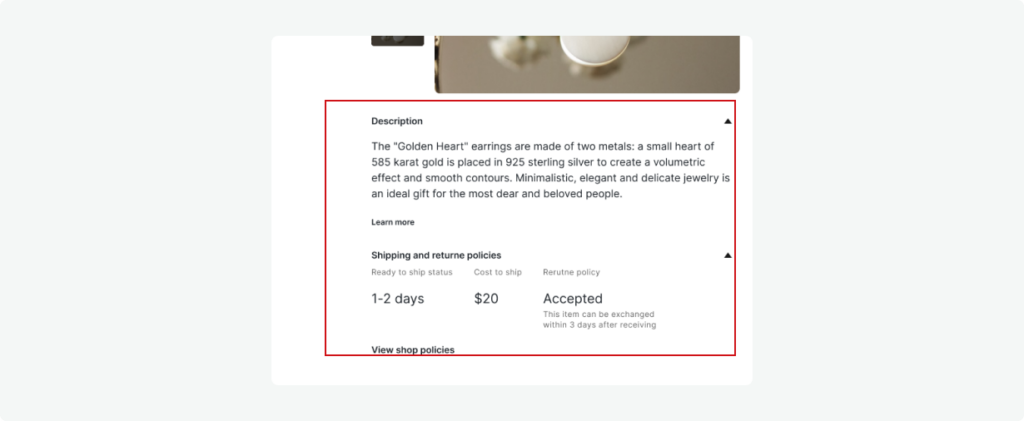
We added the new “Shipping and returns policies“ tab on the vendor editing page. This tab contains 3 areas to fill in information for 3 fields:
- Ready to ship status
- Cost to ship
- Return policy
We added the block with the information below the Add-to-cart button with the following texts:
- Add our “Safe-Buy” service (with a tooltip).
- Buy now and pay later (with a tooltip).
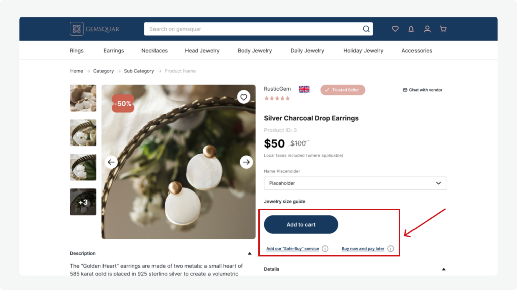
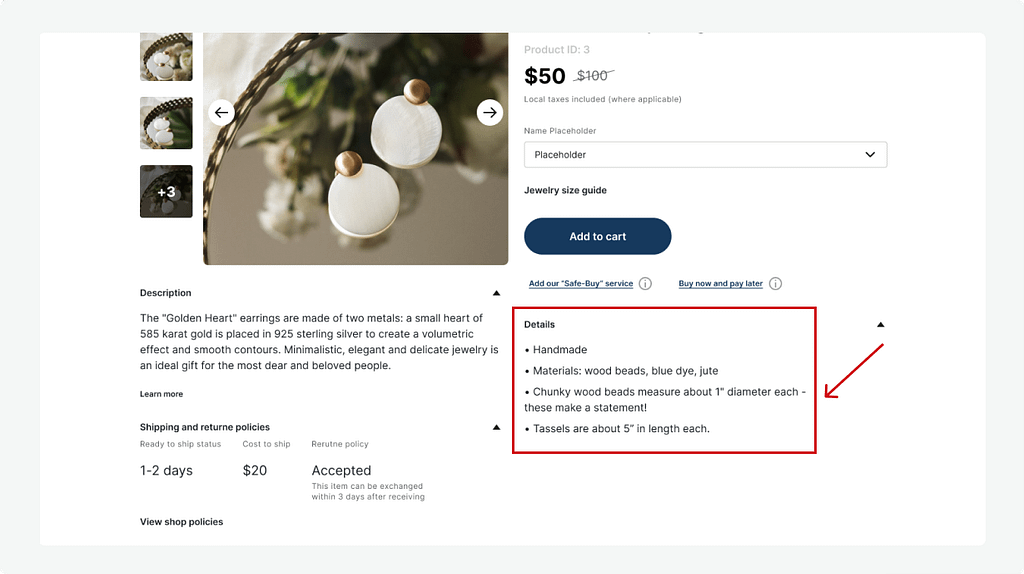
We changed the drop-down for each option of the product to one select box containing options.
Results
All was good for us. They are always quick to reply and take time to understand our needs.

