HellaBlack
Black-Owned Marketplace

HellaBlack was founded by Love-Leigh Trimiew, Layla Nielsen and Natalie Robinson in 2019 to raise Black-owned businesses. They intended to create an unrivaled shopping platform to connect Black-owned brands with a larger audience of consumers. In February 2020, Love-Leigh addressed us with a request to leverage her CS-Cart based website. We provided our Cloud Hosting services, modified some functionality, and integrated design to make her business flourish.
Challenges
Integrate new design for greater efficiency and attraction
Add Featured products auto-filling on the Products block settings page to promote vendors with a higher plan.
Customize menu to repeat category representation as on Etsy
Implementing the project
Design integration
We totally redesigned the look and feel of the site based on the owner’s mockups. The main purpose was to emphasize some parts of the marketplace to focus the customer’s attention. The design changes touched both the backend and the frontend.
- We introduced a new “Hide empty categories from the category menu“ checkbox to declutter the screen.
- We implemented the “Autosave” functionality on the product settings page in the vendor panel. The latest changes won’t be lost when the vendor switches between product tabs on the panel.
- A new “YouTube URL“ input field was added for graphic banners. Thus, the administrator got an opportunity to assign a YouTube link to the video for any graphic banner.
- We added a new “Categories with images“ template for the categories block to speed up the process of adding new categories.
- A new “Shop policies“ text area was introduced on the vendor settings page. Now, the vendor can add some policy information on his/her own.
- The vendor panel obtained an option to upload a detailed image on the vendor settings page.
- We added a new “View micro store“ link on the top panel for vendors. Now, the vendor panel can redirect visitors to the his/er micro store page.
On the storefront:
We elaborated color palettes, fonts, and designs for the main website pages.
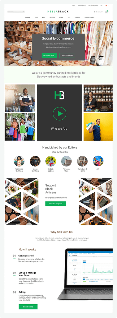
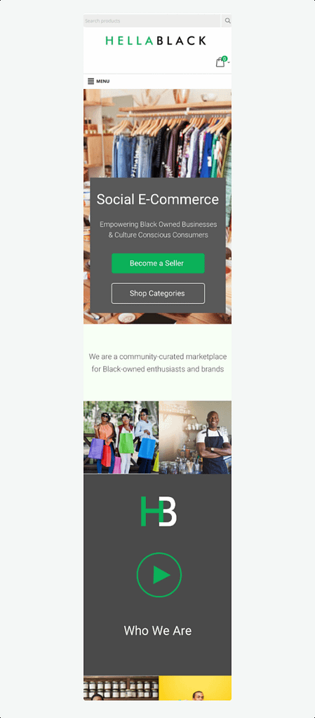
The mobile and desktop versions of the homepage were restyled based on mockups:
There were made lots of other beautiful and useful changes in the homepage design:
- Video banner blocks that were added to the homepage.
- New category block template for the product categories block on the homepage in the storefront.
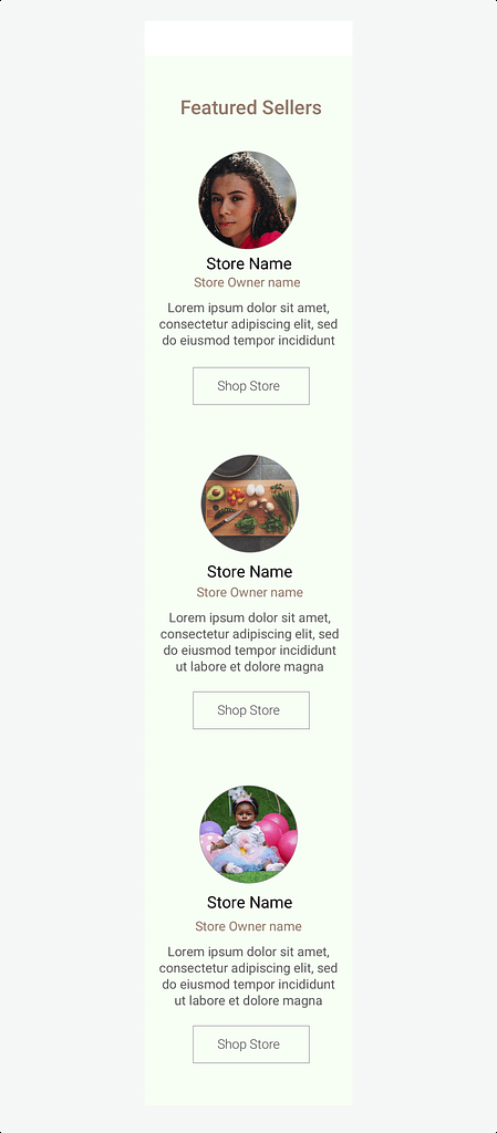
- Styled “Featured vendors“ block, header and footer in the storefront.
We styled “Choose your plan“ page, “Vendor plans“, “Vendor micro store“ page, Blog page, Category page in the storefront, Product details page, order confirmation page and other pages.
We divided checkout sections into steps within one page.
Our dev team also implemented the single sign-on functionality for the vendors. Thus, the vendors won’t need anymore to authorize in the vendor panel if they have been authorized in the storefront.
All the design changes made the use of the storefront and admin panel very comfortable and user-friendly both for vendors and admins.
Menu customization
The list of subcategories on the category page was reworked to implement a new workflow:
- Level 1 Parent Category with full-width image, Level 2 subcategories images as circles
- Level 2 category with full-width image, Level 3 subcategories as circles
- Level 3 (last level) subcategory - No hero image- no circles.
We added a new category menu in the storefront based on mockups:
Category Level 1-2 was made the same as on Etsy. For the mobile when hovering, we reveal the categories of the second and third level.
Featured products
We added a new “Featured products” filling on the “Products” block settings page in the backend panel.
The new filling sorts products listed by vendor plans in the products block. Products of vendors which have a vendor plan with high cost display first. The products list is sorted by name which is very handy. The new modification is a perfect marketing tool to promote switching to a high vendor plan.
Results
A beautifully designed and functional website.


