Free Scaling Retail Business Guide
humblemarket.co.uk
Eco-Aware and Charitable

Humble Market​

Humble Market is a socially responsible marketplace residing in the United Kingdom. The store uses Multi-Vendor as a platform to gather environmentally concerned vendors offering a wide range of products in a variety of shopping categories. This website is rich in features to help all health-conscious and green-minded consumers to buy products in the most comfortable way. Developers considered every user journey point so that customers could timely enjoy fresh foods and drinks or even flower bouquets, save money with reward points, participate in charity events, and even join fellows through the on-site community. It was a keen pleasure for us to bring to life the market owner’s bright ideas, the case when a great mind meets skillful hands.

Industries

  • Grocery
  • Eco-Friendly Gifts
  • Sustainable Household Appliances
  • Personalised Homeware
  • Healthy Foods and Drinks
  • Recycled Jewellery

Services

Location

Challenge

Develop Charity Add-On
Add New Product Tabs
Improve Shipping Estimate Add-on
Make Design Customizations
Modify Homepage and Product Page

Implementing the Project

Charity Add-On

What was done in the dashboard:

We developed a brand new “Simtech Development Charity” add-on specifically for this project. To enable the said functionality, we added a new “Donation Category” setting for category creation in the admin panel. A category of this type allowed adding donation products to it. This category cannot be chosen when creating ordinary products. Moreover, we embedded a new “Add donation product” button on the product list page. Clicking the “Add donation product” button opens a simplified product creation page to specify the product name, category, price, and description. We introduced a new record on the “Vendors Accounting” page in the admin panel to indicate which amount should be subtracted from the order total and added to the admin’s account. We created a new form with the “Donate” button next to orders on the dashboard. A vendor now is enabled to decide from which order he or she wants to donate. Our developers additionally implemented the “Donation percentage” setting as an input field with a value equal to the percentage amount that vendors can donate from their orders. For example, if 5 is entered in this setting, it means that vendors can donate 5% of the order total. We added a “Donated?” column to determine whether the order had already been donated or not.

What was done in the storefront:

Donation product is a different kind of item in the store and it is not displayed in the storefront as other products. Only a direct link can allow viewing it. We created a new block with the “Add donation” button on the “View cart” page in the storefront. Clicking this button shows a pop-up window with all the available donation products. The customer can select the desired donation and add it to the cart.

Donation Slider

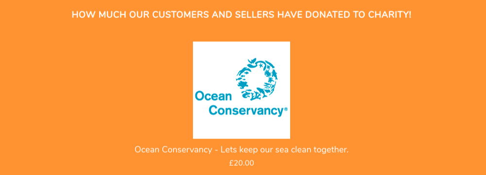
We also created a new “Our donations” block on the homepage to allow vendors and their customers to shout it from the rooftops. We made it possible to display the total gathered amount of donations per each category in the storefront. The block was implemented as a horizontal scroller.

Product Tabs

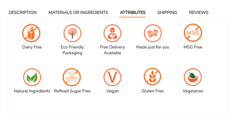
"Attributes" Tab

Daryl, the market owner, approached us with an idea to improve the product features tab to add an extra field showing the product attributes. It was a stunning and at the same time simple idea, as it helps to visualise features with icons. Having fewer words replaced with more graphics makes the customers’ perception of a product quick and easy. The concept itself is quite promising. So, we said “Yes” and turned up our sleeves. We created an additional field to upload an image to the creation/editing page of a feature in the “General” tab under Products > Features. The administrator and vendors now are enabled to choose a feature on the product editing page to have it displayed in the corresponding tab on the product page. As a result, a vendor can choose up to 20 icons pertaining to a product to visualise values of his or her product.

"Materials or Ingredients" Tab

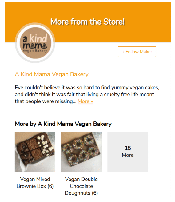
More from the Store

“More from the store” is another bright idea we’ve got from Daryl. This tab is a piece of useful content that gives a vendor an opportunity to tell more about his or her company and overcome suspicion of future buyers. We added the vendor’s logo, short description, and other vendor’s products with links to their detailed pages on the right of the page.

Shipping Estimate Add-On Improvement

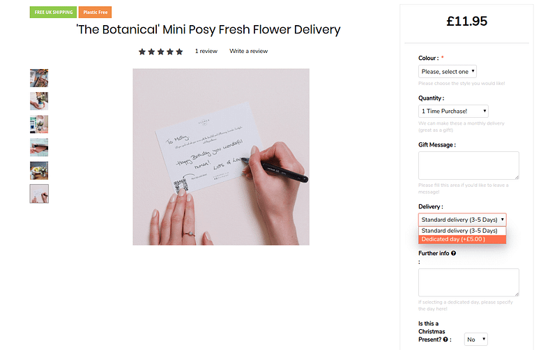
We used the Shipping estimate, the Simtech Development ready-made add-on, as the basis for further modification. The task set by the business owner was to display the delivery dates and costs on the product page. Showing a date is out of the add-on’s standard functionality. So, we modified the existing “Shipping estimate” add-on to improve its functionalities:

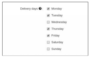
- we added "Delivery days" setting to the creation/editing page of a shipping method and created checkboxes:
- we changed the logic for calculating the delivery time.
The delivery time specified in the shipping method settings now can be increased by the number of days specified for the “Delivery days” setting. For example, if 3-5 days is specified in the shipping method and Monday, Tuesday and Friday are selected for the “Delivery days” setting, the delivery time is calculated as 8 days. The selected weekdays are taken into account when calculating the delivery time with the current shipping method.​

Design Integration

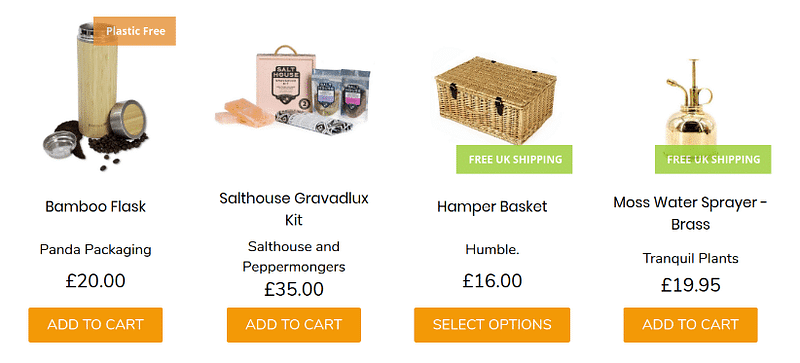
The humblemarket.co.uk online marketplace uses the “Rome” theme as a design template. However, not all features can cover every need. For the purposes of better UX & UI and on request from the owner, we changed the storefront view to adapt it for mobile devices. We put some changes on the homepage in the product blocks by adding a centered link with a vendor name to drive more traffic and engagement with the vendors’ pages and increase knowledge about makers with the customers.

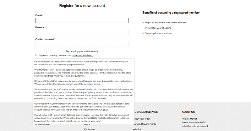
We made the “GDPR agreement” tooltip opening by clicking on the “Processed as follows” link on the “Checkout” and “Registration” pages. We limited the height of the pop-up box and added the scroll functionality. We disabled auto-checking of the “I agree” checkbox on the “Checkout” and “Registration” pages to make visitors perform this action consciously to avoid any misunderstandings in the future.

Results

A customized online marketplace with handy delivery options, informative banners, improved vendors dashboard, awesome donation functionality - everything looking as natural as the marketplace items by themselves.
"Wonderful, thanks for the quick turnaround. It looks great, let’s get it on and going!" said Daryl while letting us transfer one of his modifications. And we hope to continue transferring new bright ideas of the marketplace owner, so excited we are with his great missions that effectively work in the eCommerce environment.