Be the first to know!
So what’s hot in eCommerce technology development today? Having learned from mistakes with Millenials, online retailers are now better preparing for the next generation of shoppers – Generation Z.
We were discussing the growing power of Gen Zers and their shopping behavior in the interview with the owner of a new fashion brand.
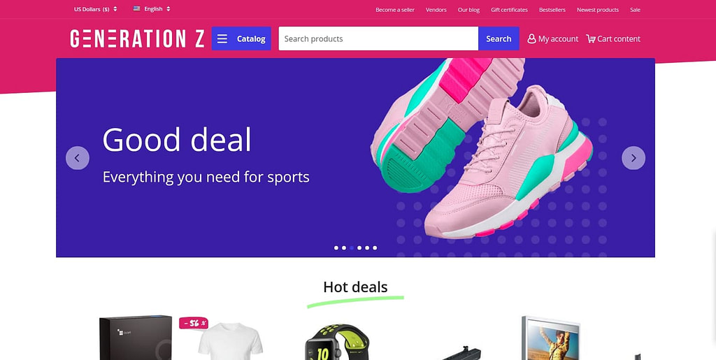
Today, we’re unveiling a new development we’ve been working on, a CS-Cart storefront theme that is specifically designed for selling to Generation Z, the Gen Z theme.
In this post, we will highlight terrific features of the Gen Z theme from the interview with Alexander Loginov, front-end developer at SimtechDev.
Designed for supreme customer experience
Alex, what exactly sparked the idea of creating the Gen Z theme?


Alex: We observed that customer design expectations in online shopping have evolved dramatically compared to the past few years, mainly because of the shift of generations. The eCommerce entrepreneurs needed something to aim the younger audience, known as digital natives, something simplified yet more effective.
In what way does this theme improve customer experience?
Alex: This time we had a fundamentally new approach to creating a theme. We had to keep in mind that this generation has grown up with immediate access to everything, therefore we started with addressing the most essential aspect of shopper experience – site navigation. We completely redesigned the hierarchy of product categories making more categories visible and accessible as customers browse.
Improved navigation:
- The catalog with product categories expands on button click and is now available next to the search bar,
- Interactive keyboard navigation on site,
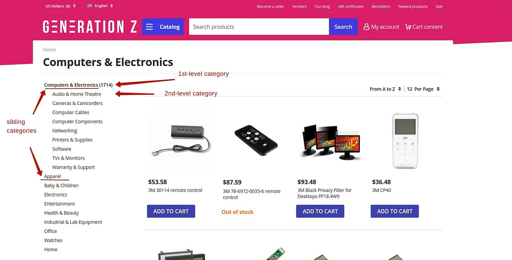
- The first-level category page now shows the number of products in the category, its sub-categories as well as sibling categories.


Alex: Our second goal was to give young consumers a cool mobile experience and here our main challenge was to enhance a product search functionality. We implemented a new scrolling pattern: the horizontal scrolling container used to display a set number of products and it wasn’t clear whether there are more products to see if you continue scrolling, now the scroll view prompts that there is more content to see. It does so by showing the product images picking out from the screen edges.


Improved mobile:
- New mobile layout templates for responsive design,
- Hamburger menu,
- Enhanced search functionality,
- Scrolling with a visual hint that a set of content is horizontally scrollable.
Designed for building brand recognition
Looks like the new theme will definitely simplify the lives of shoppers but is there anything to simplify the lives of store owners?
Alex: Setting up the look and feel of the page header with a chosen storefront theme was painful for many CS-Cart store owners due to limited possibilities of page layout block manager – blocks had fixed sizes. They had to request customization services to get the header the way they wanted. For the Gen Z theme, we have a new script that allows blocks of the header to be elastic – for example, when adjusting the size of the logo block, the size of the search bar block adjusts automatically to the changed size of the logo block, and there is no more need to request customization service to do that.


Alex: Apart from that, there are a number of fancy little things store owners will be able to do for their brand identity, like, changing the background image in the authorization form, setting icons for promotions, highlighting orders and many more.
Improved customization:
- Elastic blocks in the page layouts,
- Background image for sign in & authorization page,
- Icons for promotions,
- Different theme color schemes,
- Highlighting orders with different colors,
- Product images in orders,
- Manually and automatically closing individual notifications,
- The positioning of promotions applied to the order in the shopping cart.
Thank you, Alex, for giving our blog followers some insight into the new development of SimtechDev taking place.
And that is what we are up to!
If you are concerned about how to approach the next generation of shoppers, creating a compelling shopping experience is your ultimate goal. But you can do so much with your bare hands, you need a professional tool to power yourself with. The Gen Z theme was designed according to the behavioral patterns of Gen Zers, displays your store in the best light and engages wandering minds of your audience with visual stimuli, resulting in more conversion rates.
Be the first to buy!
The Gen Z theme is scheduled to be released at the beginning of November. Follow us and be the first to equip your business with the new innovative tool for future success!

