
Imagine that the magician asks you to take candy out of the bag. You shove your hand, and there are candy wrappers and only a couple of sweets. The magician created the illusion that the sack was full, but most of the sweets were up his sleeve.
Likewise, a product using dark patterns confuses the user. User thinks he or she is downloading the software, but ends up on an advertising page. Or rejoices in cheap TV, but stumbles onto a service fee when paying.
This article contains nine types of dark patterns with actual examples, which will help you figure out what it is.
How dark patterns work
Dark patterns are interface tricks that force the user to do something that the business owner wants. For example, subscribe to spam messages, order additional services or choose a more expensive product.
Dark patterns work because the brain is lazy and doesn’t always want to seek solutions. That’s why often people are guided by the opinion of the majority. Their choices are defined by discounts and limited offers.
Dark patterns draw mixed reactions. Someone thinks that such methods help to achieve goals faster: build a mailing list, increase conversions and profit.
Some business owners believe that dark patterns can harm them. For example, a person saw that today a subscription is at half price. And after payment it turns out that the discount is updated daily. When the user realizes being caught, he or she probably won’t want to come back. Some customers can also tell others about such a bad experience with your brand. People can shout out about it on Twitter using the hashtag #darkpatterns. In California, you can get a fine for dark patterns. Companies are prohibited to mislead users or entice personal information from them.
We have collected 9 types of dark patterns to explain how to avoid doing the same.
Bait and Switch
The user wants to unsubscribe from the premium subscription. The interface offers a button and
confirms that this is exactly what is needed for this. But the result is different, unexpected and unwanted – the payment page opens. Later on, it turns out that in order to refuse payment, it is necessary to click on a less obvious option.
The user runs a free trial, but the application withdraws the amount for a year, for example.
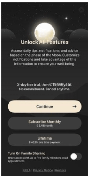
In MoonX, the user is immediately struck by the Continue button. In fact it is the annual subscription, as written below in the fine print. By choosing this option a person is redirected to the checkout page. Opportunities to purchase it for a month or for life are given to create the illusion that the main button does not lead to a subscription. You can leave the screen only by clicking on the almost indistinguishable cross in the upper right corner.
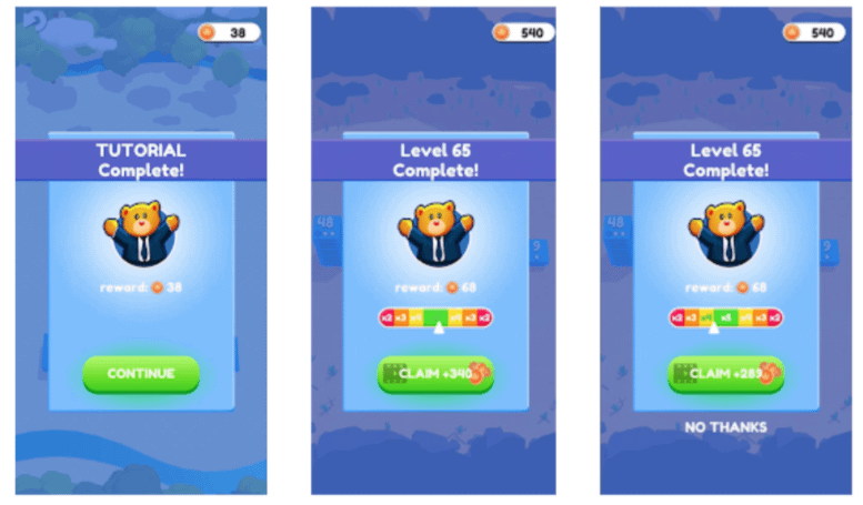
The City Takeover game has the “Continue” button at the end of each level. But in the course of the game, it is replaced by “Claim Coins”, a click on which launches ads. The real button to continue “No Thanks” appears later and it is not obvious that it leads to the next step.
It would be correct not to hide “Continue”, but to highlight two buttons: for viewing advertisements and continuing. A person would not be annoyed at trying to pull out money and enjoyed using the application.
It’s more honest not to put pressure on the user. If the product is of high quality, users may have
desire to support the developer – pay for a subscription or not skip ads.
Tricky questions
The user registers on the site and receives a question, reads it in haste and automatically unchecks the checkbox. When reading carefully, it becomes clear – by this action the user condemns him- or herself to receive emails. It was written about it, but not explicitly. People do not delve into cliche texts, and marketers use it.
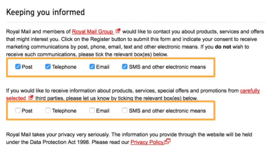
An example is the postal service Royal Mail. If you tick the checkboxes after the first paragraph, you will refuse to subscribe to the mailing. But if you do the same in the next block, you subscribe.
Another example is Currys PC World, a British hardware and electronics store. In their old registration form, checking the first checkbox meant refusing to send one type, and the second was consent to another type of mailing. The user will either automatically fill in both, or ignore it – and in both cases will subscribe to the newsletter. Few people read and understand that only the top checkbox needs to be checked.
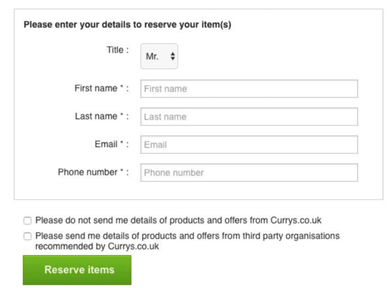
Currys PC World no longer uses this trick. To receive emails, you should activate the toggle switch.
Hidden Costs
The service does not mention additional spending: delivery or service charges.
The user proceeds with the checkout, but at the last step an additional expense comes up and it is impossible to refuse. The user would like to close the tab immediately, but has already spent effort and time to complete the path to the final step of the purchase. Therefore, leaving the site is psychologically much more difficult than if the user knew the real price from the very beginning.
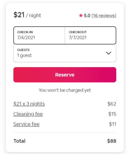
Airbnb, a real estate booking service, shows a price per day, but it does not add up over several days. If you expand the drop-down menu “Show price details ”, it turns out that there is a cleaning and service charge.
It would be correct to immediately clarify that $ 21 is not the final price, but only the fee.
Most likely, hidden costs will not force you to abandon the application if the person is ready to pay. But if more honest analogs of the product appear, then in the future the user may prefer them.
Confirmshaming
This pattern makes the user feel guilty for not choosing an option that is profitable for business. Making somebody feel guilty can be encountered when refusing tips or optional fees, creating a personal account, unsubscribing or deleting an account.
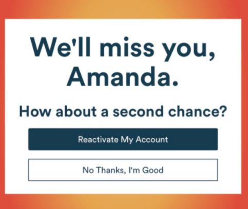
Gobble food delivery service really doesn’t like to part with customers. When deleting an account, a dialog box appears asking you to give a second chance.
One more way to make you feel guilty is to make an unpleasant choice.
To unsubscribe from the journal MadameNoire, you have to click “Nope, I don’t care enough”. The wording evokes emotions. Someone will unknowingly agree to the newsletter to avoid an unpleasant choice.
However, such manipulations can provoke someone to choose another service.
Roach Motel
A person registers in the application in half a minute – they just log in with any account. But when the user decides to delete the account, he or she falls into a trap. Going away from the application is very complicated so the user drops it. The design easily gets a person into the situation the business needs, but getting out is problematic. Usually the registration process is kept as short as possible, the opposite action is more difficult.
In Yandex Plus, you need to make two clicks to subscribe, while unsubscribing takes ten steps.
Read more about Yandex.Mail for Domain
A Spotify personal account is created in a minute. To delete, you need to log in to the browser.
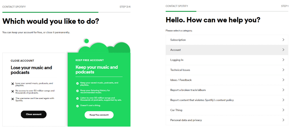
This will be followed by two blocks of questions – four and five steps each.
After that, you are sent an email which must be confirmed. If you do not do it during the day, the unsubscription process will have to start over. Not everyone has enough patience to bring the matter to the end. This degrades the user experience.
Aggressive attempts to hold the user may end up with the user leaving your service.
Fear of Missed Opportunity (FOMO)
A person visits the site, sees the timer for the promotion and thinks that this is a great reason to make a purchase. The purpose of this pattern is not to give time to weigh the pros and cons. If
the buyer was not in hurry, he or she would realize that the product is not worth buying. But the timer and the fear of losing profit prevents the user from refusing to purchase.
The educational resource Udemy offers to purchase a course at a bargain price on the last day of the discount. The offer is not unique, the banner is always there. But only the regular visitors know about it.
Another way to mislead is to create the illusion of huge demand. Service reports a shortage, and the user makes a hasty decision. The trick is used by hotel aggregators. They show how many people are browsing options together with you or have made a reservation. And the offer “Last Chance” can turn out to be untrue.
Disguised Ads
This pattern distracts the users’ attention from the desired link and forces them to click to the ad. There are harmless manifestations – advertising in a search engine. And there is also the most annoying manifestation of disguised advertising, when the site instead of the desired file slips garbage pages.
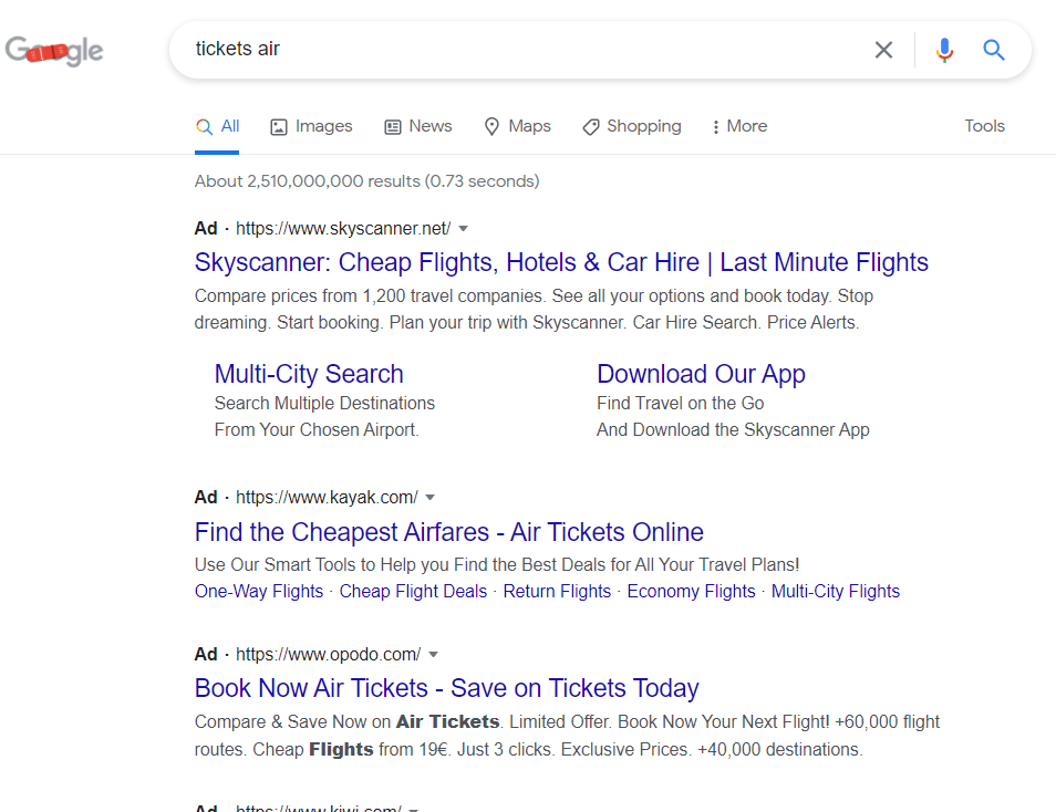
Advertisements in search results appear as query results. They are distinguished by a small mark. If a resource moves to the top of the search results with an increase in reputation and the quality of the content, then the places in the ad unit are bought to promote the site. When searching for a specific resource, you can get the first link and accidentally click on it.
Disguised Ads wastes time, leads to junk links and slips irrelevant results. This aggressive approach is intimidating.
Sneak into Basket
This pattern is similar to Hidden Costs. The user places an order, and then bears an additional expense. The difference is that Sneak into Basket allows you to cancel an extra service.
This is what the Shein clothing store does. Shipping is added at checkout guarantee. This is a very small amount that a person may not notice.
It’s unpleasant if, for example, a return guarantee was automatically added to the cost. It is more correct not to impose additional services, and let the user choose them independently.
Misdirection
Design in this pattern focuses attention on one object, distracting from another that you are looking for.
We are used to the fact that the button “Buy” or “Subscribe” is striking: it is large and contrasting. We usually don’t think that it’s contrast against the background of the “Cancel” button is a trick.
In any mailing list, the “Unsubscribe” button is at the very bottom, and the font size is small, it’s impossible to read it.
But some go further: Britishgas.co.uk hides it in the middle of the footer and does not highlight it with color, but only with an underline.
If the user is willing to spend money, then Misdirection can bring this moment closer. But if not, the user will be annoyed in vain.
Final Thought
For small businesses the use of dark patterns is a question of survival. They allow them to achieve their goals faster than ethical methods. If you are a young company that resorts to gimmicks, then after reaching your goals, try to get rid of them.
However, dark patterns negatively impact user experience and the brand reputation. Companies that use them will sooner or later have to think about what they sacrifice to get quick results.
And if you want qualitative growth, think about customizing the design of your site to stay apart from the default CS-Cart functionality, draw attention with custom styles, features and opportunities. We can help you with that. Our staff involves professional designers, front- and back-end developers. We can recommend the design that will help you to make your website visible for visitors, and let them want to stay with you without tricky methods.