
When creating a website, you often have to make a tradeoff – either make a beautiful design, or work on a high conversion rate and purchases. Combining these two in one is not the luck, but a wise approach to all the aspects of the website design. We have divided common mistakes in web design into seven blocks:
- Poor design
- Typography
- Content
- Usability
- Navigation
- Graphic and images
- Legal docs
With these aspects treated carefully, your online store and marketplace has no chance to lose customers.
Poor design
1. Why use Responsive Design when most people browse from PCs
A site that looks the same on all devices converts better into purchases. Of course, from the point of view of design, this is a big, difficult job, but it makes sense to start it when you work for an audience of different ages
According to Google, nearly 75% of users start their day by consuming information on one device and end on another. Therefore, it is important to consider the specifics of cross-device marketing, at least superficially.
Also, based on the recommendation of the Google team, a responsive site with cascading style sheets (CSS) appears higher in the search query.
Read on
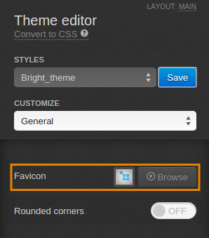
2. No favicon or standard favicon
People often create many tabs while browsing the site. Some users leave them open to view later. Favicons (icons in the browser) give visitors a visual cue they need to navigate and return to a tab while browsing.
3. 404 error pages
404 pages are silent traffic killers. According to the independent American company Zona Research, three and a half thousand users (37% of the total number of respondents) do not even try to take any action to eliminate this problem.
Such pages can be called dummies. They only issue confirmation that the object does not exist. You can get to them if the person entered the wrong address or did not find the product. In this case, it is very likely that the user will not want to come back and leave the site.
What can keep a user at 404? A beautiful conceptual design or built-in useful functionality – a search bar or suggestions for other products.
4. Your page has a carousel
The carousel itself is not terrible. But it can become a problem when automatic scrolling starts. It kills conversion, because the banner is no longer perceived, but looks more like an advertisement. The person just doesn’t see the message they want.
Carousels are annoying, distracting from the main target action.
5. Your site takes a long time to load
Google’s Core Web Vitals are the latest initiative aiming at improving user experience with sites. It contains the basic metrics that show how good your site is performing in terms of user-friendliness. A peculiarity of the initiative consists in the main focus on mobile representation of your page. Google distinguished three core vitals to define the ranking:
- LCP or Largest Contentful Paint gives you a clue about the loading time of your main content (like images and text blocks) to appear on the users’ screens. It should be kept from 2.5 (or less) to 4 seconds.
- FID or First Input Delay measures interactivity: how quick is your page responding to user actions (like clicks or keystrokes). These metric limits are from 100 ms to 300 ms.
- CLS or Cumulative Layout Shift tells about the visual stability. Does your page have some shifts of visual elements (like fonts, images, buttons, or contact forms) while loading? Take an example of a “Buy Now!” button that may move after a customer click making him press another button or an empty space. It can turn into cancelling the order and a bad user experience with your site.
Google’s report for Core Web Vitals can be found on Search Console. After you defined the drawbacks and fixed them, you can dive deeper with PageSpeed Insights and Lighthouse to further refine your store issues that you’ve uncovered before.
More to read on the subject
6. Slow server response time
If you’ve optimized your web pages for speed, but the server is taking a long time to respond, your website will still be slow. Google strongly recommends reducing server response times to 200 milliseconds or less.
And there are many reasons for this:
- unoptimized logic,
- slow database queries,
- frameworks and libraries,
- poor processor capacity,
- lack of memory.
Consider reading
Typography
7. Unreadable font
Italics and handwritten text are very difficult to read. Do you understand what is written on the page? Fonts that cannot be read on the first try cause confusion.
8. Bad kerning
Kerning is the decrease or increase in the distance between the letters. Leave more space between words and lines. The text should “breathe”. Ease of reading is very important.
9. Use of multiple fonts
If you use a large number of different fonts, users will be confused. Visitors will be distracted by the presentation instead of focusing on the message you are trying to convey.
Changing fonts repeatedly decreases cognitive fluency. That is, you start reading the text at a certain speed, but at the same time you have to sometimes stop and read the details. This is not the best way to attract a customer.
A good rule of thumb is to use no more than three fonts. But there are exceptions. If you’re not sure, it is better to audit your website UX/UI with professional designers.
You may be interested in
Content
10. Content for the sake of content
Inexperienced marketers usually create content that is not useful to the client, but focused on their own goals. It does not take into account the desires, goals, problems, fears of the target audience. Therefore, the low level of trust in such text makes it difficult to convert visitors to customers.
11. Your content is not readable
According to research by Nielsen Group, users view 28% of the text on average on a web page.
Does this mean that you should reduce the amount of content? No, that means you need to focus on creating content that is easy to scan. What should it contain?
- descriptive headings,
- short paragraphs of two to three sentences,
- important information that is highlighted (using bold type or numbered/bulleted lists).
It is this kind of content that is better read and perceived by users.
12. Lack of space
With the proper highlighting, spaces will increase perception and readability of the text. When there are few of them, the content becomes difficult to understand.
Spaces are meaningless. While it might make sense, it doesn’t live up to the expectations of your site visitor.
13. Poor grammar
We all make grammatical mistakes, and most users do not focus on this. But gradually “grammatical blindness” can arise. And you no longer understand why your text is not read to the end, but simply scrolled. Your site trustworthiness disappears and conversion gets lost.
Usability
14. Ignoring user questions
Site visitors often ask questions. If the administration ignores their requests or refuses to give a detailed answer, then they leave.
FAQs vary depending on the topic of your site. But there is a list of questions that need to be answered.
- How can I contact your company?
- What is the price of your products and services?
- How can I exchange or return a product?
- What is your privacy policy?
- What are the delivery terms?
- Why should I choose your product or service? Why are you better?
Such questions convert visitors into subscribers, who later become buyers.

15. Bad search
Visitors, especially in eCommerce, use the search bar to find the desired product or service on the site. Search is the tool helping visitors navigate large and complex sites. An excellent search engine is considered if it can process:
- typos,
- plural,
- hyphens,
- keywords.
Sorting results by keywords and queries is useless. If your site needs a search engine, make sure it prioritizes the best or most relevant results for each query.
Navigation
16. Change the color of the tabs viewed
Users need to understand where they are now and where they have already been. This is important in order to exclude pages that do not give the desired answer. Different colored tabs will help the user navigate on your site.
17. Centering the logo kills site navigation
Research by the Nielsen Norman Group found that it is six times more difficult for visitors to find a homepage in one click on sites with centered logos. Why is it important for visitors to return there? This is one of the first places they go when they get lost or disorientated on your site.

18. Transparent navigation bar or menu
It does not answer the question “Where am I?” It helps you better navigate on the page.
An opaque or transparent navigation menu makes it clear:
- Better orient users;
- Does not clutter the screen or obstruct other information.

19. Flashing and flickering content
Flash navigation is a conversion killer. Visitors spend time trying to figure out how to use it when they need to look for answers to questions. Most visitors are annoyed when, instead of a clear answer, they have to look at blinking icons or moving people. They usually just leave the site.
Graphics and images
20. Stock images
Stock images from open sources reduce understanding and meaning. Therefore, if you run a blog on your eCommerce site, it is better to use a unique photo or select stock images clearly assessing their relevance to your post. Otherwise, you risk losing the visitor.
21. Poor scaling
A stretched or low-quality image looks cheap. By using low-quality images, you are pushing the user into distrust. Even if the site contains useful content. Large images can also increase loading times. A good rule of thumb is to match images to the size they will appear on your site
Further reading
22. Lack of metadata
Digital cameras retain a lot of useless metadata. File names (e.g. PH00017.jpg) do not help visitors or search engines. Better to give a clearer name.
23. You got addicted to Javascript
The design of your site, individual web pages, and basic functionality should not be compromised if visitors choose to disable JavaScript.
24. No images or even photo compression
Image files contain a lot of redundant information. Image compression removes all unnecessary without loss of quality.
Tip: our Hosting clients get image optimization on the server on a complimentary basis.
25. Lack of caching in the browser
By enabling browser caching, your web pages load faster. Caching first loads files and resources and then stores the data on the hard drive. Images will load faster from your hard drive than from a web server.
Tip: for Cloud Hosting customers, all long-term payments come with a built-in extended cache plugin.
26. CSS, HTML or JavaScript have not been minified
Compressing the code improves the overall performance of the site by removing unnecessary characters.
Legal docs
27. Lack of privacy policy
One independent research center has learned from the Americans what they know about the privacy policy. It turned out that 50% don’t even know what that means. Can you say that no one cares where your personal information goes?
Not really. Users understand the meaning, but do not go into details. It is important for them to know that there is a certain plan of action if something goes wrong.
28. No Warranty
Make it clear to visitors that you are always ready to help them in case of controversial situations. It is necessary to convey to them that you have an algorithm of actions, and you adhere to it.
Therefore, the more comfortable it is for customers to work with you and even take risks, the more likely it is to turn them into super loyal customers.