Your website is often the first interaction that potential customers have with your business. Just like fashion and technology, websites need regular updates to stay relevant, engaging, and functional. An outdated website can lead to poor user experiences, lower search engine rankings, and lost sales opportunities. This article explores why a website makeover or relaunch is not just beneficial but essential for businesses striving to maintain a competitive edge in eСommerce.
Signs a website is outdated
An outdated website can damage your reputation and hurt your profits. Identifying signs that your website needs an update is the first step toward a successful makeover or relaunch.
Low conversion rates and lack of leads
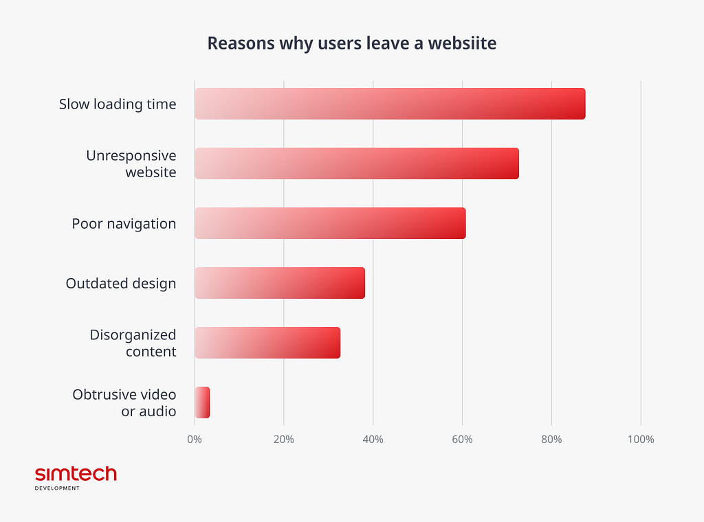
Low conversion rates and a lack of leads are often indicators of underlying problems. Analytics can reveal a lot about your website’s performance. A high bounce rate means users leave your site quickly, likely due to poor design, slow load times, or irrelevant content. A low conversion rate suggests visitors aren’t completing purchases, possibly due to a lack of trust, or a complicated checkout process.
It’s hard for users to navigate the website
Your website should help visitors find the information they need quickly and easily. If analytics or a website audit show that users are getting lost or giving up, it’s time for a redesign or at least a sitemap refresh. If users struggle to find products or information, they’ll likely abandon your site for a competitor’s. Modern users expect pages to load within a few seconds, so slow load times can lead to high bounce rates and lost sales. Modern design favors clean, minimalist layouts that highlight products. A cluttered layout can overwhelm and confuse users.
Lack of modern features
Problems also arise when your website can’t support new developments. For instance, if your website only has product descriptions but you want to add an eCommerce module, you may find it easier to build a new website than improve the old one. Modern platforms use AI to offer personalized recommendations and experiences. A lack of personalization can result in missed sales opportunities. Social media integration allows for seamless sharing and engagement. Customers expect a variety of payment options, including digital wallets and buy-now-pay-later services. Limited options can hinder sales.
SEO performance issues
Staying on top of search engine results requires constant technical adjustments and content updates. Many CMS systems make it easy to set metadata without needing to change the code. If you don’t have a CMS, you might need help from professional web developers.
Search engines value fresh and relevant content as a ranking factor. To stay on top, you need to regularly add new content. The easiest way to keep your site fresh is by maintaining a blog.
Outdated websites often suffer from poor SEO performance, evident through low search engine rankings and content that is not optimized for relevant keywords and user intent, which can hurt your site’s searchability.
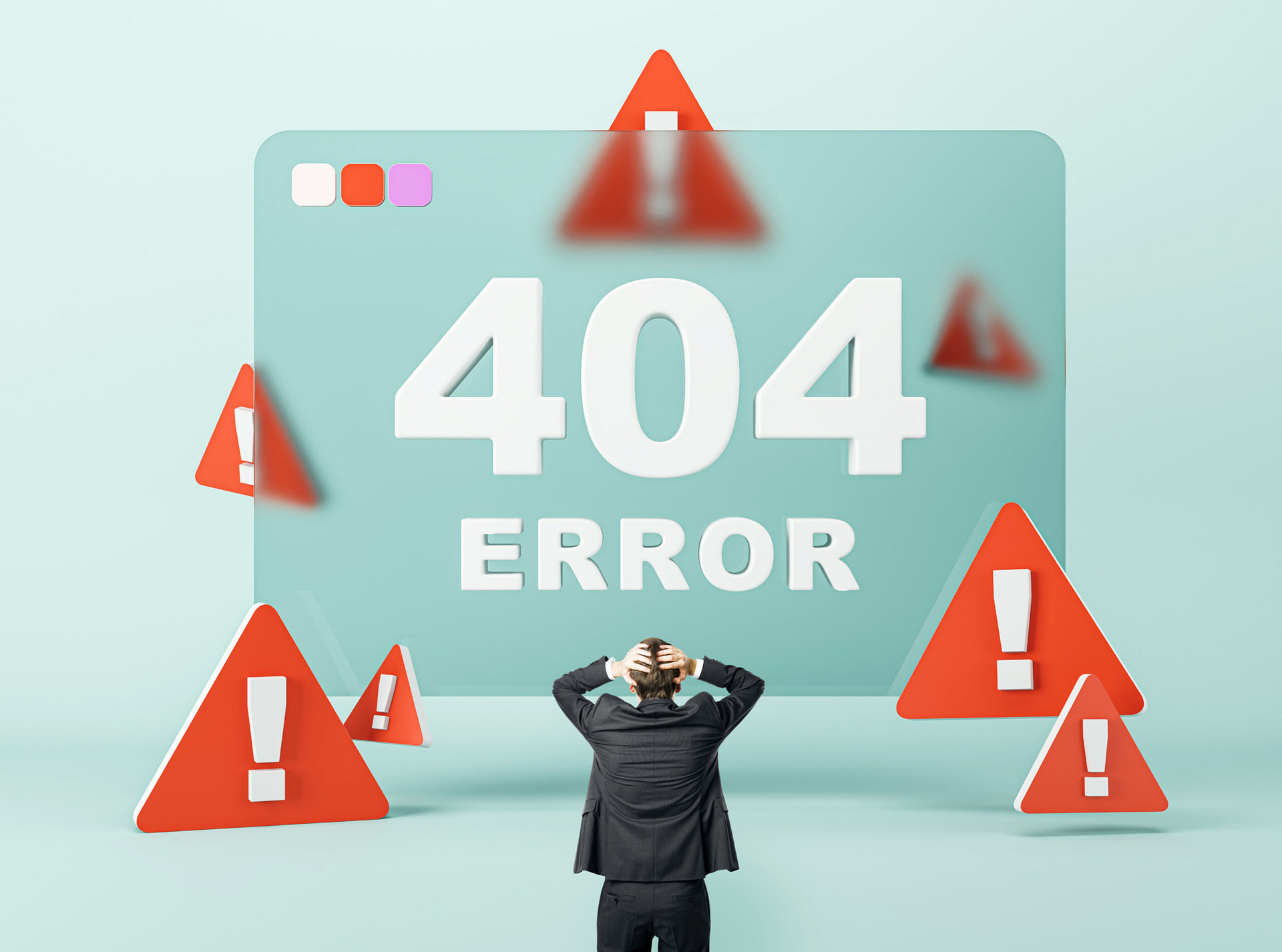
Broken links and 404 errors not only frustrate users but also negatively impact SEO rankings.
Design is not optimized for mobile
With increasing visits from mobile devices, it’s essential that your website meets mobile users’ needs. If your site doesn’t leverage responsive design, it’s not mobile-friendly. A regular website may not suffice for mobile visitors, who expect the same user experience as on a desktop. You can also create a separate mobile web without rebuilding the old site. Understanding the difference between responsive web design and a mobile web is crucial and one of the most valuable web design tips for creating a user-friendly site.
Read more:
- 10 Ways to Build Trust in eCommerce
- Why Do Your Customers Leave? 5 Common Mistakes of eCommerce Website Owners
- How to Optimize an eCommerce Website for Mobiles: Looking for an Optimal Solution
Websites that need improvement
Understanding the distinction between a dated and an outdated website is crucial for eCommerce businesses aiming to stay competitive. While both types may benefit from improvements, their specific needs and the urgency of those needs can differ. To determine whether a website is dated or outdated, eCommerce businesses should conduct a thorough audit, focusing on key areas such as:
Dated websites: when a refresh is enough
A dated website typically features design elements and functionalities that are no longer in vogue but are still fundamentally sound. These websites may not be leveraging the latest trends or technologies, but they are functional and provide a satisfactory user experience. Key characteristics of a dated website include:
- Basic functionality. The website works well without major issues, but it lacks modern enhancements.
- Acceptable user experience. While the user experience might not be cutting-edge, it is still adequate and doesn’t frustrate users.
- Stable performance. The site loads at a reasonable speed and is stable, with minimal downtime.
- Security Measures. Basic security measures are in place, though they may not be the most up-to-date.
For dated websites, a refresh can be sufficient to bring them up to modern standards. This might involve:
- Updating visual design. Modernizing the visual elements such as fonts, colors, and graphics to align with current design trends.
- Enhancing UI. Streamlining the UI to make it more intuitive and user-friendly.
- Integrating new features. Adding new features like live chat support, updated payment options, or social media integration.
- Improving content. Updating and optimizing content for SEO to boost search engine rankings.
Outdated websites: when a relaunch is necessary
An outdated website, on the other hand, suffers from significant issues that impede its functionality. These websites not only look old-fashioned but also perform poorly and fail to meet modern standards. Characteristics of an outdated website include:
- Poor functionality. Frequent errors, broken links, and outdated plugins that hinder usability.
- Negative user experience. Slow load times, non-responsive design, and confusing navigation that frustrate users.
- Performance issues. Regular downtime, slow server response times, and poor performance metrics.
- Security vulnerabilities. Lack of HTTPS, outdated security protocols, and non-compliance with data protection regulations.
For outdated websites, a complete relaunch is often the best solution. This involves:
- Redesigning from scratch. Creating a new design that is visually appealing, responsive, and aligned with current trends.
- Rebuilding Infrastructure. Updating the underlying technology stack, including CMS, plugins, and themes, to ensure optimal performance.
- Enhancing UX and UI. Implementing a user-centered design approach to create a seamless user experience.
- Strengthening security. Implementing the latest security measures, such as HTTPS, secure payment gateways, and compliance with data protection regulations.
- Optimizing for SEO. Ensuring the new site is fully optimized for search engines to improve visibility and attract organic traffic.
Benefits of a website makeover
Investing in a website makeover can yield significant benefits for e-commerce businesses. An updated, modern website can enhance user experience, boost search engine rankings, and ultimately drive more sales. Here are the key advantages of a website makeover:
Higher conversion rates
A website makeover can significantly boost your conversion rates by creating a more seamless and persuasive shopping experience.
- Optimized checkout process. Streamlining the checkout process reduces cart abandonment and encourages more completed purchases.
- Enhanced CTAs. Strategically placed and visually appealing CTAs can guide users towards desired actions, such as signing up for newsletters or making a purchase.
- Trust signals. Updating security features and displaying trust badges can increase consumer confidence, leading to higher conversion rates.
Competitive advantage
A modern, well-functioning website can give you a significant edge.
- Differentiation. A unique and engaging website sets you apart from competitors, attracting more customers.
- Adaptability. An updated website is better positioned to adapt to future trends and technologies, ensuring long-term competitiveness.
Customer loyalty
A positive user experience leads to higher customer satisfaction and loyalty, driving repeat purchases and referrals.
- User-friendly interface. A user-friendly interface encourages users to return, increasing customer retention.
- Positive impressions. A modern website creates a positive impression, leading to higher customer satisfaction and word-of-mouth referrals.
Improved UX
Enhancing the user experience is a primary goal of a website makeover.
- Increased engagement. A modern, visually appealing design keeps users on the site longer, exploring more pages and products.
- Simplified navigation. Improved navigation structures make it easier for users to find what they’re looking for, reducing frustration and bounce rates.
- Faster load times. Optimizing for website speed ensures that pages load quickly, meeting user expectations and reducing abandonment rates.
Better mobile performance
With a growing number of users shopping on mobile devices, optimizing your website for mobile is crucial.
- Responsive design. A responsive design ensures your website looks and functions well on all devices, from desktops to smartphones.
- Mobile features. Implementing mobile-friendly features, such as simplified navigation and touch-friendly elements, enhances the mobile user experience.
Enhanced SEO
A website makeover can greatly improve your SEO, leading to higher rankings and more organic traffic.
- Improved site structure. A clear, logical site structure makes it easier for search engines to index your site.
- Fresh content. Regularly updating content and integrating relevant keywords with the help of a SERP API to boosts your site’s SEO performance.
- Technical SEO improvements. Addressing technical issues, such as broken links and slow load times, can improve your search engine rankings.
Modern design
A website makeover allows you to refresh your design and branding to stay current with industry trends.
- Consistent branding: A cohesive and modern design reinforces your brand identity and creates a memorable user experience. A great branding team can ensure every visual element aligns perfectly with your brand’s message and values.
- Updated visuals: High-quality images, videos, and graphics enhance the visual appeal and professionalism of your site.
- Keeping up with the trends: Staying updated with design trends ensures your website feels contemporary and relevant.
New features and technologies
The latest features and technologies can significantly enhance functionality and user experience.
- Personalization. Implementing AI-driven personalization can tailor the shopping experience to individual users, increasing engagement and sales.
- Social media integration. Integrating social media platforms allows for seamless sharing and interaction, expanding your reach.
- Advanced analytics. Upgrading analytics tools provides deeper insights into user behavior and site performance, informing future improvements.
Do you need only a homepage redesign or a full website relaunch?
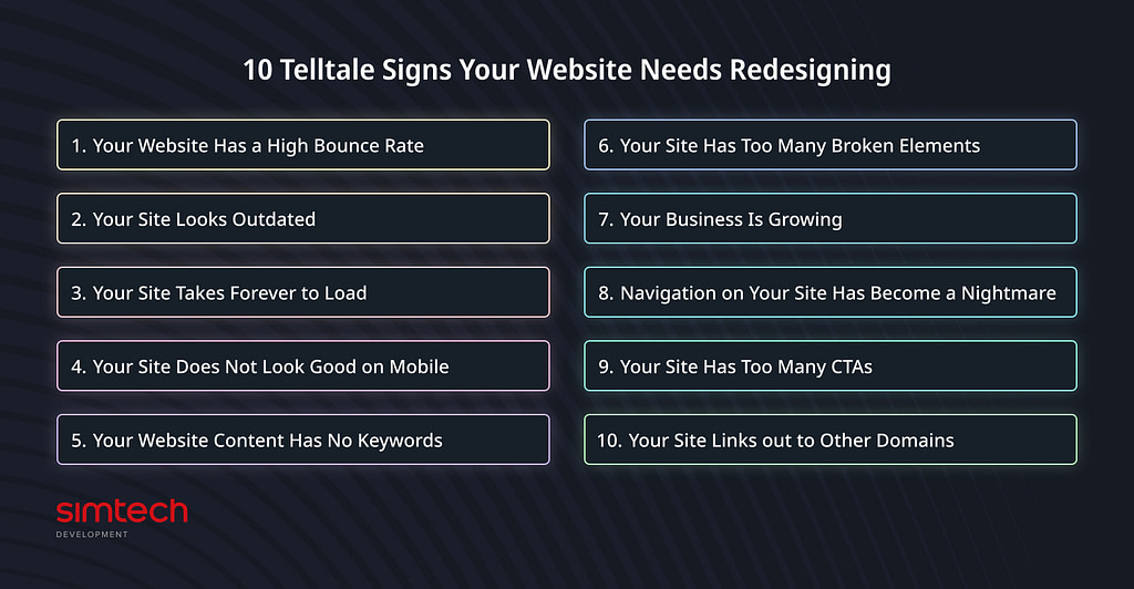
Determining whether your website needs just a homepage redesign or a full relaunch requires a thorough evaluation of its current state and your business goals. A homepage redesign can be an effective solution if the rest of your site is performing well, both functionally and aesthetically. This approach is typically quicker and more cost-effective. If your homepage looks outdated, has poor navigation, or doesn’t reflect your brand accurately, a redesign can freshen up its appearance and improve user engagement. This targeted change can boost the first impression your site makes without the need for a complete overhaul.
However, a full website relaunch becomes necessary when issues extend beyond the homepage. If your website suffers from slow load times, poor mobile responsiveness, outdated design across multiple pages, or lacks modern features, a comprehensive relaunch is the best course of action. A relaunch allows you to address these issues holistically, ensuring that every aspect of your site meets current standards and user expectations. It’s also an opportunity to rebrand, incorporate new functionalities, and improve the overall user experience.
When considering a full relaunch, evaluate your website’s performance, user feedback, and analytics. High bounce rates, low conversion rates, and user complaints about navigation or speed are clear indicators that a relaunch is needed. Additionally, if your site’s technology is outdated, making updates and maintenance more challenging, a full relaunch will allow you to adopt more modern, efficient systems.
Website redesign strategy, goals, and process
Website redesign requires a clear strategy, defined goals, and a structured process. The goal is to enhance user experience, align the site with current trends, and ensure it meets business objectives. The process typically involves six key steps.
- Conduct a comprehensive audit of your existing site to identify strengths and weaknesses. This includes analyzing user behavior, site performance, and technical aspects. The audit helps pinpoint areas needing improvement and informs the redesign strategy.
- Define your redesign goals. These should be specific and measurable, such as reducing bounce rates, increasing average session duration, or boosting sales. Clear goals provide direction and focus throughout the redesign process.
- Create a detailed plan outlining the redesign’s scope, timeline, and budget. This plan should include a sitemap and wireframes to visualize the new structure and design. Having a well-thought-out plan ensures the project stays on track and within budget.
- Develop and design the new site. This phase involves creating visual designs that reflect your brand and appeal to your target audience, followed by developing these designs into a functional website. Prioritize user experience by ensuring intuitive navigation, fast load times, and mobile responsiveness.
- Thoroughly test the new site before launch. This includes usability testing, performance testing, and ensuring all links, forms, and functionalities work correctly. Testing helps identify and fix issues before they affect users.
- Launch the new site and monitor its performance. Use analytics to track key metrics and assess whether the redesign meets your goals. Be prepared to make ongoing adjustments based on user feedback and performance data to ensure continuous improvement.
Case study
Shopmundo
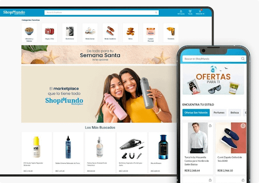
Shopmundo is the Dominican Republic’s first multi-product eCommerce marketplace, setting the standard for online shopping by offering user-friendly technology for merchants and seamless shopping experiences across devices. The owners faced slow website performance and frequent errors, leading to customer complaints and lost revenue. While they had plans for future improvements, their immediate need was to resolve these critical issues. Our team conducted a performance audit and fixed key bugs, including issues with the VisaNet payment system and promotional code mechanics. We also implemented custom features like one-click purchasing and a virtual wallet. To address mobile shopping needs, we launched a PWA application, offering a cost-effective alternative to a mobile app.
Key takeaways
- Recognize the signs of an outdated website. Regularly evaluate your website for indicators of being outdated, such as slow performance, high bounce rates, and security weaknesses. Staying proactive helps you maintain a competitive edge.
- Distinguish between dated and outdated. Understand the difference between a website that needs a design refresh (dated) and one that requires a complete overhaul due to fundamental issues (outdated). A dated site might only need aesthetic updates, while an outdated one may have deeper, structural problems that hinder performance and user experience.
- Identify how you ended up with an outdated website. Several factors can lead to an outdated website: rapid technological advancements, neglect, shifting user expectations, business growth, lack of strategic planning, budget constraints, and the complexity of redesign projects.
- Consider the benefits of a website makeover. A website makeover can significantly enhance user experience, increase conversion rates, improve mobile performance, boost SEO, modernize design and branding, integrate new features, enhance security, increase competitive advantage, and elevate customer satisfaction and loyalty.
- Decide between a homepage redesign and a full website relaunch. Assess your website’s current state, performance metrics, and user feedback to decide if a targeted homepage redesign is sufficient or if a comprehensive site-wide relaunch is necessary.
- Follow a structured redesign strategy. Establish clear goals, conduct thorough research, engage stakeholders, and follow a systematic process for your website redesign.
Conclusion
Determining how often to update your website depends on its needs and the expectations of your customers. While minor updates might be necessary weekly or monthly, a complete overhaul is typically recommended every two to three years. The focus should be on responding to current needs rather than adhering to a specific timeline. If your website isn’t meeting its goals, it’s time to consider a revamp.
If you recognize any of the issues mentioned, it’s a clear sign that your website is outdated. You may not need to start from scratch, but it’s crucial to address the errors and maintain your website at an optimal level.
A well-executed website makeover can transform your e-commerce platform, leading to better user experience, increased conversions, improved SEO, and a stronger competitive position. By following a strategic and systematic process, you can ensure your website meets current standards and sets the stage for future growth and success.
