The beginning of 2020 was quite an ordeal for small and medium-sized businesses. It took flexibility, imagination and foresight from specialists who are responsible for communication (marketers, SMM, designers and PR managers).
Situational PR and marketing has become, perhaps, the main trend in communications. How to make people talk about your product or brand when the attention of millions is drawn to lockdowns or ecology? What kind of communications (email, social platforms or local marketing) should you bet on with a limited budget? The answer lies within visual communication. This post guides through some of the most prominent examples of the new trend.
Images and PR instead of advertising
You will be disappointed: Millennials, the most “buying” social group in 2020, are deaf to promises, advantages, and benefits. They are incredulous. To sell something to millennials, you need to make the brand their friend. Affiliate marketing is the perfect fit for that job, but not only.
Socially responsibility is a trend that should be followed in all your visual communication, including creating an account on social networks, building a website, and product packaging.
Take the example of UrbanKissed.


This marketplace promotes its values through Plant a Tree popup and illustrated articles telling about the brand values and demonstrating their social responsibility.
Tip: Promote brand values, not products!
Mobile-first approach
According to BroadBandSearch, in 2019, almost 56% of internet traffic came from desktop users, and over 40% was consumed through smartphones and tablets. This year, the percentage of information consumption using mobile devices continues to grow. In some niches (for example, in retail or entertainment), the ratio of mobile to desktop traffic reaches ten to one.
Vertical images (photos, diagrams, videos, or interactive objects) drive conversions, whether they are images for a corporate website or emails. The layout of such products can be adaptive, but the basic version is always mobile.
Tip: Give preference to vertical images!
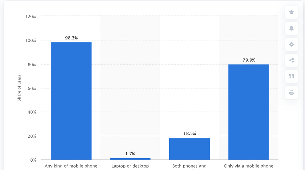
If Facebook or other social media is your main channel for communicating with your audience, here’s another argument for vertical visuals. 79,9% of Facebook users in October 2020 used exclusively mobile devices.

Openness is a new standard
In 2020 conventional ways of marketing became ineffective. It’s time to forget about visual forms with an emphasis on the beneficial properties of your product. Dedicate videos, photos, and custom graphics to where your brand really lives. The inner life of the company, the relationship between employees, funny stories about how you work on new products are topics worth illustrating today.
Problem cases and people’s stories deserve special attention. If your company has experienced a setback, be honest about how you go through get out of a sticky situation). Negative feedback and honest opinion (forget about formal responses!) can also become a topic of discussion.
The request implied redefining the whole checkout process. Our CTO, Sergei Minyukevich, personally got in touch with Matt and confessed: ‘My professional recommendation is not to proceed with this customization. The current request would require serious customization to move checkout into a pop-up. Additionally, even such a customization would be designed as an add-on it would have minimal compatibility with future upgrades. Moreover, I failed to find any professional article proved conversion rate by having a popup in the checkout’.
User Case: AreaSafe
Tip: Give the floor to your employees, apologize for mistakes and share small favors with your clients!
Video and motion graphics instead of static images
To say that the intensity of information consumption on the Web is increasing every year is to say nothing. A modern user spends more than 450 minutes in media all day and manages to consume one post on social networks every three seconds.
Brands only have a few seconds to convey a message to a potential client.
It is easy to guess that pictures do their job much more efficiently than text, and dynamic pictures are more effective than the static ones. An important nuance: even if you explain something to the user in a few seconds, this does not mean that he will remember you or your message for a long time.
Dynamic images and visual content that you can interact with increases the chances of long-term contact with the user, and, therefore, that you will remain in their memory. Not surprisingly, Facebook, Instagram and YouTube are the fastest growing social networks in the world in 2020.
Tip: Invest in content where the main idea can be captured in seconds and watched for hours!
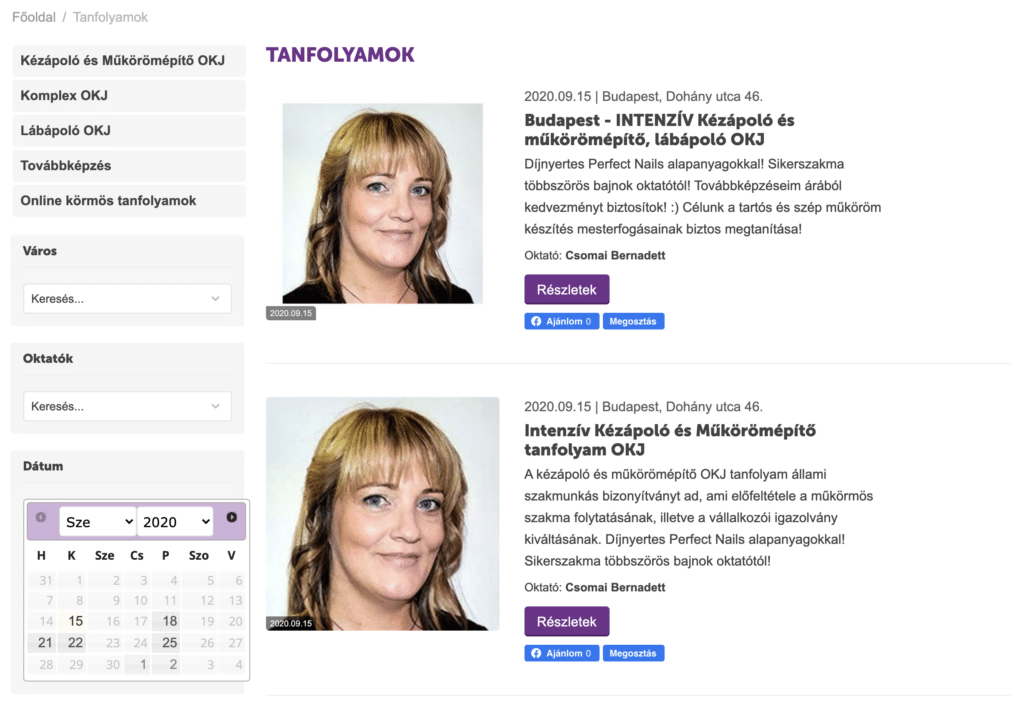
One of our clients uses the YouTube channel to promote nail courses. Perfectnails integrated the YouTube channel into their CS-Cart website calendar to increase comfort of users.

If you’ve been dealing with static illustrations only up to this point, start experimenting with gif animation based on your familiar static content. Integrate micro-animation into email campaigns and use dynamic graphics on your website.
Read more about 3D images for CS-Cart
UGC and interactive visual forms
User-generated content (UGC), the content created by users themselves, is the essence of any social network. However, it wasn’t until 2020 when it became apparent that Stories and other posts from users (not necessarily top bloggers) could be an alternative to traditional advertising. The thing is that a company encourages its subscribers to publish content related to the brand, and then shares it on its official page.
Tip: Communicate with users always, use user content for promotion based on it!
For example, Crocs’ #ThousandDollarCrocs TikTok Challenge generated over 3 billion videos. Its gist was to invite subscribers to film a video presentation of their customized Crocs.
Read more how to add a TikTok icon to your CS-Cart store
All the CS-Cart users can showcase their Instagram feed including those posts that were shared by users. Fetching content from social media accounts helps retain visitors on your platform and lead them further to a purchase.
Learn more about social media campaigns
Key takeaways:
- Check how your visual content is displayed on mobile devices (vertical orientation).
- Define the social mission of the brand and find its reflection at the level of branding, style, themes and illustrations.
- Dedicate brand messages to the lives of employees, the manufacturing process, and user stories.
- Make visual content dynamic (gif animation, video or interactive story).
- Communicate with customers and encourage their initiatives to build a community around your brand.
Interactivity, openness, humanity and dynamics – these are the principles that we advise you to follow when creating visual content. And to speed up the production of banners and other products, we recommend addressing pros. At Simtech Development, we assist in designing a project from scratch, customizing and maintaining the overall project.

