In this article, we have collected the most popular features that our customers ask for when customizing their jewelry online stores and marketplaces.
Why You Should Sell Jewelry Online
Selling jewelry online can be a great way to reach a larger audience and potentially make more sales. By choosing to sell jewelry online, you can showcase your goods to customers all over the world, rather than just those in your local area. Additionally, online platforms often have lower overhead costs compared to physical stores, allowing you to potentially earn higher profits. Online marketplaces also offer various tools and resources to help you market and sell jewelry effectively.
Top 10 Jewelry Ecommerce Stores and Marketplaces
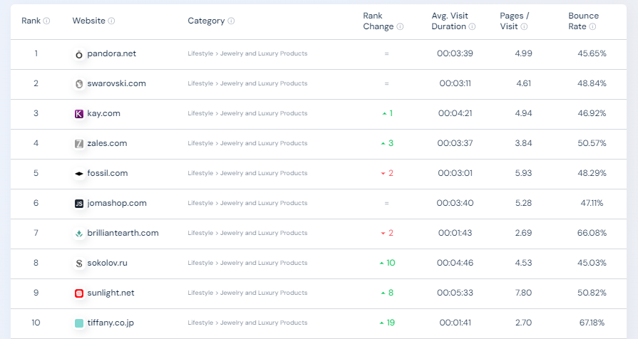
Source: SimilarWeb, January 2024
For the U.S. this list is composed by:
- brilliantearth.com
- jomashop.com
- kay.com
- pandora.net
- zales.com
Jewelry eCommerce specifics
- According to Statista, the most revenue of the jewelry market was generated by Asia Pacific, specifically, by China. Other countries leading in jewelry sales include the Middle East and Africa, Japan, India, France, and Italy.
- According to National Jeweler, people buy gems and luxury items for one of the reasons: to get exactly what they want, to celebrate a milestone, to commemorate a special occasion (a trip, for example).
- Forbes states that the jewelry market audience is mostly women (+70%). They usually buy precious items for themselves.
Must-Have Feature for a Jewelry Ecommerce Site
Incorporating these must-have features into your online store can help you provide a positive user experience, build trust with customers, and increase sales.
Responsive theme and mobile website version
In any eCommerce there are basic components: a home page with promos, a catalog with filters, product cards with photos and descriptions, a shopping cart, payment and delivery options. And if everything is almost the same, then why do users squeal with delight from one online store and order in it again and again, and from the other one they are sick of their hearts?!
The whole question is in the UI, the user interface – if it is thought out to the smallest detail, then it is convenient to use the site. And the first thing that even Google’s algorithms are now paying attention to is whether there is a mobile version of the site. In the field of jewelry, it seems that everyone understands that people now do not let smartphones out of their hands. Thus, mobile responsiveness is the key in jewelry eCommerce. That’s why using a reliable website builder that supports responsive themes and mobile optimization can make all the difference in delivering a seamless shopping experience.
Read more:
- How To Optimize An eCommerce Website For Mobiles: Looking For An Optimal Solution
- Why Do Your Customers Leave? 5 Common Mistakes Of eCommerce Website Owners
Geolocation
Ability to select a city that determines the availability of products and the possibility of delivery or pickup in that place is one more feature your jewelry online store or marketplace offers.
Content and User Profile
An option to create a personal account on the site and the existence of a blog containing engaging and valuable content are the most fundamental factors in choosing your content among other web pages.
Personal accounts and blogs are essential for jewelry online stores for several reasons:
- Personal accounts allow customers to save their preferences, track their orders, and receive personalized recommendations, creating a more personalized shopping experience.
- Blogs provide a platform for sharing information about jewelry trends, care tips, and styling advice, which can help educate and engage customers. This can also help drive traffic to the website through valuable content and improve search engine rankings.
Both personal accounts and blogs can help build a sense of community and trust, as customers can interact with the brand and other customers through comments, reviews, and social sharing.
Promotions
A common feature on eCommerce homepages is the promotional slider. If your focus is on attracting both buyers and sellers, you can include a banner with options such as “Shop Now” or “Sell Now” to engage them right away.

Special offers and deals
Another common element found on eCommerce homepages is special offers and promotions. Some stores employ psychological tactics such as showcasing what others have purchased (creating a sense of “I want it too!”) and using a bright, colorful timer to create urgency by counting down the time until the end of the promotion.
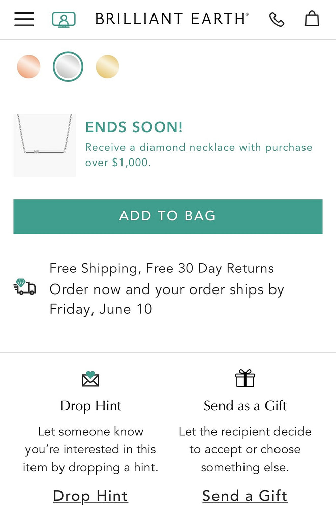
After choosing a call-to-action (such as “sell”) on the main page, vendors can utilize a promotional slider to showcase company news or highlight specific products in close-up. If special offers hold greater significance for your target audience than new items, consider placing them in separate sections within the Sale menu. Additionally, instead of displaying discounts on product pages, consider listing two prices: the discounted price and the original price.
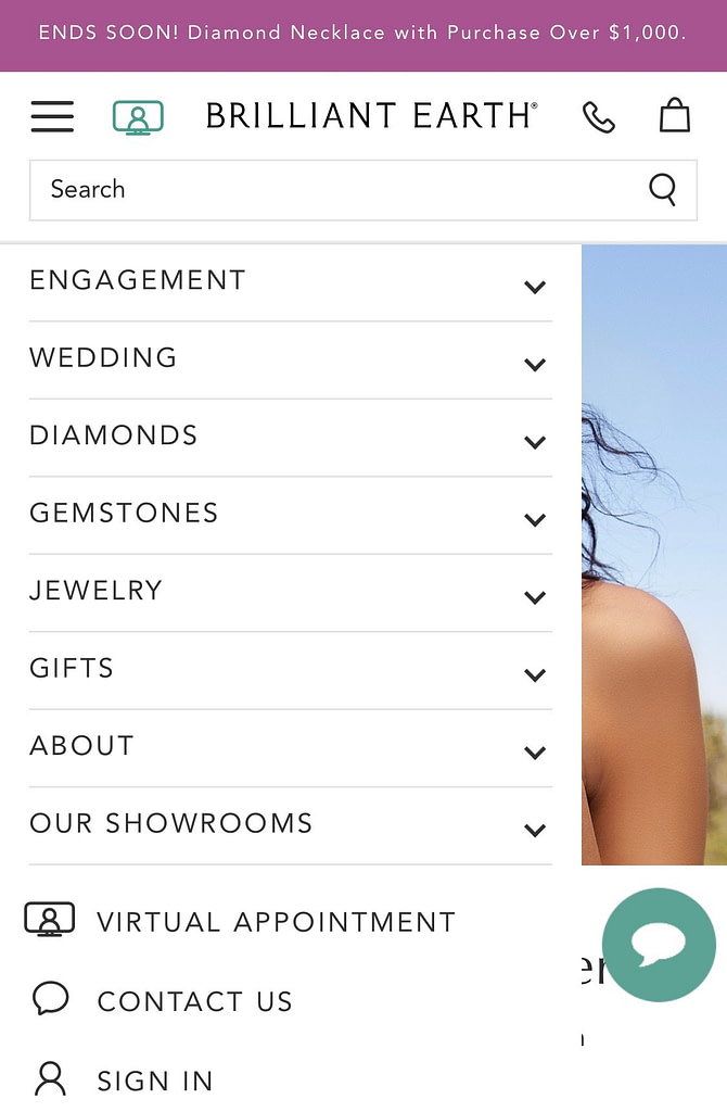
Catalog sections
Catalog sections in the menu are one of the basic ways to navigate the site: it is the menu that determines where the users will stay on the site, and whether it will be easy for them to find what they want.
You can put all the basic categories in the main menu bar: rings, earrings, pendants, chains, bracelets, watches and more.
Within each category, add additional parameters: type, sample, for whom, size, etc. And for greater convenience of the search, provide a quick selection of jewelry according to the criteria:
- Product type: ring, earrings, pendant…
- Metal
- Color
- Clasp
The drop-down menu may include product pictures and brand logos.
You can group menu sections not by product type (rings, earrings, etc), but by topic: promotions, engagement or wedding, jewelry, watches, gifts, collections and brands. This division is more appropriate when the user is looking for something specific (wedding rings, watches, or a specific brand). You can leave a large “jewelry” section with all products, where the user can select a category, brand or collection from a drop-down menu.
Filters
Quite often, online store catalogs offer a giant filter that takes into account very fine settings. In the case of jewelry, these can be shades of gold, for whom the product is chosen, the type of product, composition, and so on.
The problem with the huge filter can be solved by making scrollbars in each filter section – so it takes up less space. The filter can be fixed while scrolling the entire page. Your concern with the abundance of brands can be solved with a pop-up and an alphabetical index of all brands.
Product page
In an optimal catalog, product pages should encompass essential features: indicating whether it’s a new or discounted item, stock availability, pricing, and product specifications. Additionally, including options to add to favorites and quick buttons like “add to cart” or “more info” is crucial. Clearly highlighting “in stock” and promotional pricing can help incentivize purchases.
Consider utilizing a gallery instead of static photos in product cards to provide a more dynamic experience. Furthermore, displaying available sizes on hover can enhance the user experience on the product page.
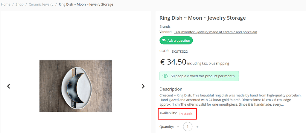
Our client – Kayamo – made all right: there is an availability bar and even a FOMO (fear of missing opportunity) section, prompting to buy
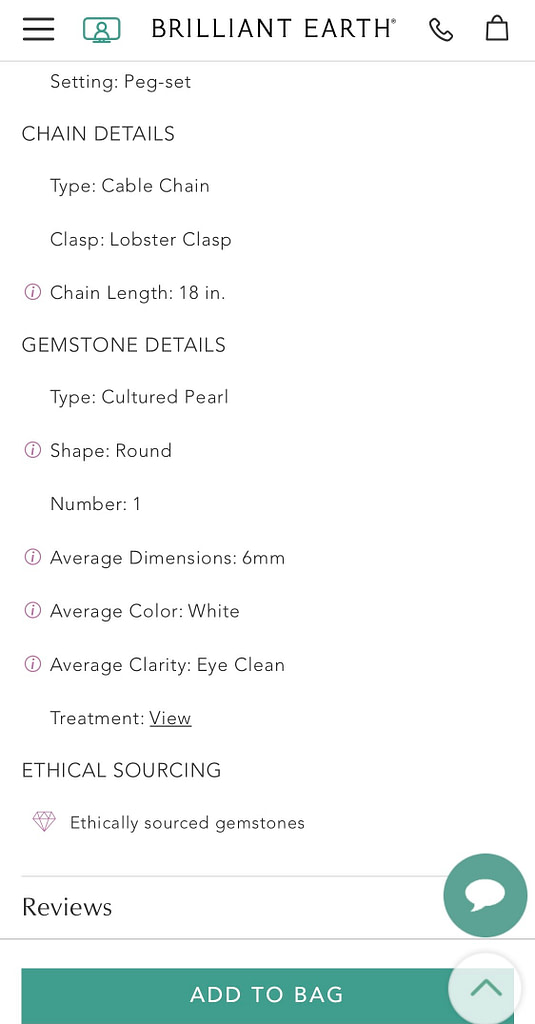
On the product detail page, you’ll usually find a photo gallery, similar or suggested products, a “You may like” category, a “You have already viewed” section, and an “Add to cart” button. You can also include an illustration of a certificate with detailed information on markings, benefits, and metal characteristics. Additionally, provide options to select available sizes, view payment methods, and access key product parameters like stone characteristics, metal details, and manufacturer information.
For expensive jewelry, the conclusion of a gemologist is especially important.
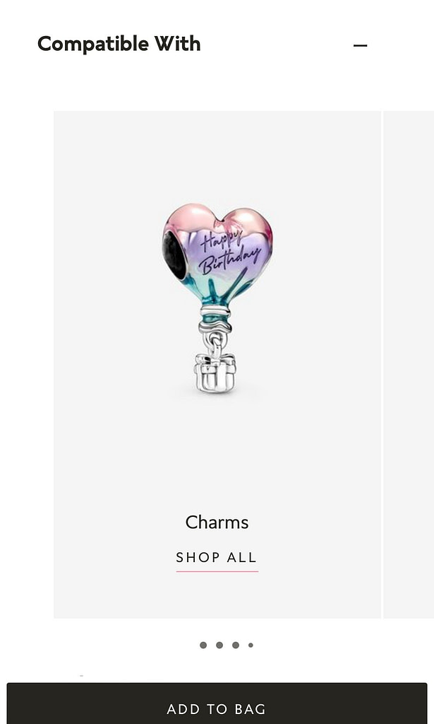
Offer a product bundle (“Compatible with” tab) for products of the same series or the same material and immediately show the price for the set.
You can also add a 3D model that can be rotated in different directions. This is possible with integration of a special API.
Allow virtual try-on for a selected piece of art.
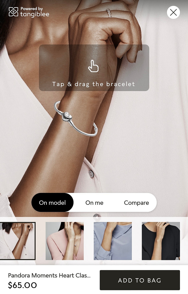
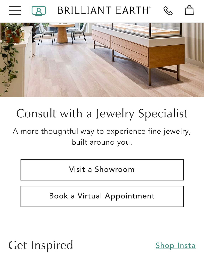
Ability to book an appointment to virtually visit your store.
Another trick is to hint that you want this product as a gift.
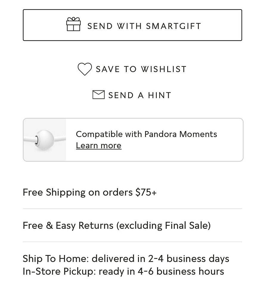
You can also highlight the ability to share the page on social accounts putting it in a prominent place.
Cart
We’ve pinpointed the essential features for a jewelry store cart:
- Caching items in the shopping cart
- Selecting the order pickup location (users only need to choose the location once, and it will be remembered for future orders)
- Ability to adjust the quantity of products
Incorporating these features enhances user convenience and streamlines the purchasing process. Read more about building product pages in our blog post How to Create the Perfect Product Page For Your Marketplace?
Payment and Delivery
There are always many difficulties with payment and delivery – it is important to take into account all delivery options, the user’s city and place an order correctly.
Add instructions to the checkout so that the user can select a transport company, indicate the desired city and leave a note, as well as payment methods. Sometimes customers want to learn more information about shipping and payment, but not always there is such a page. Make sure that your online jewelry store provides all the information of interest to customers.
In total, the payment and delivery page should include:
- the ability to select a city on the order page
- choice of delivery options
- the ability to place an order without a personal account
- separate page with delivery conditions
Dealing with payment and delivery can often be challenging. It’s crucial to consider all delivery options, the user’s city, and ensure a seamless ordering process.
To streamline this, include clear instructions at checkout. This should allow users to select a transport company, specify their city, leave a note, and choose their preferred payment method. Some customers may seek additional information about shipping and payment, so ensure that your online jewelry store provides all relevant details.
In summary, the payment and delivery page should encompass the following features:
- The ability to select a city on the order page
- Various delivery options
- The option to place an order without creating a personal account
- A dedicated page outlining delivery conditions
Our case – Gemsquar: Transforming a Jewelry Marketplace
In 2021, we got a challenging request from a jewelry marketplace that was struggling to stand out from the competition. Simtech Development helped the marketplace team implement several key modifications that helped them gain a competitive edge.
One of the most important modifications was the addition of a size guide. This helped customers make informed decisions about the size of the jewelry they were purchasing, reducing the number of returns and increasing customer satisfaction.
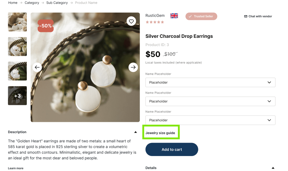
Another modification was the implementation of a drop-down menu with item options. This made it easier for customers to find exactly what they were looking for, without having to search through endless pages of products.
To further increase customer confidence, Simtech Development helped the jewelry marketplace implement a “Safe-Buy” feature. This ensured that customers could purchase with peace of mind, knowing that their personal and financial information was secure.
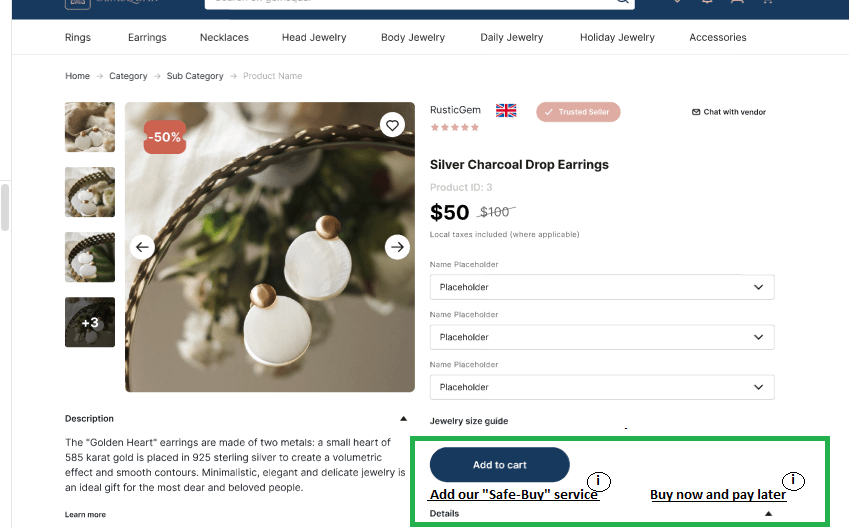
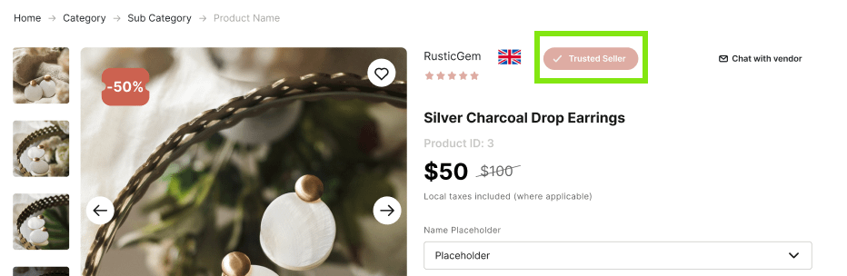
In addition, Simtech Development helped the store establish a trusted seller program. This program highlighted sellers who had a proven track record of customer satisfaction, giving customers even more confidence in their purchases.
Finally, Simtech Development helped the marketplace establish a clear and fair return policy. This ensured that customers could return items that didn’t meet their expectations, without fear of being stuck with a product they didn’t want.
Thanks to these modifications, the jewelry marketplace was able to stand out from the competition and establish itself as a trusted and reliable destination for jewelry shoppers.
Trending Jewelry Niches
The jewelry eCommerce niche is constantly evolving, with the industry rapidly embracing new trends. To stay ahead and compete with industry leaders, it’s essential to stay updated on the latest jewelry innovations. Below are some trending niches that have shown consistent growth in recent years:
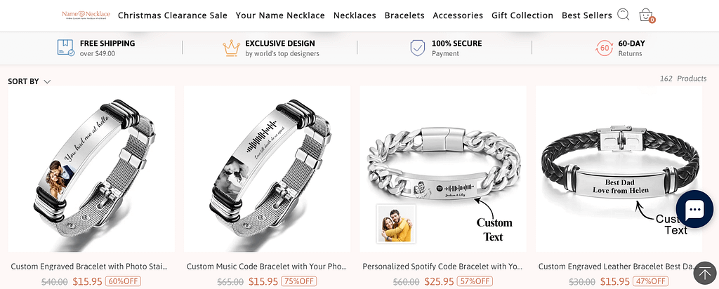
- Personalized Jewelry: Customized jewelry pieces, such as engraved necklaces, bracelets, and rings, have become increasingly popular as people seek unique and meaningful pieces. Example: NameNecklace offers a wide range of personalized jewelry, including engraved necklaces, bracelets, and rings. Buyers can customize their jewelry with names, initials, and meaningful messages.
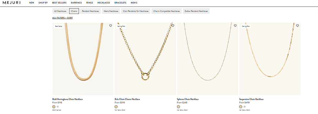
- Minimalist Jewelry: Simple and understated jewelry designs, such as delicate chains and stud earrings, have become a popular trend in recent years. Example: Mejuri is known for its minimalist and modern jewelry designs, offering delicate chains, simple rings, and stud earrings. Their collection focuses on understated elegance and everyday wearability.
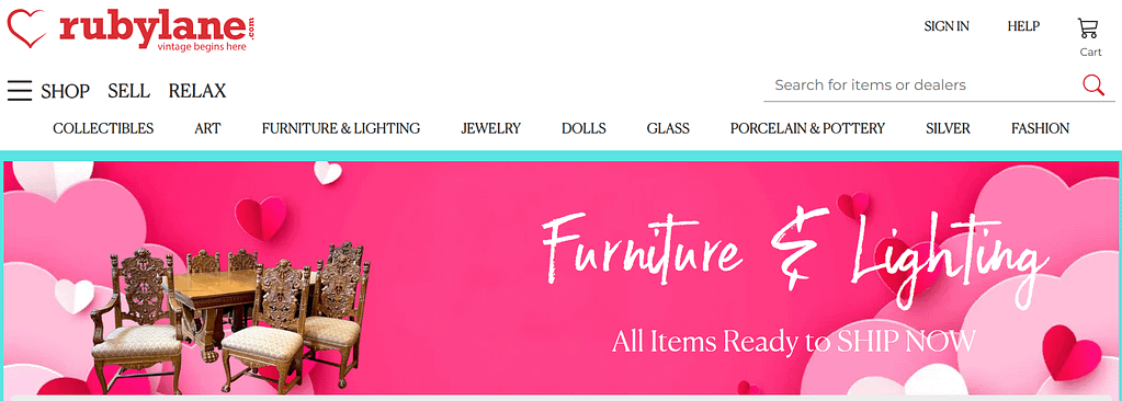
- Vintage and Antique Jewelry: Vintage and antique jewelry pieces have gained popularity among collectors and fashion enthusiasts alike, as they offer a unique and timeless appeal. Example: The Rube Lane store, specializes in vintage and antique jewelry, offering a curated selection of unique pieces from different eras. Their collection includes vintage engagement rings, Art Deco jewelry, and other timeless pieces.
- Sustainable Jewelry: As more consumers become environmentally conscious, eco-friendly and sustainable jewelry made from recycled materials or ethically sourced gemstones have become a popular niche. Example: Brilliant Earth is a leading retailer of ethically sourced and sustainable jewelry. They offer a range of eco-friendly jewelry made from recycled metals and ethically sourced gemstones, catering to environmentally conscious consumers.
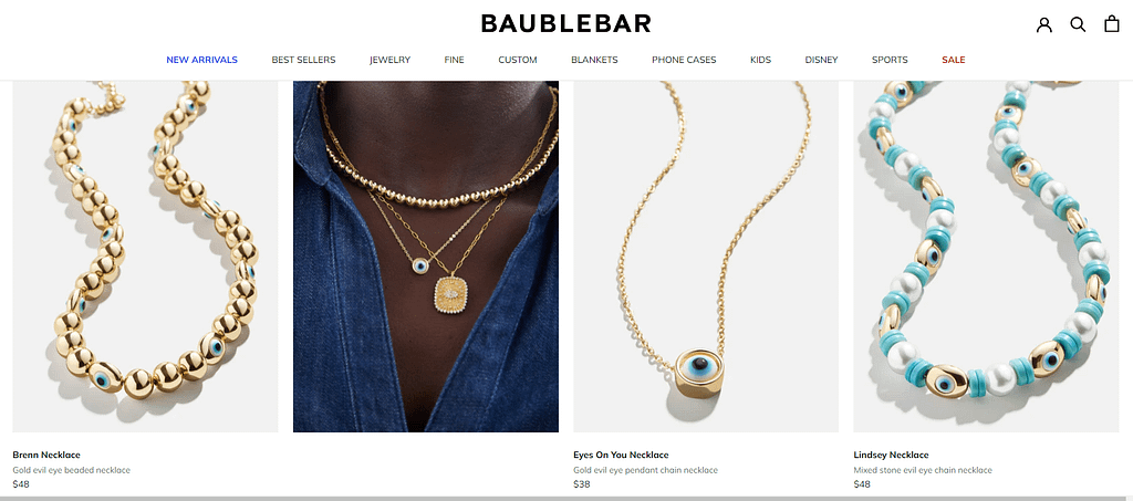
- Statement Jewelry: Bold and eye-catching jewelry pieces, such as oversized earrings and chunky necklaces, have become a popular trend for those looking to make a statement with their accessories. Example: BaubleBar is known for its bold and eye-catching statement jewelry pieces. Their collection includes oversized earrings, chunky necklaces, and vibrant accessories designed to make a statement.
Five jewelry business ideas
Staying ahead of the competition by following trends is one approach, but another solution is to unleash your creativity. Consider building your jewelry web store around the following ideas:
- Handmade Jewelry: Create and sell unique, handcrafted jewelry pieces. This could include personalized and custom-made items, such as beaded bracelets, wire-wrapped pendants, or hand-stamped necklaces.
- Jewelry Subscription Box: Launch a subscription-based service that delivers curated jewelry pieces to customers on a regular basis. This could include themed boxes, seasonal collections, or personalized selections based on customer preferences.
- Ethical and Sustainable Jewelry: Start a business that focuses on creating and selling environmentally friendly and ethically sourced jewelry. This could involve using recycled materials, conflict-free gemstones, and sustainable production practices.
- Jewelry Repair and Restoration: Offer jewelry repair and restoration services, catering to customers who need their precious pieces repaired, resized, or restored to their former glory.
- Online Jewelry Marketplace: Create an online platform that connects independent jewelry designers and artisans with customers. This could be a marketplace for unique, handmade, or artisanal jewelry, providing a platform for designers to showcase and sell their creations.
These are just a few jewelry business ideas to consider. Each idea can be tailored to your interests, skills, and target market, and can be a great way to tap into the thriving jewelry industry.
Jewelry eCommerce Specifics
No matter the core concept or trend driving your online venture, it’s essential to take into account specific considerations that are typical for the jewelry market online niche. The jewelry eCommerce sector demands unique attention to detail. Let’s once again list key specifics to consider when establishing an online jewelry store:
- High-Quality Product Photography: Jewelry is a visual product, so high-quality product photography is essential. Invest in a good camera, lighting, and editing software to create clear and detailed images that showcase your jewelry in the best possible light.
- Detailed Product Descriptions: Along with high-quality images, detailed product descriptions are crucial for eCommerce success. Include information such as materials, sizing, weight, and care instructions to help customers make informed purchasing decisions.
- Secure Payment Processing: Jewelry is often a high-value item, so customers need to feel confident that their payment information is secure. Use a reputable payment processor and ensure that your website has SSL encryption to protect customer data.
- Shipping and Returns Policies: Clear and transparent shipping and returns policies are important for eCommerce success. Provide information on shipping times, costs, and tracking options, as well as a clear and fair returns policy to help customers feel confident in their purchases.
- Customer Service: Excellent customer service is essential for building trust and loyalty with customers. Respond promptly to customer inquiries, provide helpful information, and offer a personalized touch to create a positive shopping experience.
By focusing on high-quality visuals, detailed information, secure payment processing, clear policies, and excellent customer service, you can create a successful online jewelry business.
Mistakes to Avoid Making as a First-Time Jewelry Seller
As a first-time jewelry seller, it’s important to be aware of potential pitfalls that could impact your business. Consider the following common mistakes to avoid:
- Lack of Market Research: Failing to conduct thorough market research can lead to offering products that don’t resonate with your target audience. Understand your potential customers, competitors, and market trends before launching your jewelry business.
- Ignoring Quality: Sacrificing quality to reduce costs can be detrimental to your brand’s reputation. Ensure that your jewelry meets quality standards and is made from reliable materials to build trust with customers.
- Overlooking Legal and Compliance Requirements: Ignoring legal aspects such as business registration, tax regulations, and compliance with jewelry industry standards can lead to legal issues. It’s crucial to understand and adhere to relevant laws and regulations.
- Skiping the MVP stage: it allows you to test the market with a basic version of your product before investing a lot of time and money into developing a fully-featured website. Read more in our article Unlocking Success In ECommerce: The Power Of Minimum Viable Product.
- Poor Photography and Product Descriptions: Low-quality images and vague product descriptions can deter potential customers. Invest in professional photography and provide detailed, accurate descriptions to showcase your jewelry effectively.
- Inadequate Online Presence: Neglecting to establish a strong online presence can limit your reach. Create a user-friendly website, leverage social media, and consider selling on popular e-commerce platforms to expand your customer base.
- Neglecting Customer Service: Failing to prioritize excellent customer service can harm your business. Promptly address customer inquiries, provide support, and maintain transparency to build trust and loyalty.
- Pricing Mistakes: Incorrectly pricing your jewelry can lead to lost sales or reduced profit margins. Consider factors like material costs, labor, and market demand when setting prices.
- Inconsistent Branding and Marketing: Inconsistent branding and marketing efforts can confuse potential customers and weaken your brand identity. Develop a cohesive brand image and maintain consistent messaging across all marketing channels.
- Lack of Differentiation: Failing to differentiate your jewelry from competitors can make it challenging to stand out. Highlight unique selling points and tell a compelling brand story to set your business apart.
- Limited Networking and Collaboration: Missing out on opportunities to network with other businesses and collaborate with influencers or industry professionals can hinder your business growth. Building connections and partnerships can help expand your reach and credibility. To support this, using tools that find email addresses from names or domains makes connecting with potential partners easier
By avoiding these common mistakes, you can set a strong foundation for your jewelry business and increase your chances of success. Continuously learning and adapting to the evolving market will also be crucial for long-term growth.
Conclusion
All online stores and marketplaces are very individual. The main thing is to highlight your specifics in order to stand out from competitors and attract the target audience. We have identified only the main characteristics that significantly affect the process of choosing and making a purchase. Our team has completed a big deal of projects for jewelry stores with different specifics. We know exactly how to make your jewelry store sell.
You may be interested in reading:
- Customization of an online store with virtual try-on feature
- Customization for a marketplace with YouTube page linking
- Customization for a large gemstone store